CES Mobile App Redesign
January 2018
My first visit to CES (Consumer Electronics Show) was a blast, so many interesting companies showing off their coolest tech. With over 4,000 exhibitors and over 2 million square feet of exhibition space, the CES mobile app was helpful in getting around and knowing when and where events were happening. That being said, I saw several places where the CES app could be improved and this proposal aids to improve the app experience for the years to come.
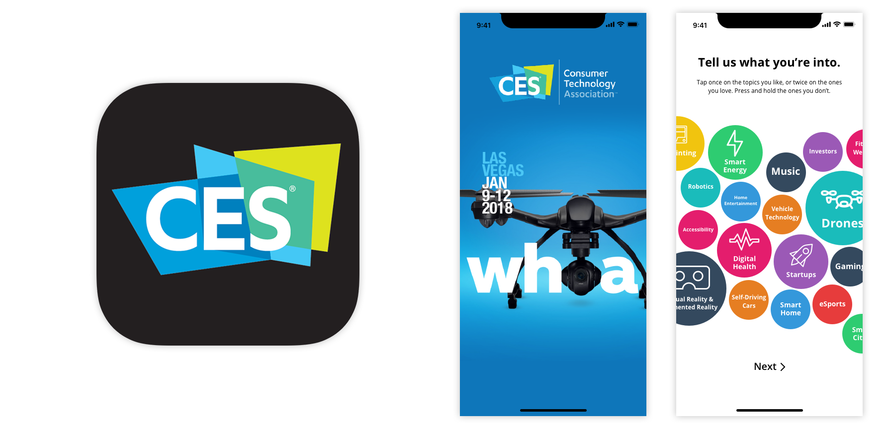
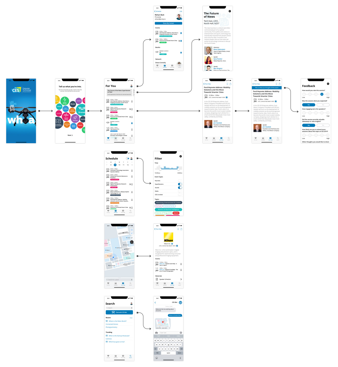
Starting with the images above presented is a refreshed icon, a refreshed splash page using this year’s marketing materials and an onboarding process gaining user preferences in order to suggest sessions, booths and other events for each attendant.
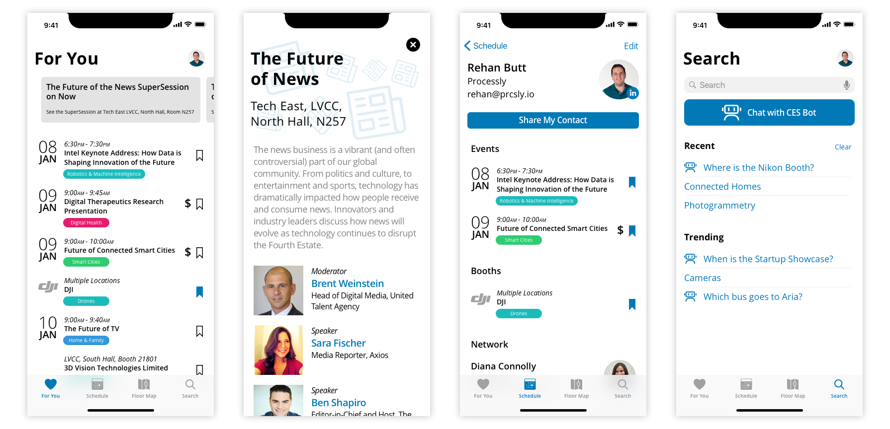
First I wanted to create a true home page, the ‘For You’ page, for the application utilizing the topic preferences collected during the onboarding process. Showcasing both sessions and booths in one place along with the notifications. This second screen shows what a notification would look like in an expanded view. The third screen showcases your profile page with bookmarked events, booths and people you have networked with. I wanted to streamline the contact sharing aspect of the app as most people just seemed to use LinkedIn. The last screen in this row is the updated search page providing recent and trending searches, as well as, a cleaner integration of the CES chatbot.
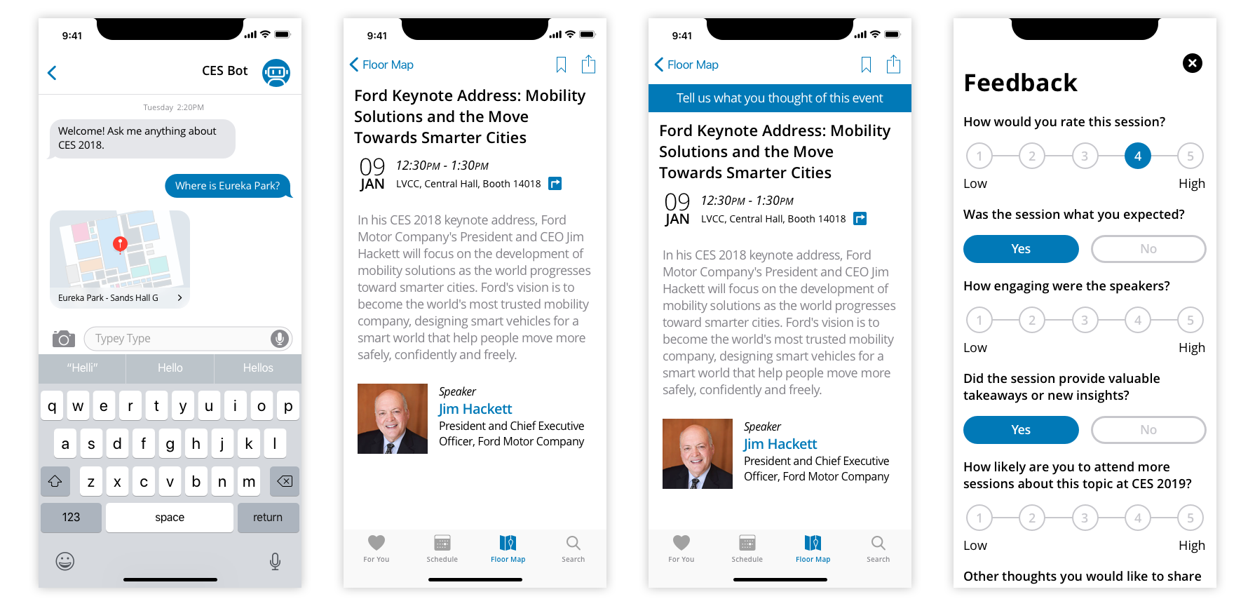
Continuing with the CES chatbot I streamlined the interface and created richer responses, such as the ‘mini-map’ when asking where something is. The next 2 interfaces show a pre-event and post-event version of an events page. The post-event page integrates a more prominent feedback call-out which would be accompanied with a notification for each session I have attended. Lastly, a refreshed feedback form.
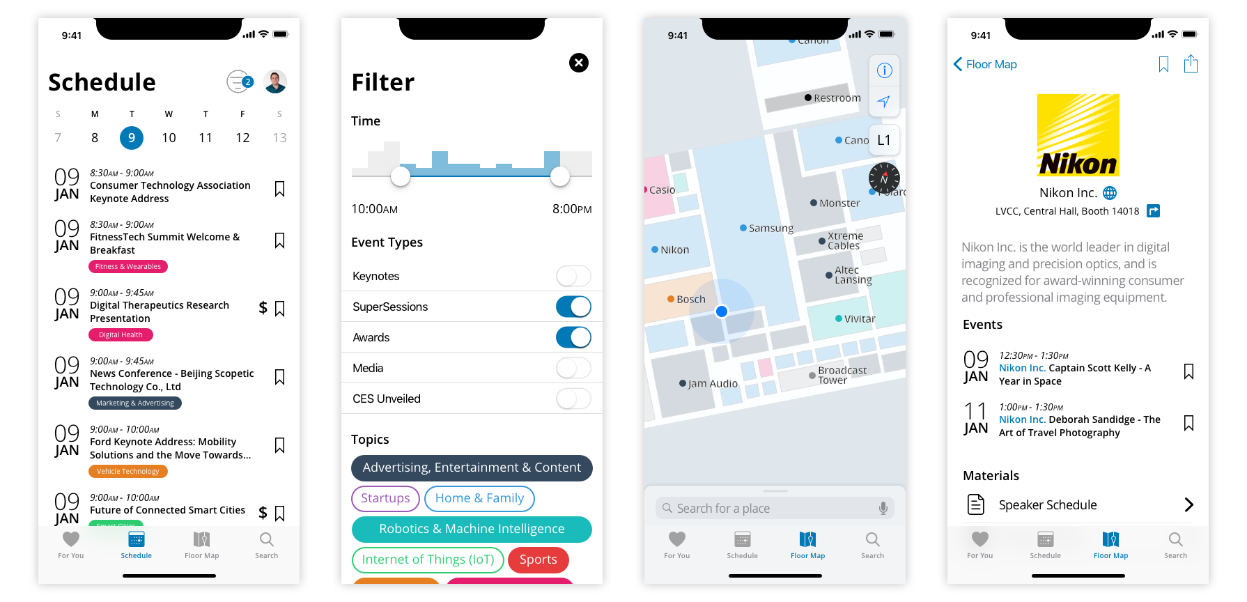
The last set of interfaces that I would like to highlight include the schedule page. I gave the schedule page improved hierarchy for each of the event entries, as well as, making clear which topic category each entry belongs. Next, I reworked the filters page keeping the event types toggles and the time slider, but adding the density of events at each time interval through the vertical bars above the slider, as well as, adding topic category toggles. One of my favorite features of the CES app was the indoor location feature, but it was tricky to use with a numbered map. As such, I wanted to again bring in the topic category color system and replace the booth numbers with company names. The fourth interface in this row shows an updated booth page highlighting the brand at the top, a link to their site and a quick function to navigate to the booth. Unless I had heard through word of mouth about a booth’s event more than likely I would not have known it was happening, as such I wanted to give booths the option to add their own events to the official calendar.
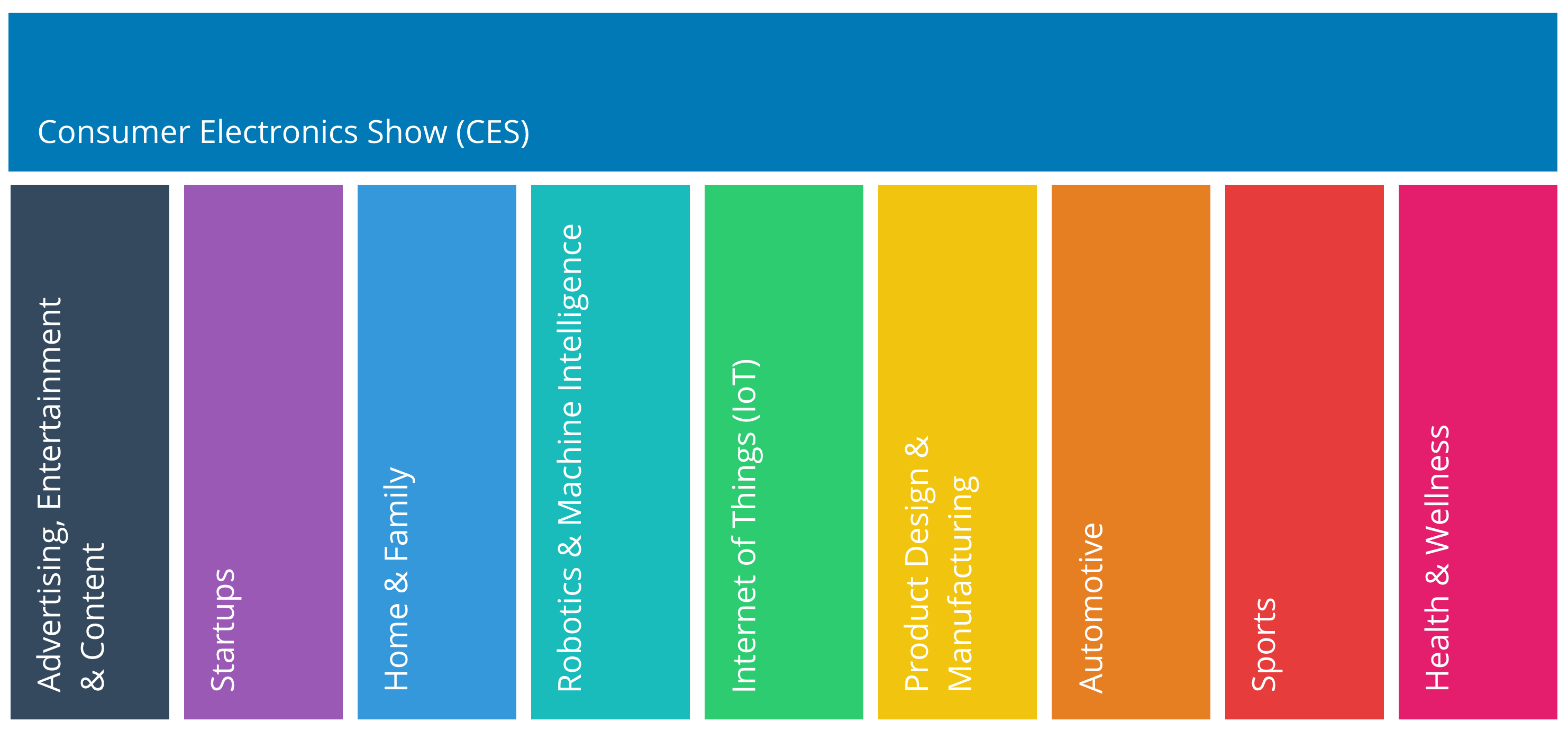
I wanted to take full advantage of the topic categories created for CES. As such I created a color system that maps each category to a color for identifying events, booths and several other things across the app experience.
Process


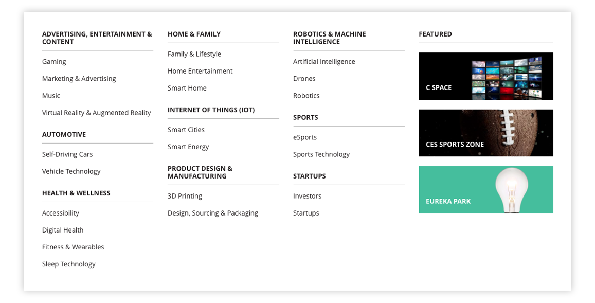
The web experience and mobile app experience are quite disconnected. I found the web experience to offer cleaner interactions and a cleaner interface and wanted to capture some of it for my redesign, while maintaining the full featured nature of the mobile app.
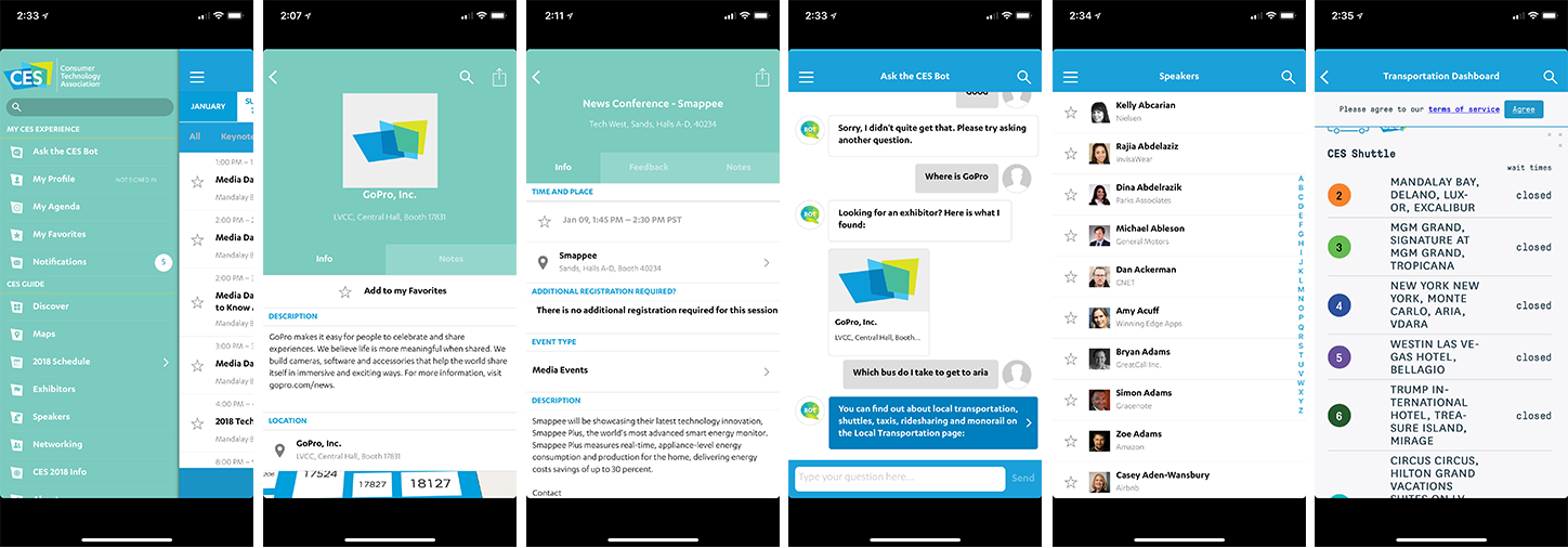
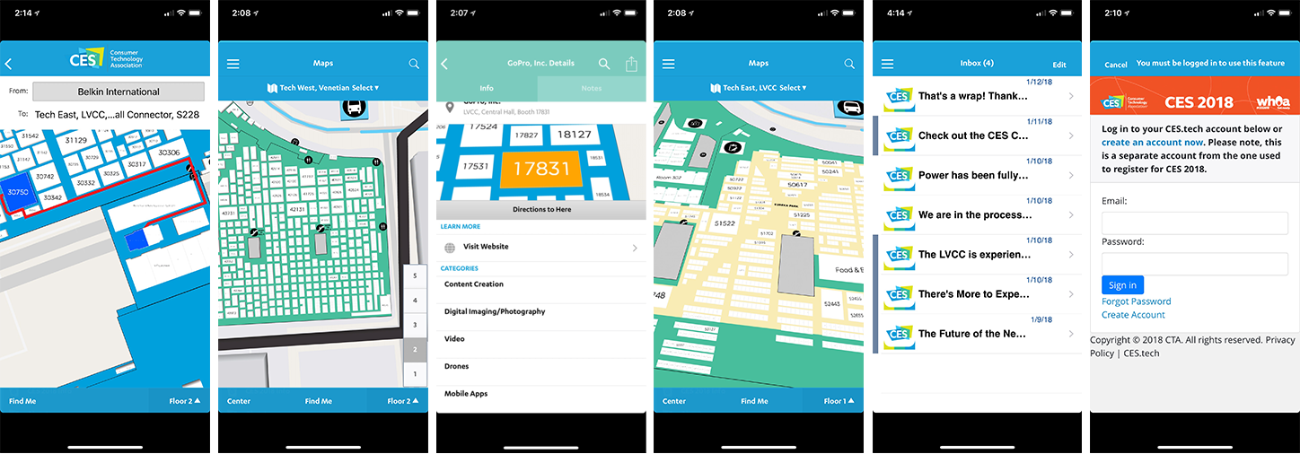
Several screens from the current app.

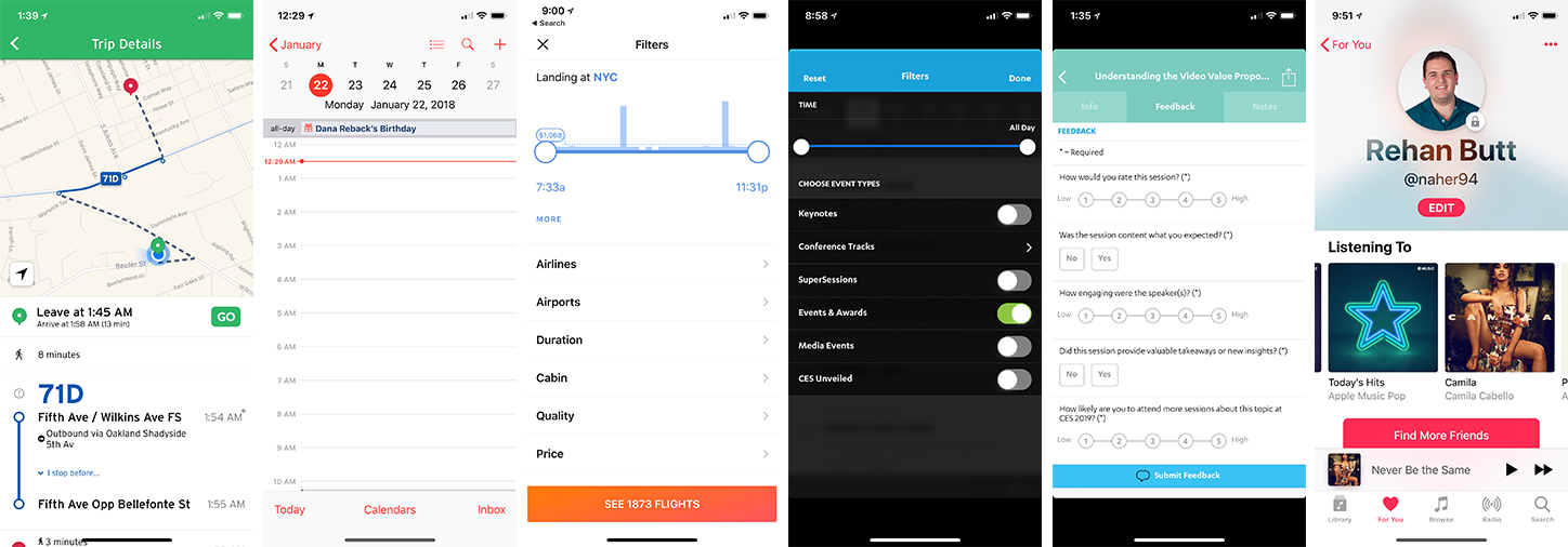
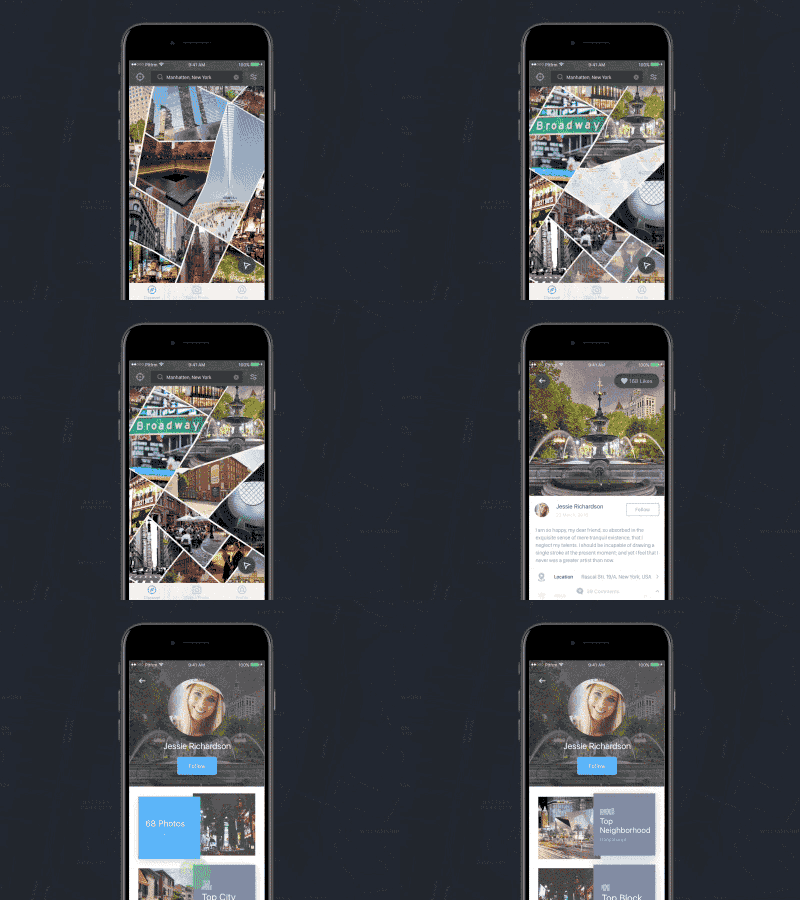
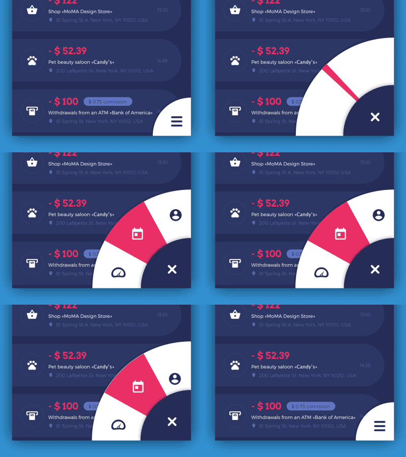
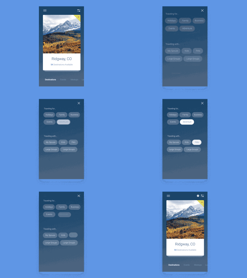
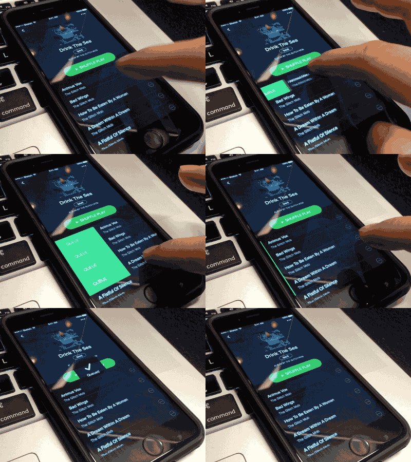
Some interaction and static interfaces, that I used as inspiration. Looking at things like ease of use, hierarchy and legibility to name a few.
