
October 2021
Environmental Conditions
What if design tools helped reflect some of the common scenarios that exist in the real world?
The Environmental Conditions feature explores what one possible solution to this problem. What about better accounting for user conditions, such as internationalization, dark environments and reduced network speeds for starters!
One key aspect of this project was to build on to an existing design tool rather than exploring what an entirely new tool might look like. As much of the design projects we all work on are around improving existing products. This approach may also help design tool teams more easily bring some of these ideas to life! If you are curious about my thoughts on a ground up design tool, check out Fluid Design Opens a new window .
Behind the Scenes
To the keen eye you may recognize the leaf icon that I am using for the branding of this project, its from Wall-E! You may also see a couple A113 references through out this project as well, another classic Pixar easter egg!
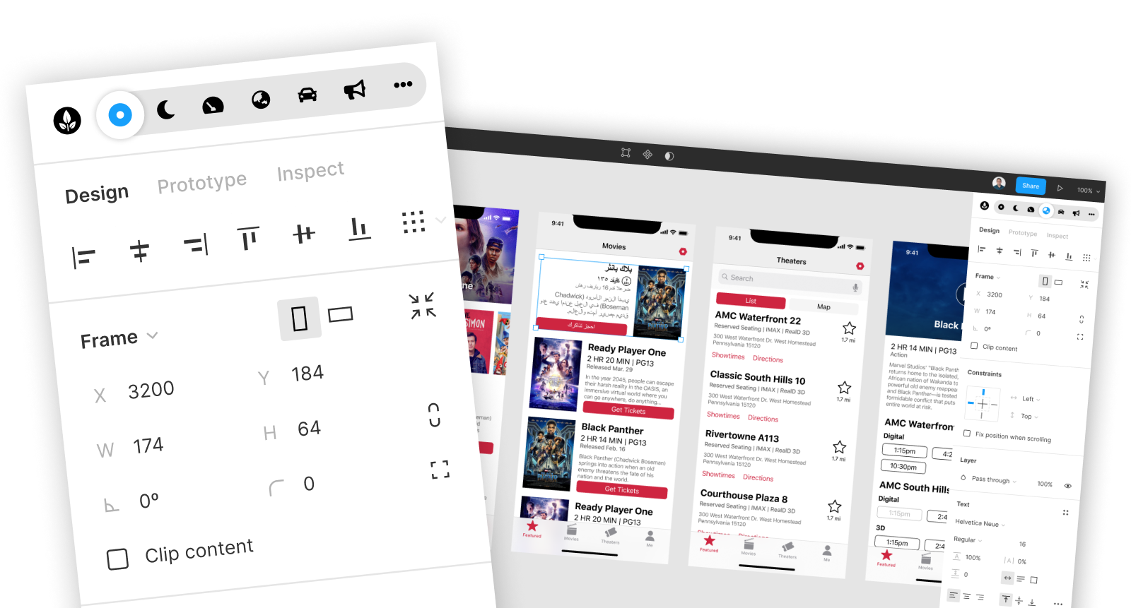
One Possible solution could be the Environmental Conditions feature. Where you design with added layers of context considering your user’s environment. Thinking beyond static visuals but experiences that are affected by the user’s surroundings. Working at night or in a dark room? Constrained by reduced network speeds? Building for an international market? All these considerations can more easily be made earlier in the design process that nicely blends into the Figma UI we all know and love.
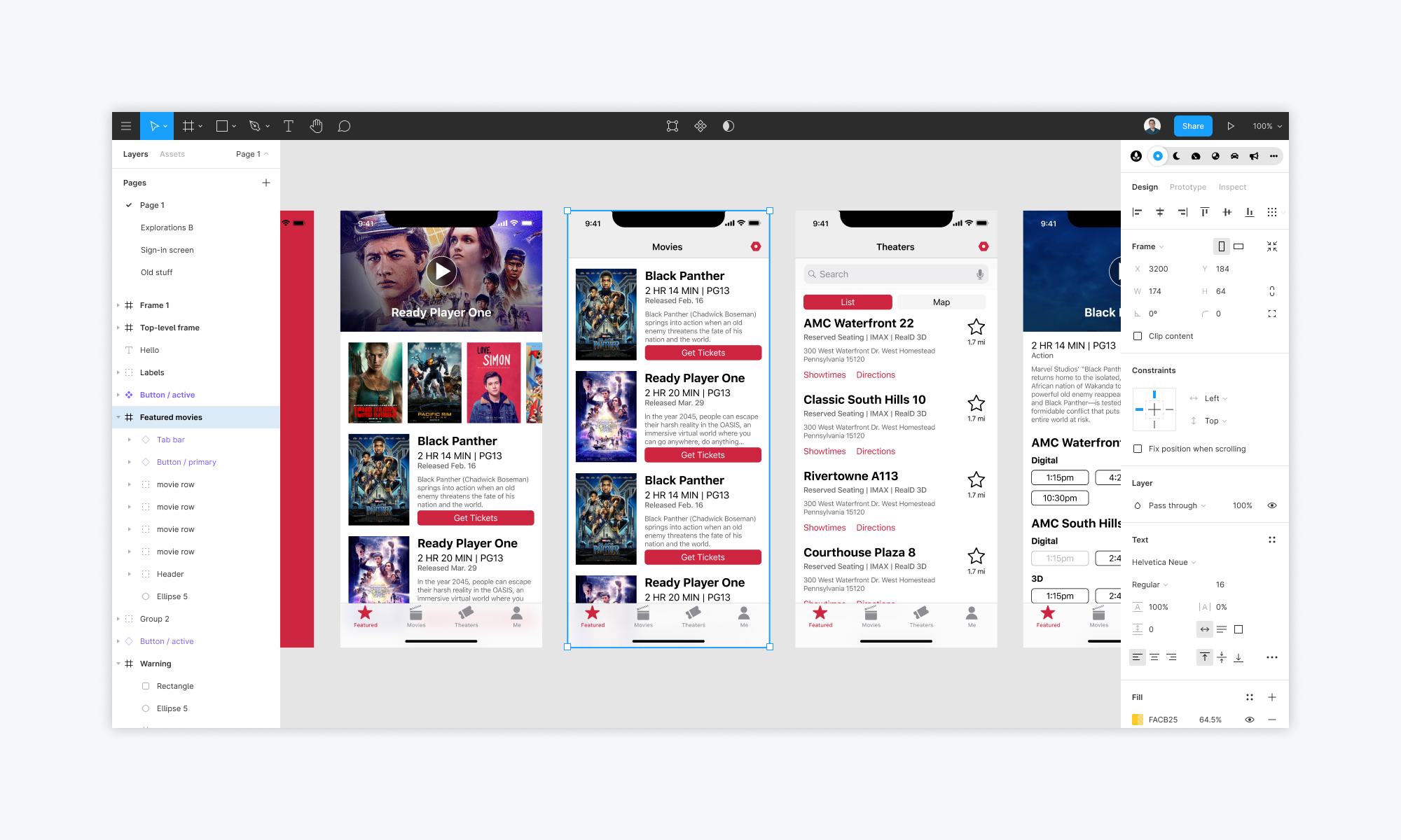
At the top of the Design Sidebar, on the right, you will notice the new Environmental Conditions control. Allowing you, the designer, to add another dimension to your designs.
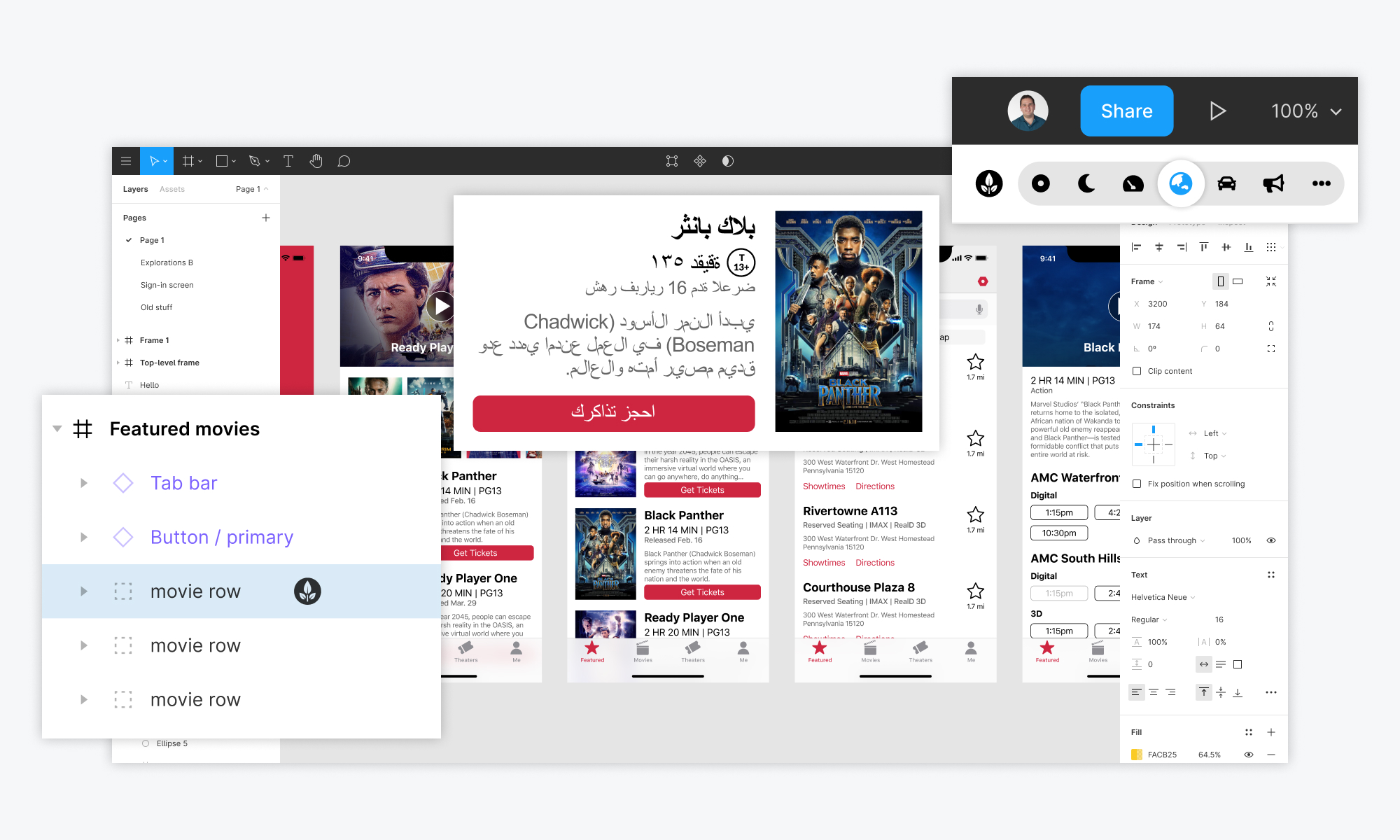
Exploring the internationalization case, you will notice in the above image that the Environmental Conditions control now selects the international dimension. Allowing for cascading changes throughout the application, specifically for your internationalization considerations. In this case thinking about the region-specific needs of a movie theatre application, exploring right to left languages and the different rating systems that would need to be applied around the world. As you proceed through your design process the Environmental Conditions Leaf anchors itself into the layers panel, informing you that there are additional dimensions added to these objects.
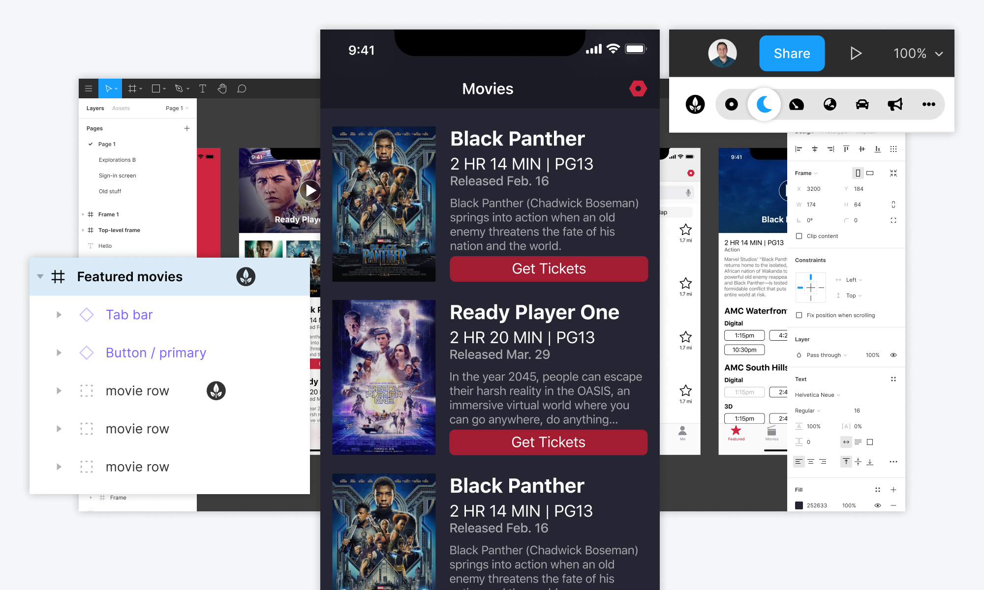
Similarly, in the case of a dark environment, the Environmental Conditions control updates and so does the layers panel. Though in this case of a dark mode you would likely update existing global color styles rather than applying the correct color to each and every object in your design.
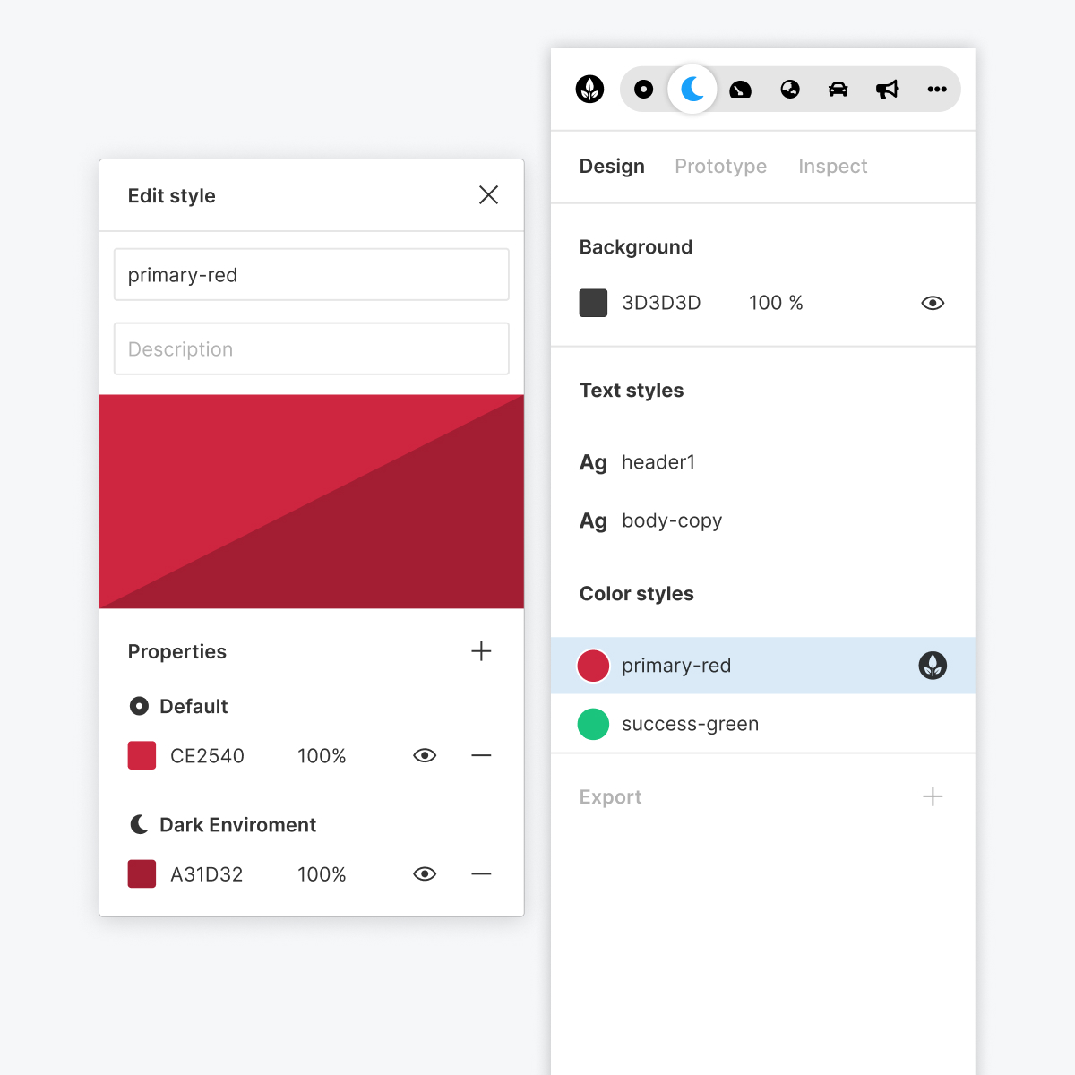
Our styles have updated to reflect these global changes! Shown above the primary-red color style now also has an added ‘Dark Environment’ property that will reflect everywhere the primary-red style is applied when the Dark Environment is set.
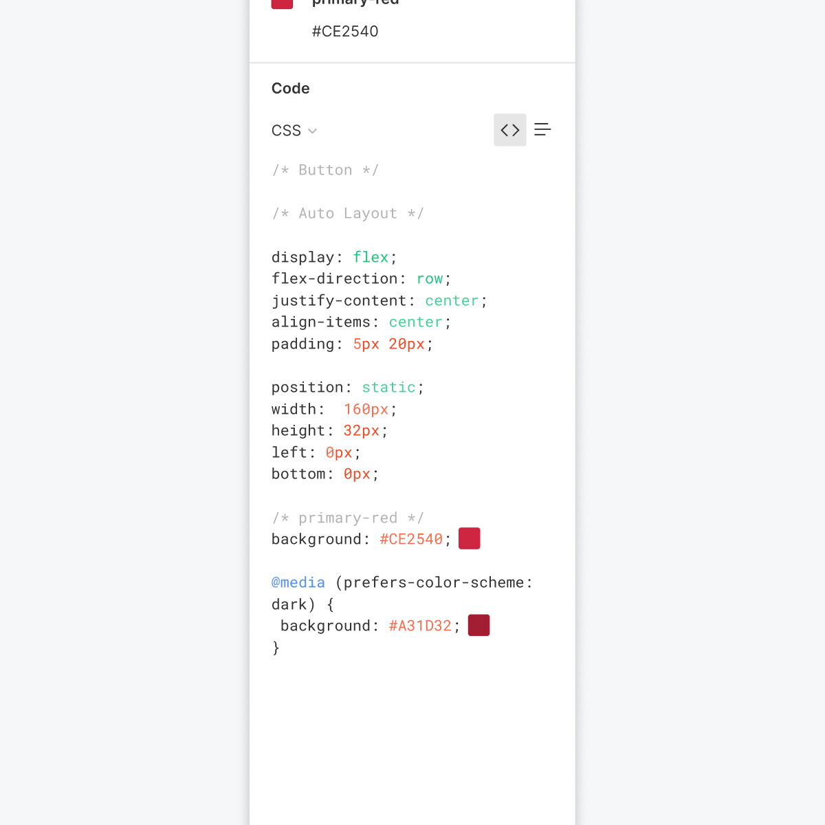
Likewise, we can’t forget about our engineers, the code panel has been updated to show media queries, in this case the prefers-color-scheme. This could be expanded to include several other media queries such as prefers-contrast, prefers-reduced-motion, and prefers-reduced-data creating a more streamlined collaboration process between design and development.
This project is in no way complete, but an exercise is what something could start to look like.
This project is in no way complete, but an exercise is what something could start to look like. As such if I were to continue with this work, I would want to focus on three main things. First, exploring interaction details and how the Environmental Conditional feature interacts with the rest of Figma. Thinking about the relationship to pages, linked layers, and showcasing a state where multiple environments are enabled. Second, user testing and seeing what works and doesn’t within others design processes. And third, the technical feasibility, is something that could be built given public APIs, or would it need to be realized by the Figma team themselves?
Process
“I find frames with their different formatting treatments tricky, like when I would steal components from you, there would be invisible stuff going on that I found hard to decode”
“Well, currently the prototyping function on Figma is my least favorite part. I wish it was a bit more flexible, more intuitive and more fluid on the animations (always laggy or jittery)”
“Hmmmm we’ve been having issues with the pathing for presentation mode. If you delete something it breaks instead of being like ‘hey let me just connect to the one that after it then’”
One of the first parts of my research and discovery process involved asking my design friends what some of the issues they experienced with design tools are and these quotes were a couple of those thoughts.
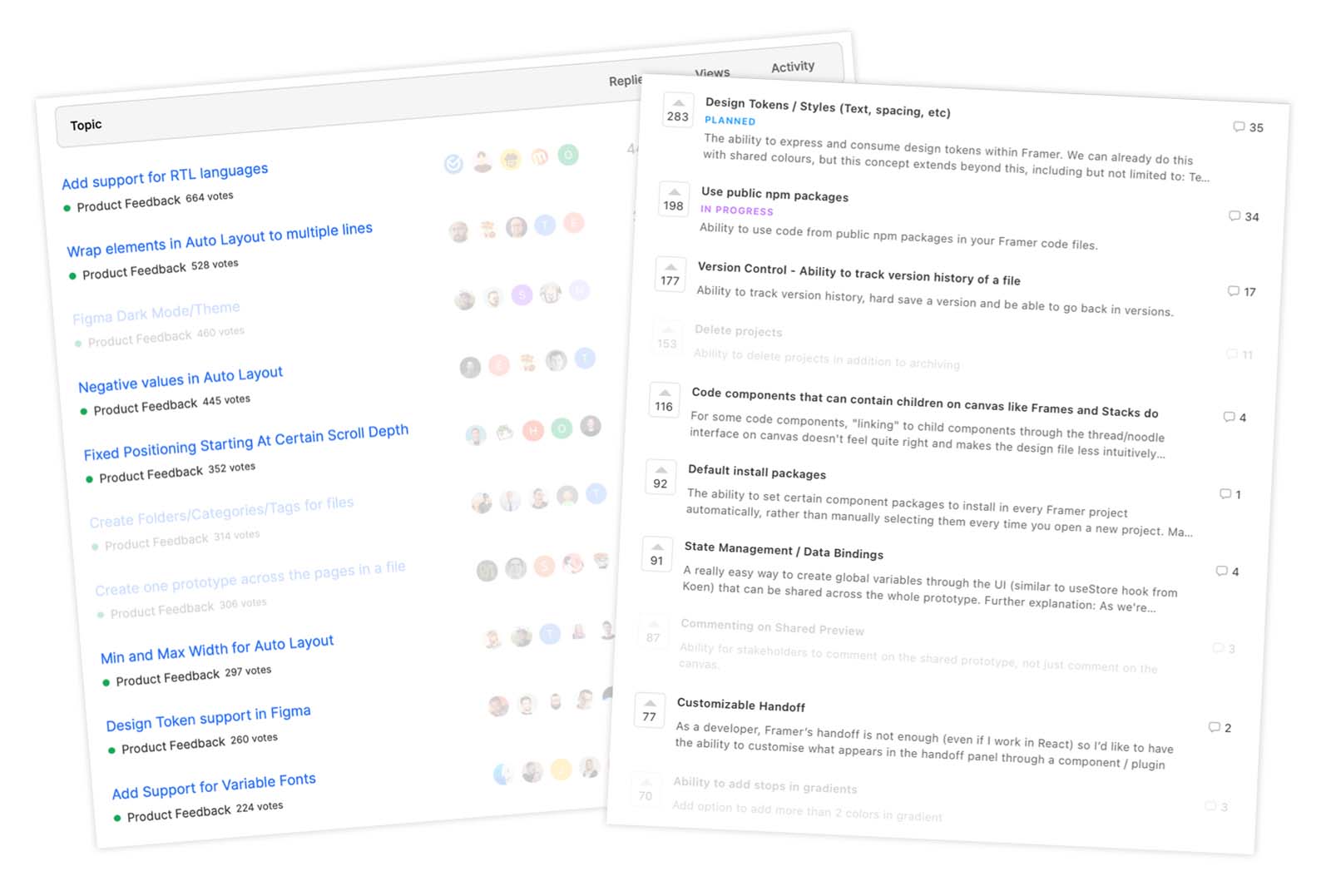
The other things I did was explore the publicly available feature request lists for Figma and Framer, getting a sense for what the general design community is looking for next in their tools. You will notice many of these requests have to do with design tools more closely reflecting the developed product. “Adding support for RTL languages”, “Wrap elements in Auto Layout to multiple lines” and “Design Token support” to name a few.
Many of the requests and comments were about bringing more real-world conditions and scenarios into the design tools and thus earlier into the design process.
Throughout this process a bunch of questions came to mind. Exploring the relationship between the designed interface and the product that ends up in the user’s hands. Here are some of those questions:
- Referencing real data?
- Creating responsive interfaces?
- How do you make the design tool act more like the real world without jumping to implementation details?
- What parts of the real world are important to translate?
- Is it about fidelity or things forgotten?
- Abstracting out a user flow from the interface?
“Team up with your dev during, not after design”
“Consider error cases and non-standard flows”
“Work to build a shared language”
“Think about things like performance and auditing”
I also chatted with several of my engineering partners, as they play a key role in my design process and any software product. Here are a couple of comments they said in relation to working with designers and the design processes.
The research helped solidify a focus area around the idea of bringing real world conditions into the design tools, specifically around non-ideal conditions or user environmental situations
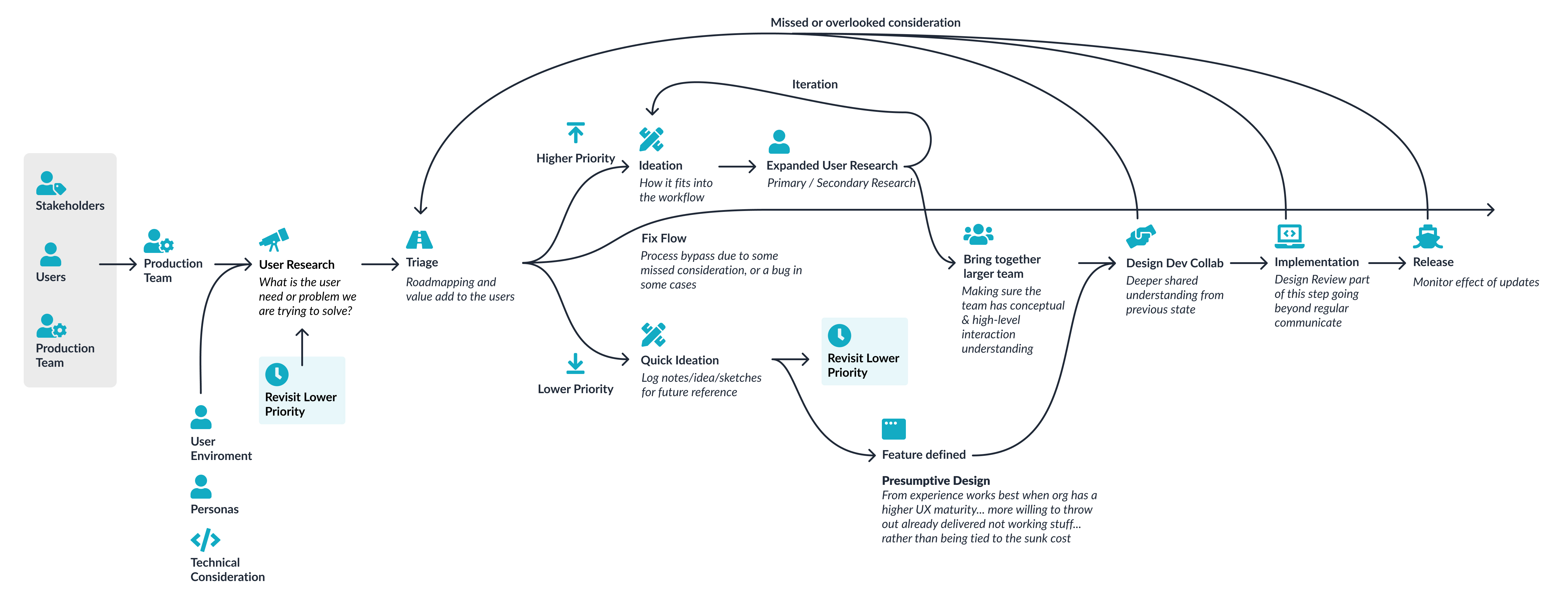
Created a workflow diagram illustrating the design I currently follow with my team. I Looked at what parts of this process would be modified and improved with this solution.
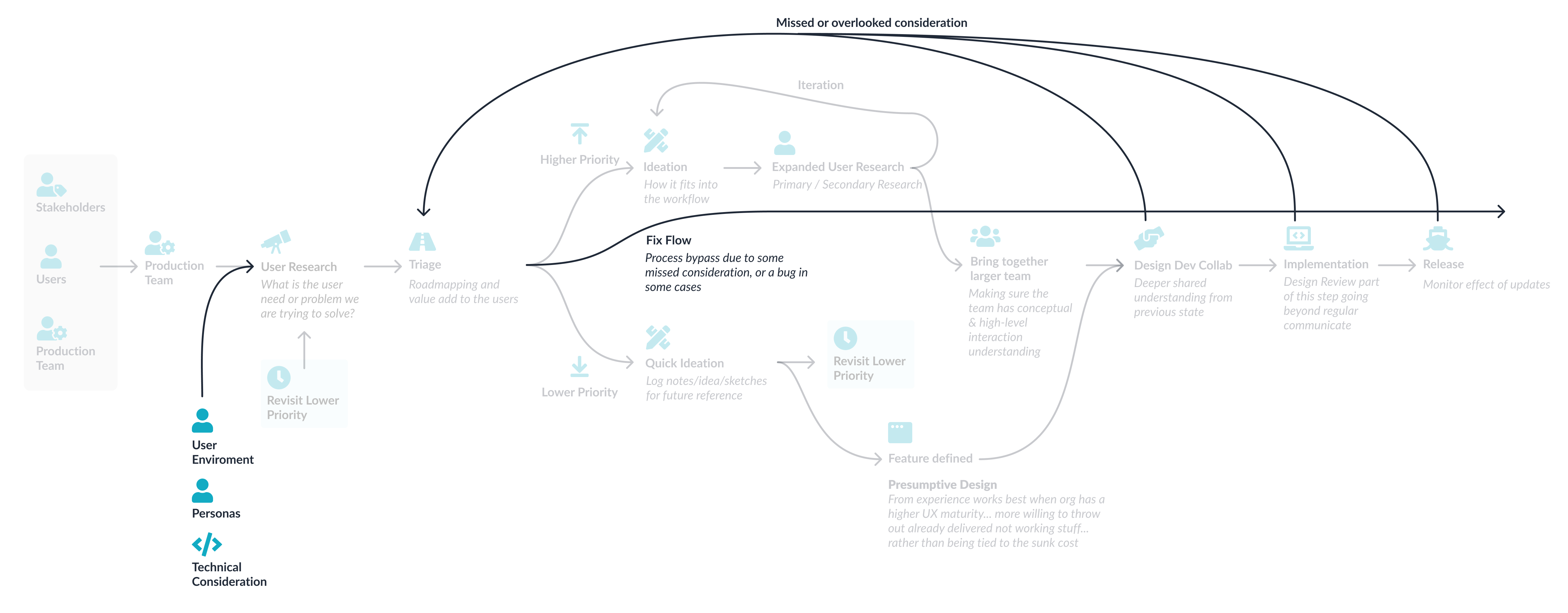
This workflow diagram highlights the situation I wanted to improve with this project. I Looked at where in the process missed or overlooked considerations ended up being caught and what would happen when those items needed to be resolved in short order. These items tend to get caught when a larger number of folks think through the problem and get missed when they are not considered from the beginning.


Two ideas came to mind, the idea of a “Fidelity Switcher” where the user flow is abstracted out from the interface layer, and the idea of “Context layering” layering in user context and environmental conditions.
For the “Fidelity Switcher” concept think about a multi-modal experience, one where you might start the experience through voice and then handoff to a screen-based interface. Abstracting that interaction flow from the voice or screen interface would lead to clearer articulation of the user flow regardless of the interface. This idea also led to back to my work on Fluid Design Opens a new window , as such I decided to explore the other route for this exercise, you should definitely check out that work!
The “Context Layering” idea explores layering in context, such as a taking into consideration dark environments, slow network speeds, internationalization or a dedicated interface when used in a car. This new dimension more closely mimics the real-world scenarios that may otherwise be missed in a typical design process and aids in the collaboration between the design and the implementation. Throughout the rest of this project, I explored the idea of bringing forward user environmental considerations.
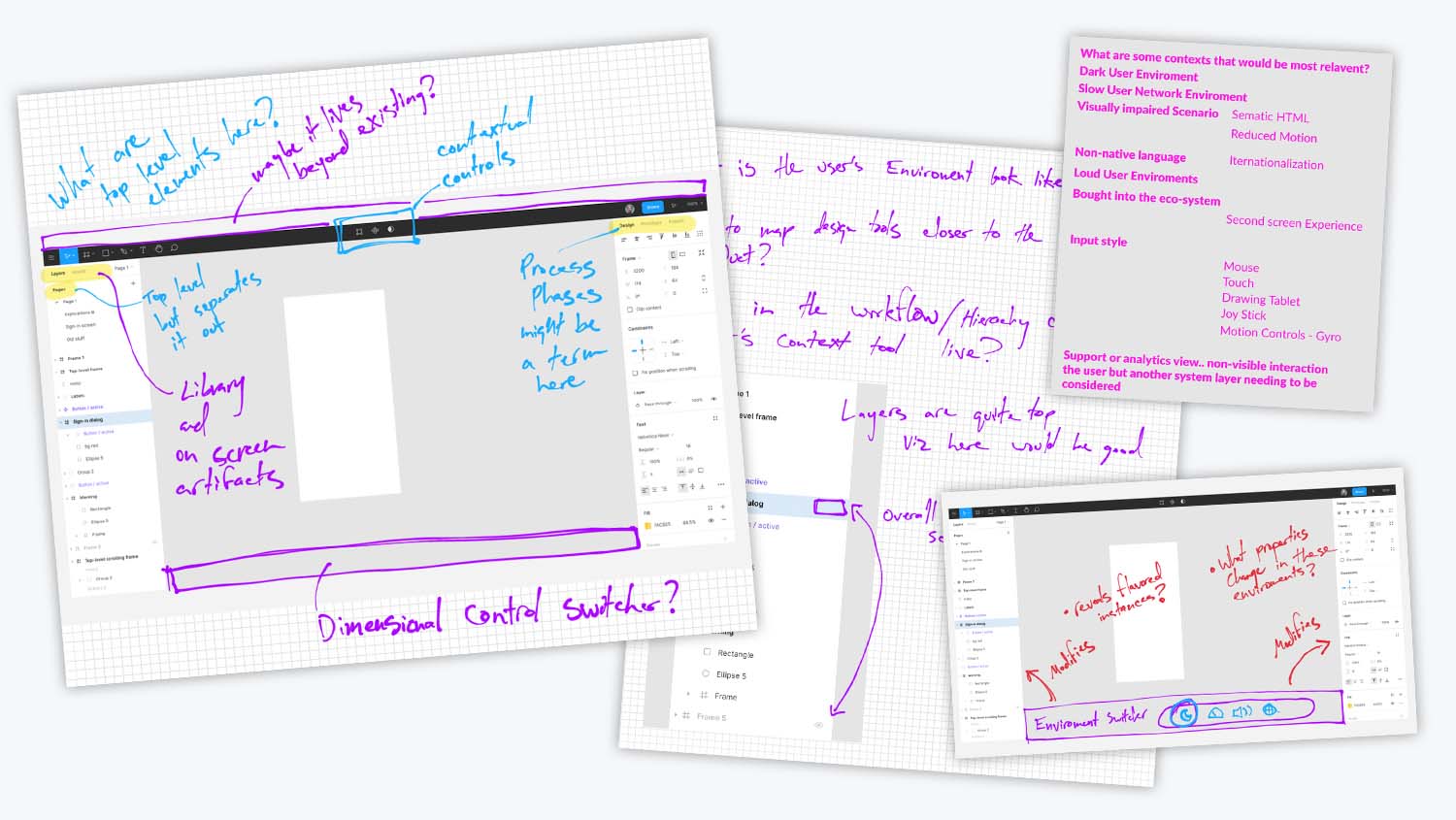
These were some of my initial sketches. Exploring what this feature might look like within Figma. Where it might live in the application’s hierarchy and how it plays with the existing toolset.
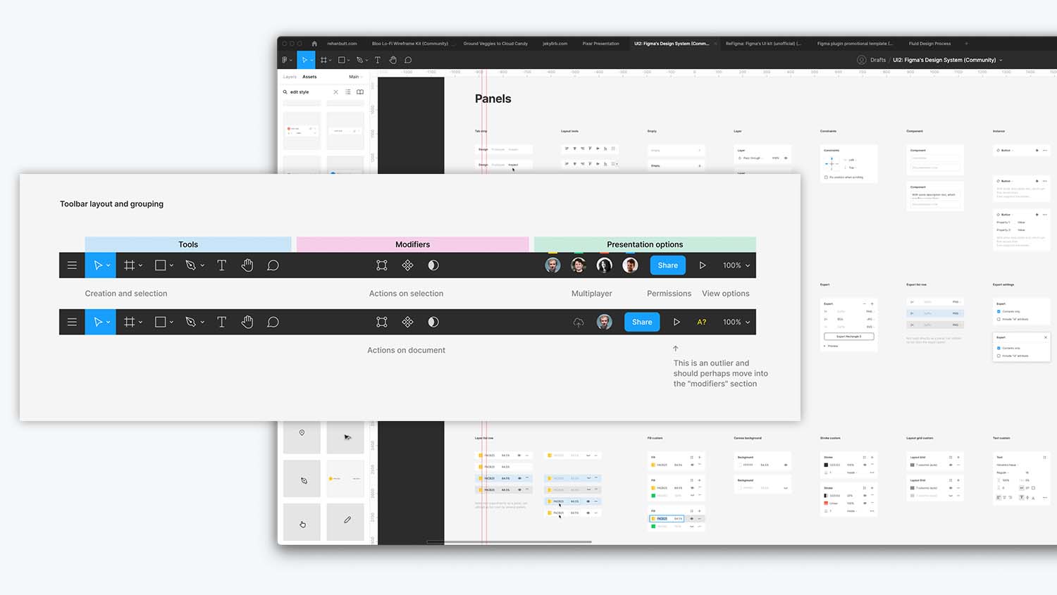
Figma happens to publicly share the design system for Figma and I referenced it to see if I could gain insights in how they go about tackling this feature with the rules they have set up in the app today. Looking at where it might fit naturally into the product. I knew it had to be a global tool and wanted to make sure it followed existing conventions and information architecture where it made sense, another benefit to having access to the Figma design system.
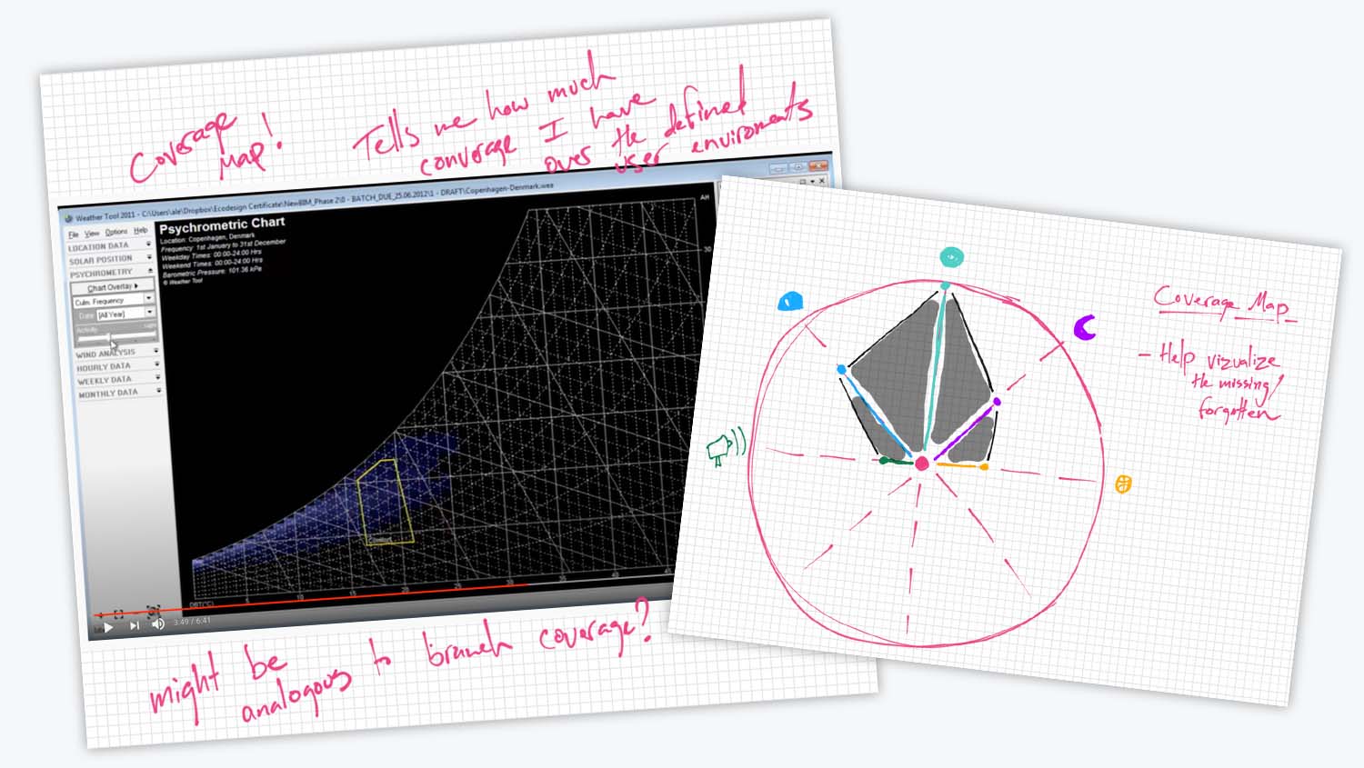
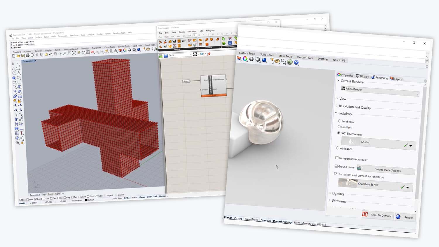
Analogous inspiration is one of my favorite research methods, looking at other contexts and industries to see how they may have solved a similar problem or even the same one. I looked at a couple of architectural tools that focused on weather conditions, another that explores physics based environments and lastly a more traditional rendering scenario.
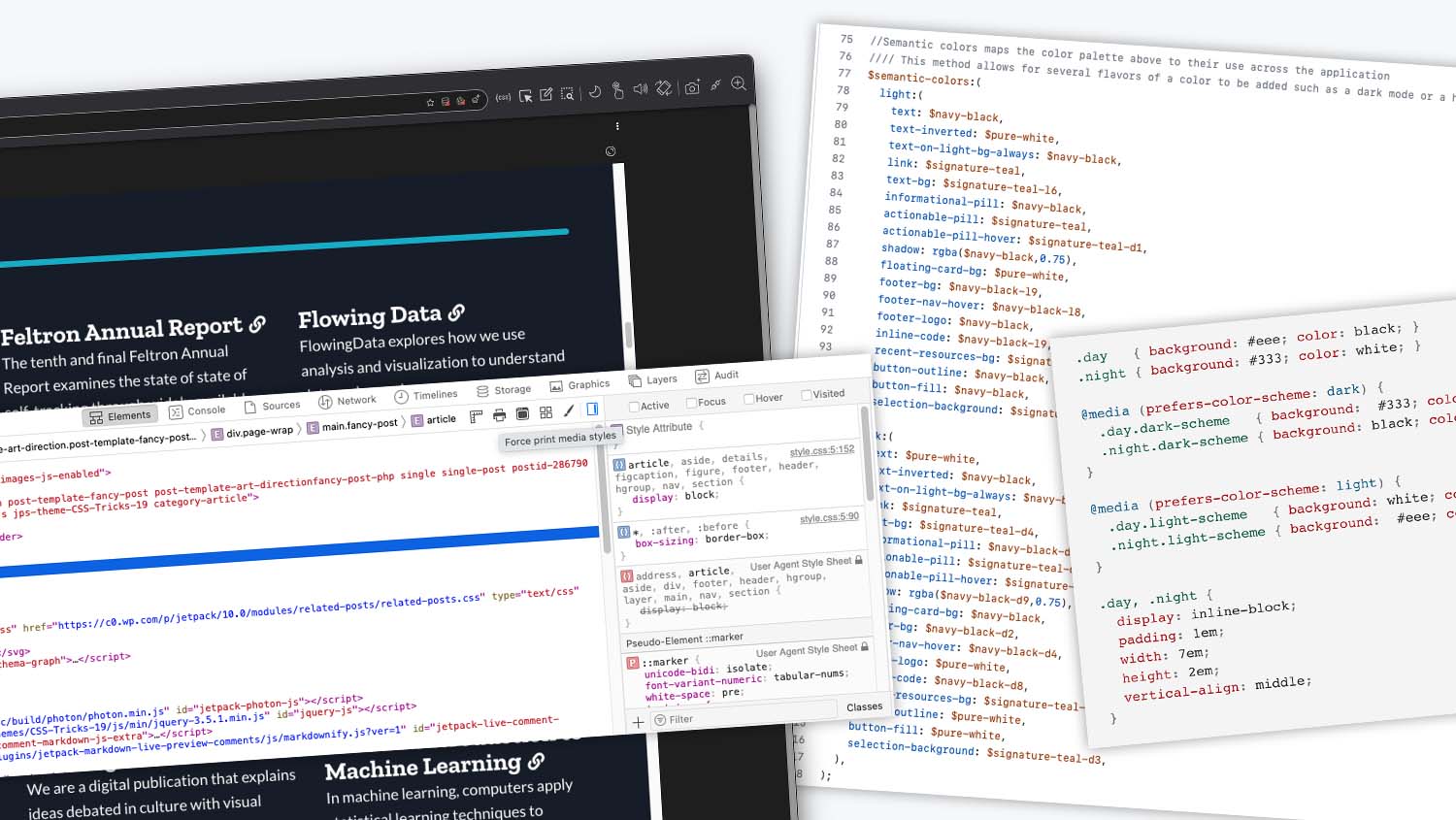
And of course, I looked at software development tools, exploring browser overrides like “Force Dark Appearance” and networking throttling and even what environment conventions are used in CSS today.

Let’s revisit the initial design process workflow without the proposed solution.
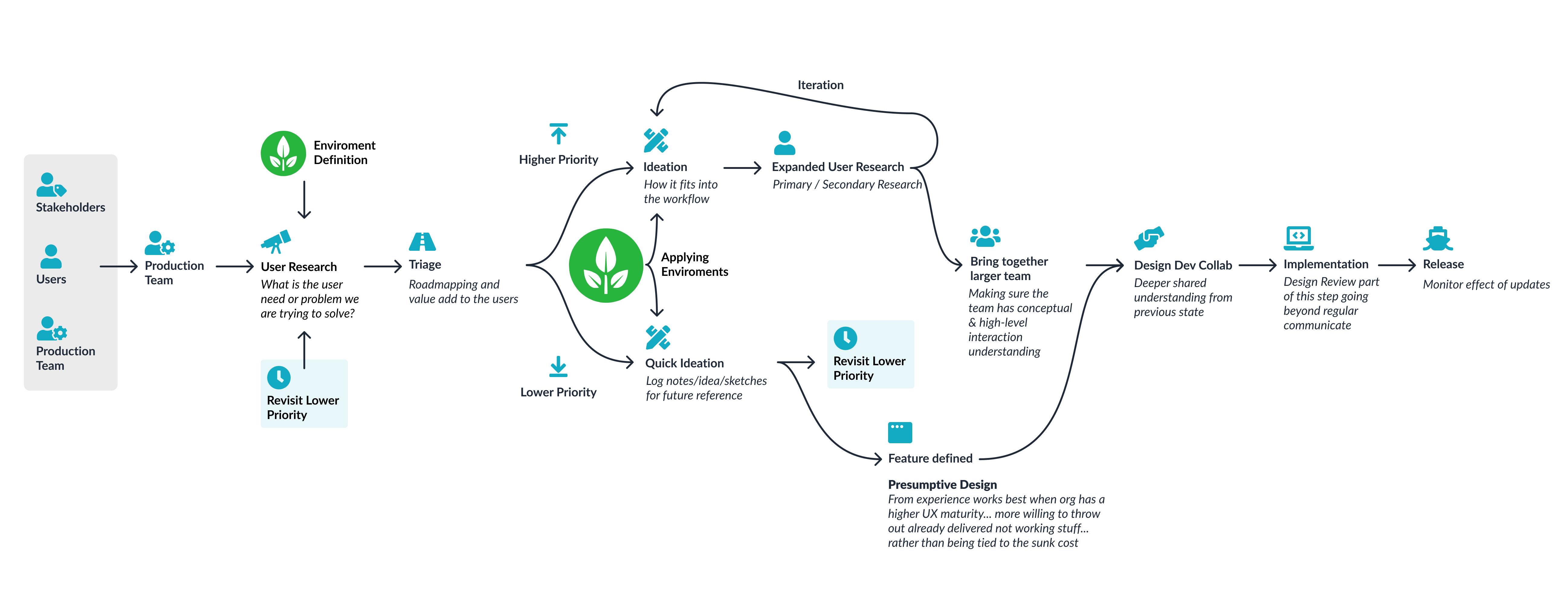
Now looking at a design process adding in the Environmental Conditions feature can help front load these, sometimes forgotten, conditions and reduce gaps in the final experience!

To recap, the Environmental Conditions feature solves the problem of bringing more real-world conditions into the design tool earlier into the design process by helping you and your team remember to consider the user’s environmental context that may otherwise be missed.