Expii Exploration
June 2017
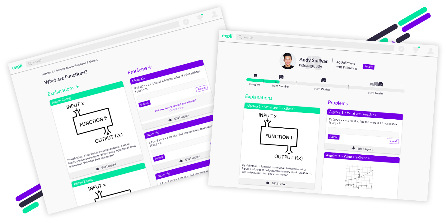
I created these quick mockups and audit as an exploration of the current image of Expii and a way to help improve some of the pain points I and several others saw when first playing with this tool.
Process
Branding
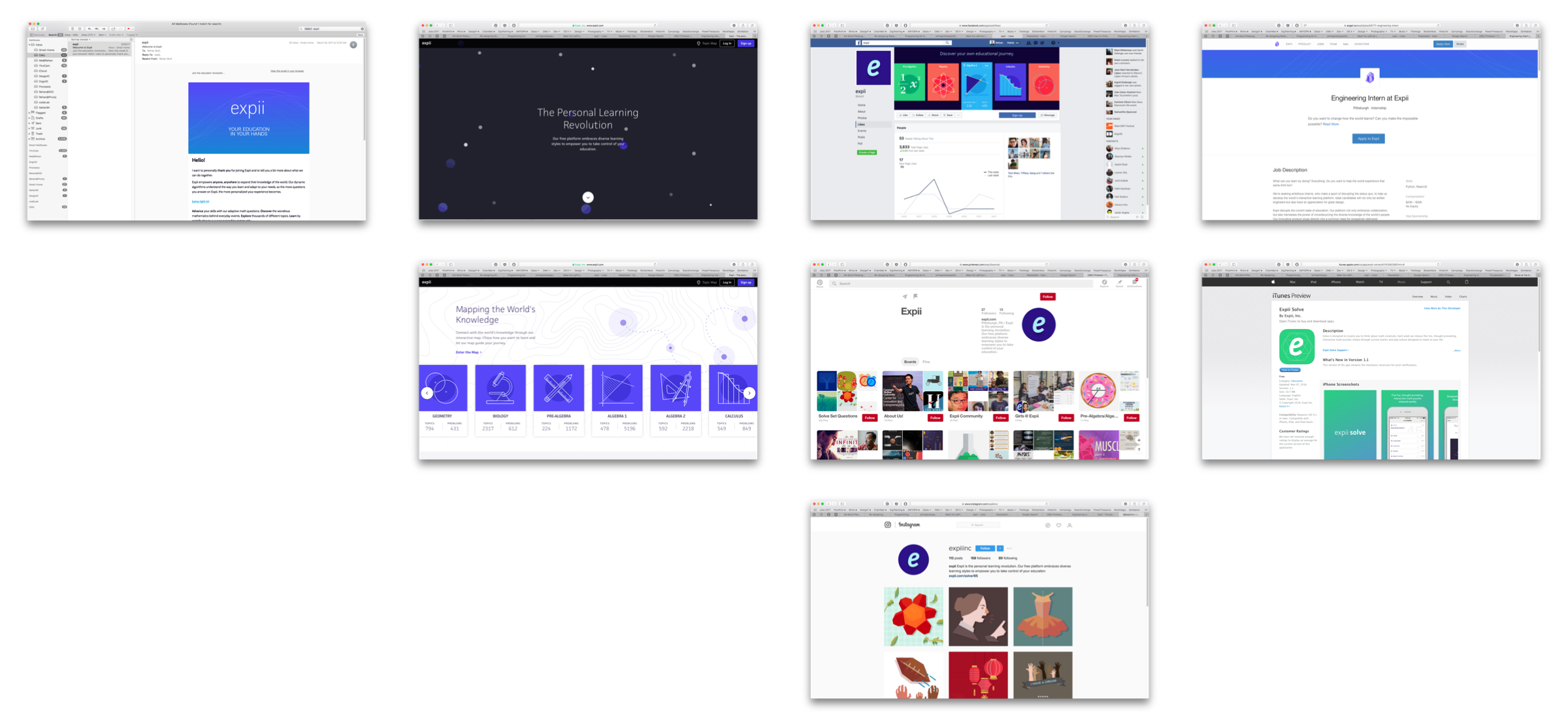
With these I was seeing where all Expii engaged their users and if the brand image was consistent, as well as relevant, to engage on each of the channels to make the most powerful impact with the smallest ember—by looking at email, the website, several social media sites, the app stores, and job boards.
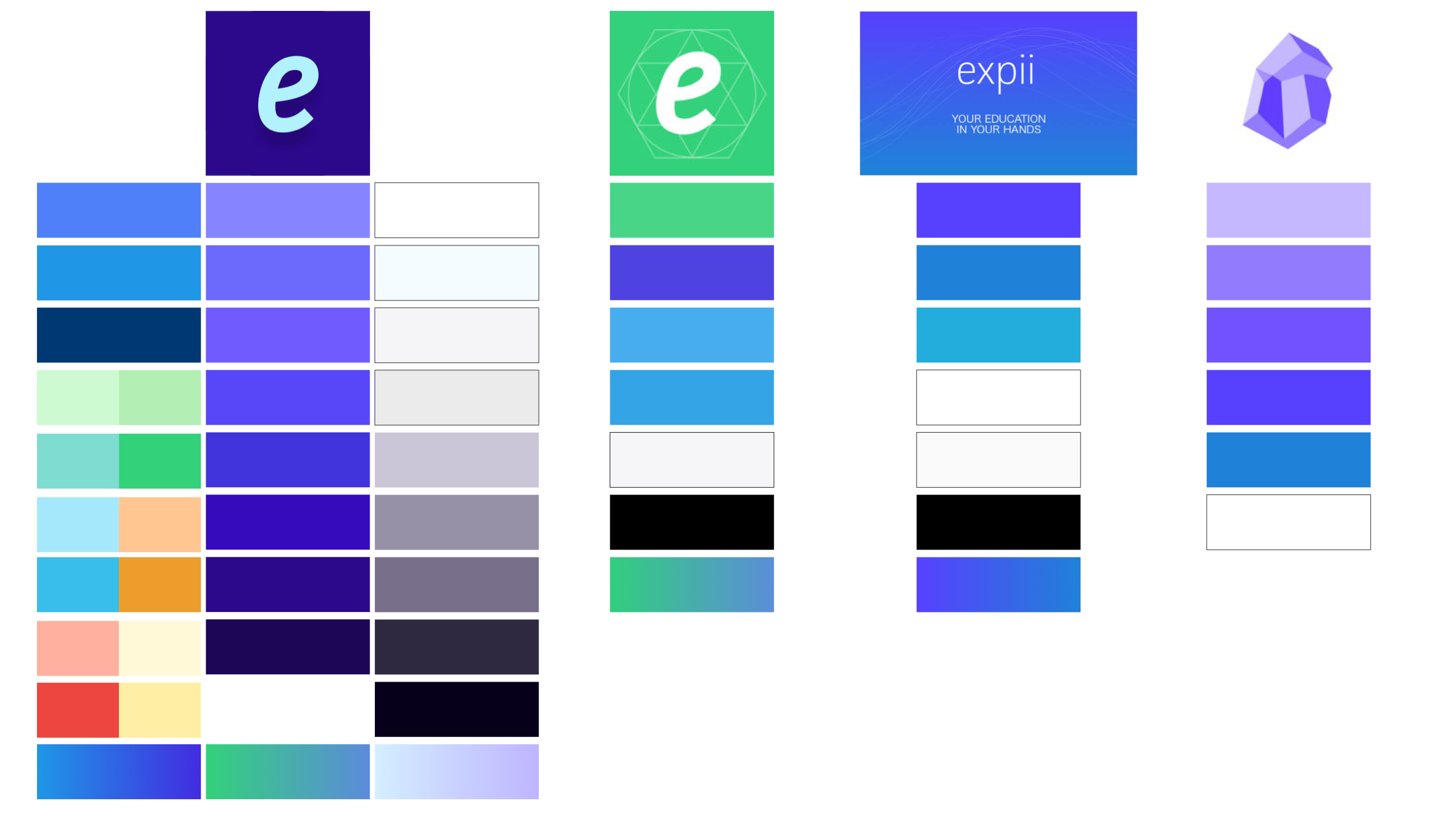
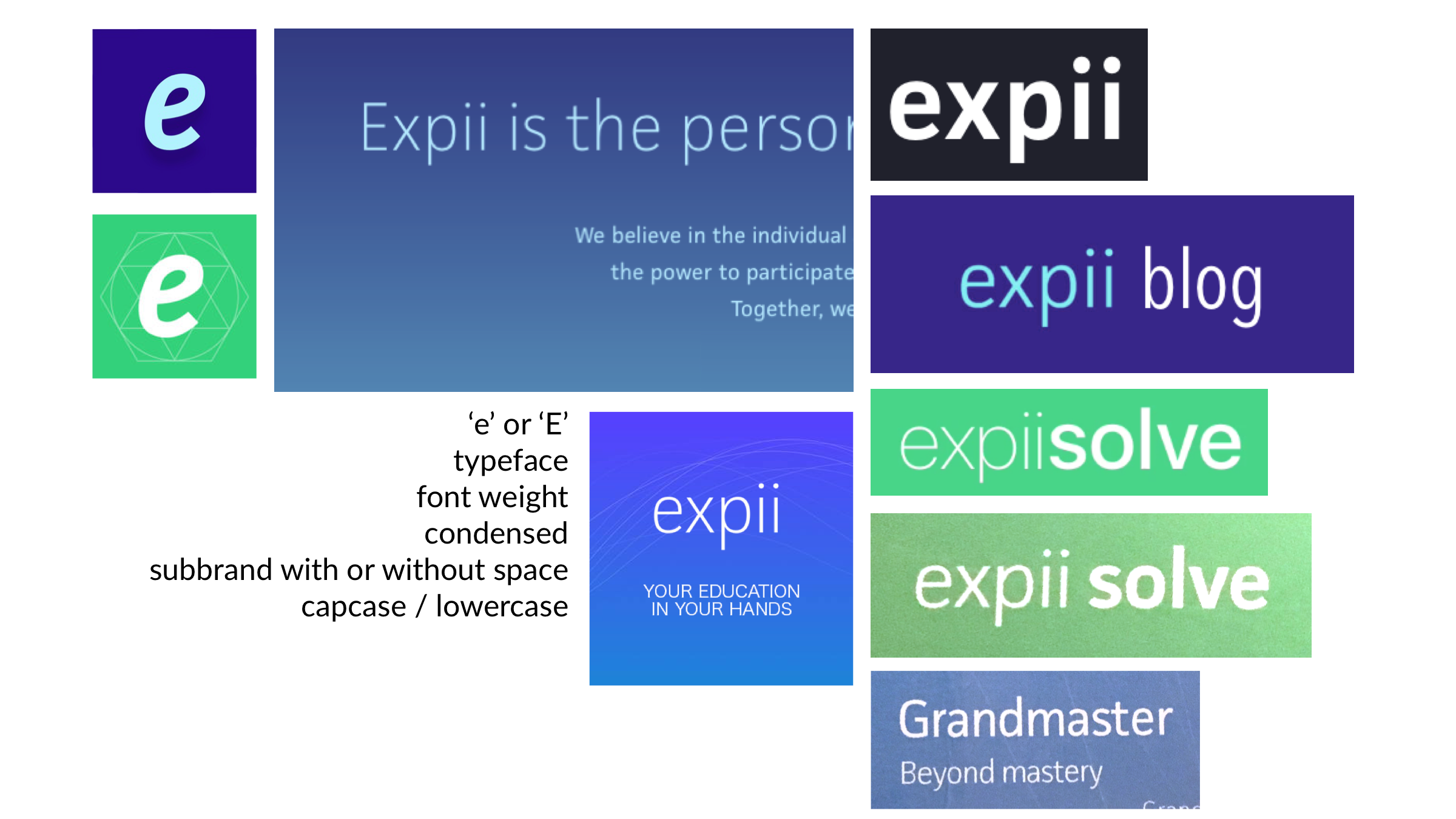
Across all the public facing platforms I came across four distinct brand images and several tones when speaking or writing about the product. I started by exploring the color schemes that users are presented with and then progressing on to typeface, type style, and brand usage. Noticing that several different typefaces, weights, and combinations of upper and lowercase lettering was being used. As such, I created one potential brand iteration solving many of the problems with the current implementation.


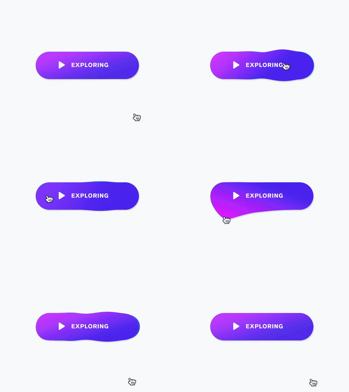

Some inspiration I used to articulate the brand, the flow, clarity, and hierarchy of the experiences.

When designing this brand image, I looked at it as the starting point for a bigger brand system. Using the pill shapes as a thematic element that could be used across all Expii products and marketing materials with an approachable color scheme and mascot to guide users through the Expii experience.
Experiences
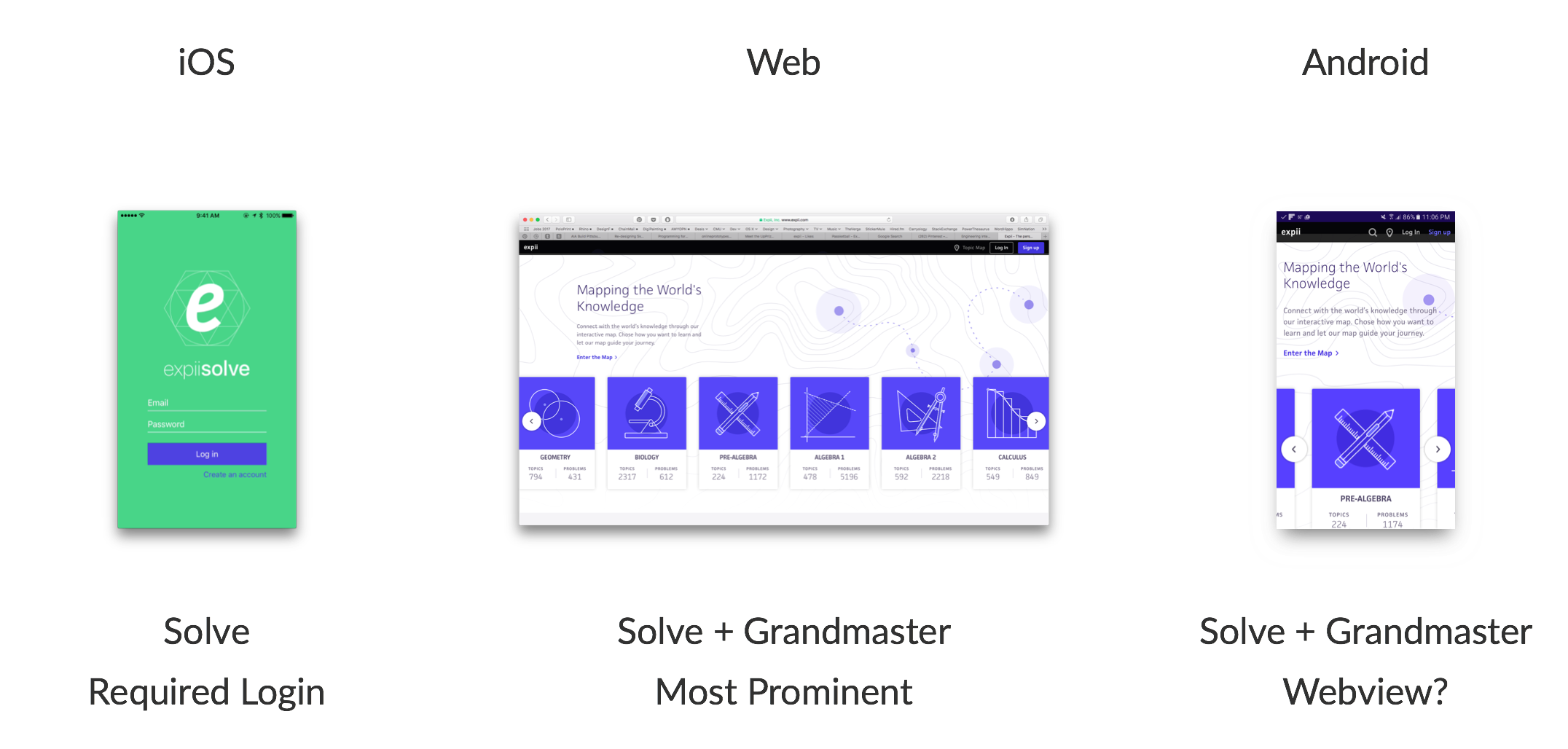
Extending from the brand audit, I looked at whether the product differed based on platform and if each platform was being capitalized on to the fullest extent. iOS only provided one of the two Expii products–Solve. Upon opening the app, the experience was immediately gated by a user login, which can be a big deterrent for users to try out a product or service. The Expii Android app was a webview leaving the interactions to be identical to the site. One of the benefits of a native app, however, is that resources can be stored on the device for easy retrieval and offline usage in many cases–something especially important in developing countries where infrastructure may not be as reliable but the added value of a learning tool like Expii would be far bigger. Lastly, I explored the desktop web experience as it is the most prominent and fully featured.
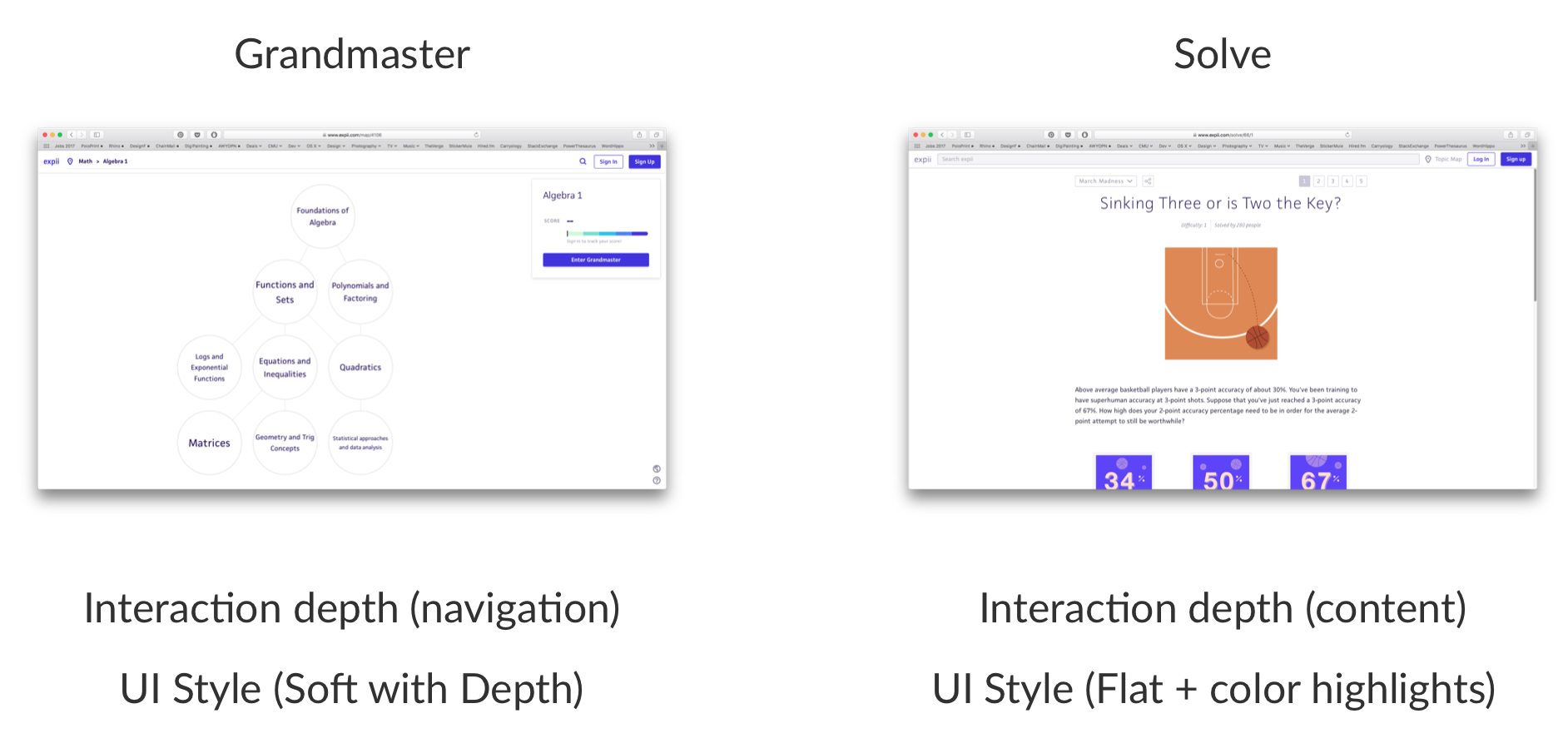
Two design languages, both in terms of visual UI styles and interaction depth and type, existed across the two products–Grandmaster and Solve. Thinking about pulling a design language out to be used across both products I delved deeper into Grandmaster, a network of math and science topics to be explored by the learner at many different skill levels. I chose to look at Grandmaster over Solve as it was a far more complex experience and wanted my design proposals to succeed at all levels of complexity.
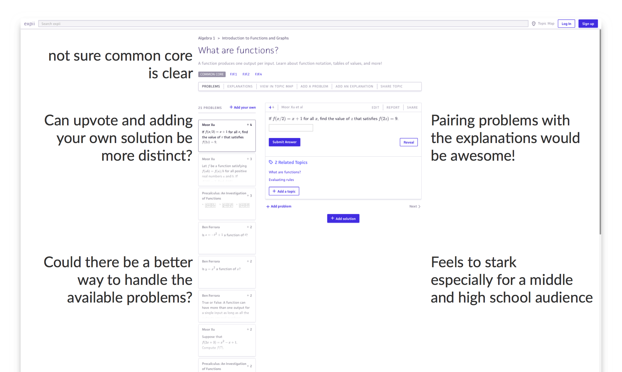

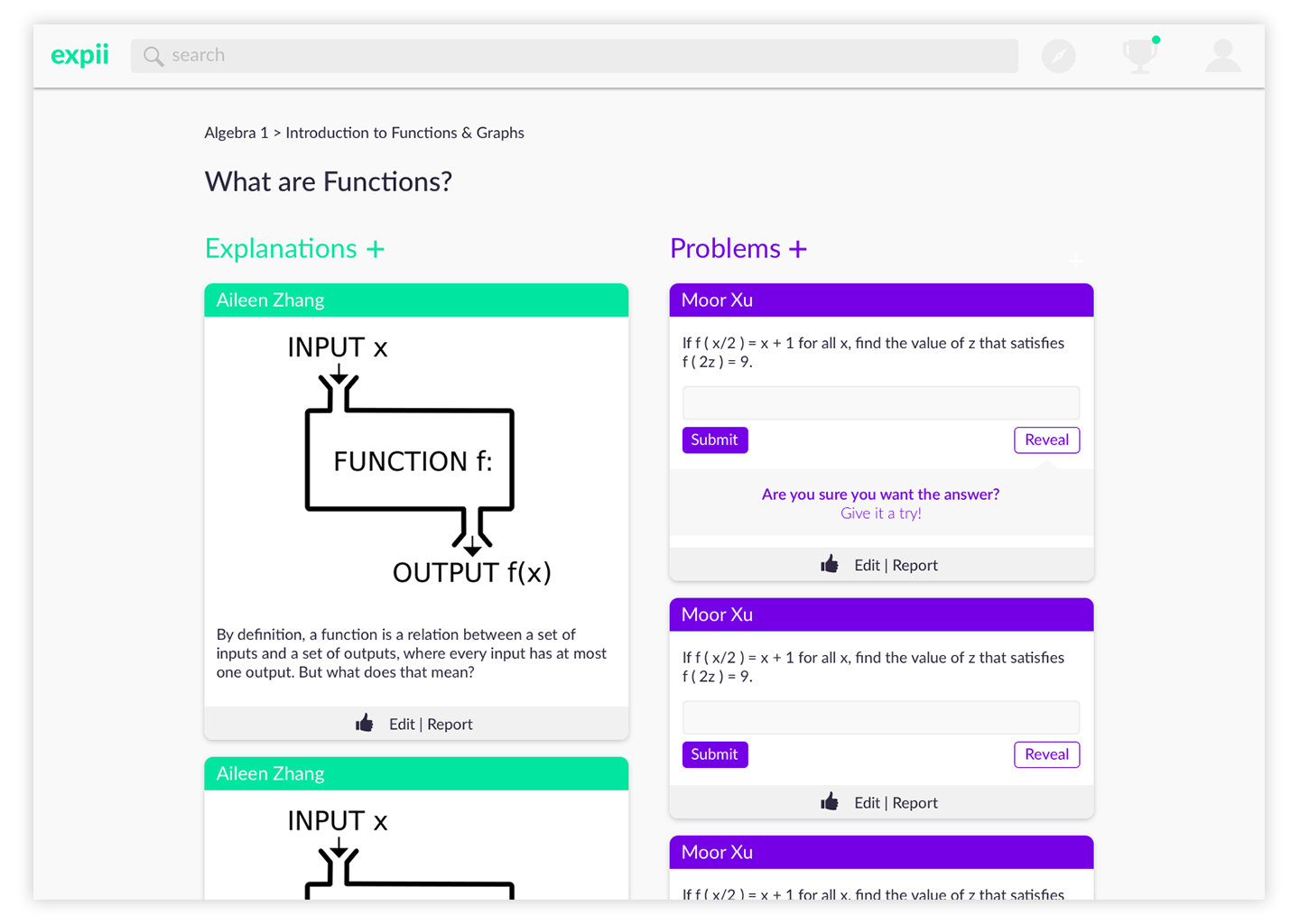
Looking at the “What are Functions?” page I saw several opportunities to clarify and simplify the experience. Thinking about what information was most critical for the learner and how we could aid in the learning process for these students. Several of the biggest questions are overlaid in the current subject page. From these observations, I looked at elevating the most important aspects of the page, the explanations and problems; and thinking about a way to combine them for students to check their understanding of the subject matter. One of the smaller, yet critical moments in the experience is when the students may get stuck and would like to reveal the answer. In the current implementation, the answer is provided right away on click. In my proposal, I have added a secondary step to encourage students to make a guess based on the explanations provided not only to help the team see if certain questions or explanations need to be clarified but also as a way for students to hold themselves accountable for understanding a particular topic. After looking at both the bigger and smaller opportunities I applied the proposed brand language to the page for a cohesive experience.
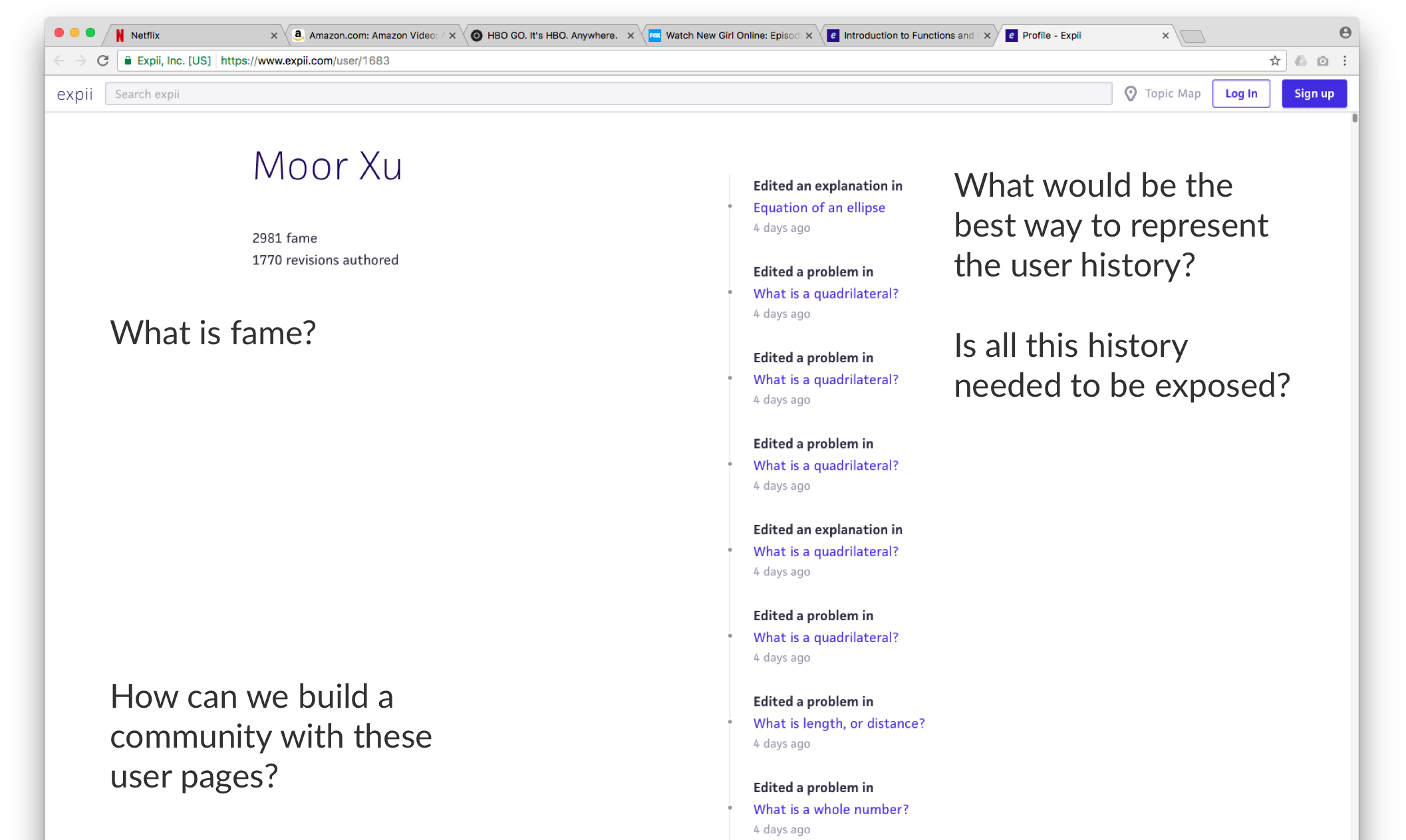
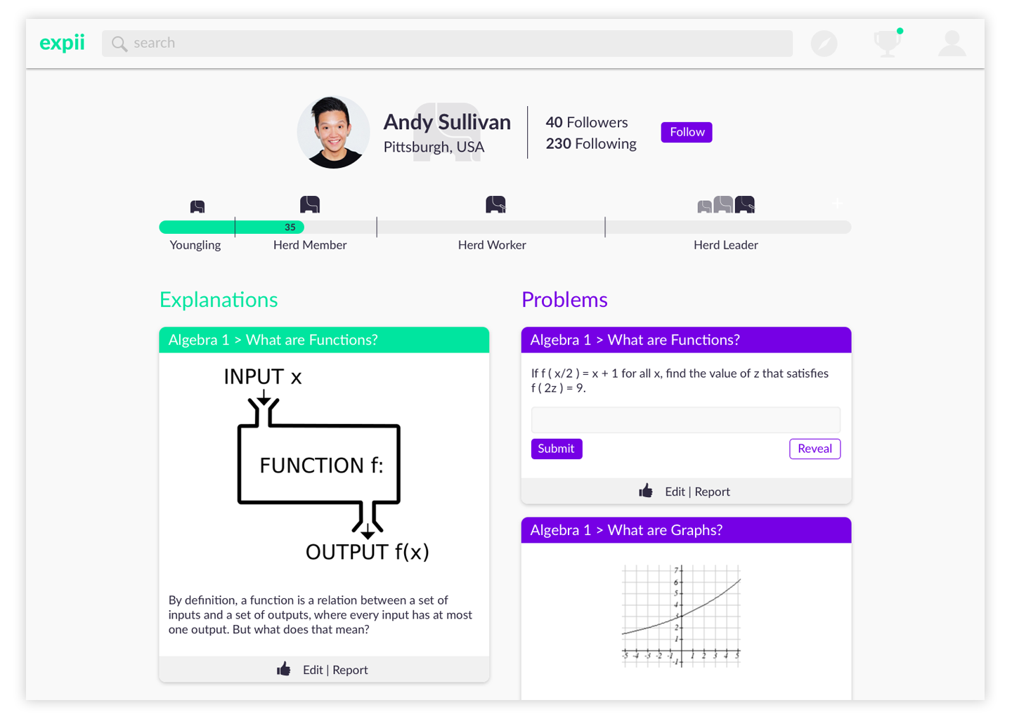
The second aspect I wanted to explore was the profile pages as Expii is creating a community to crowd source the lessons. I saw several opportunities here, as well, thinking first about why someone would access their own or another users profile page. Let’s unpack the second part of that. Why would I explore a fellow users profile page? Probably because they have left a comment, problem or an explanation that clicked with the way I think. And if that is the case, that’s wonderful! You found someone that speaks to you to understand the subjects at hand. How could Expii help provide you with more of the stuff that works? As such, I added a way for users to follow other users that they understood the most as a way to maintain activity of that user, rather than leaving from frustration. This may even lead to growing the learners’ topic interests if someone they trust to provide good learning resources covers topics outside of the learners’ main topic interest.