Ideate Branding
March 2016

Process
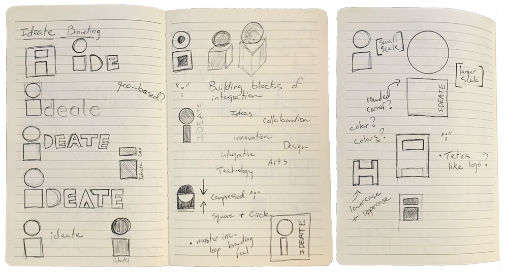


Some feedback from Ideate faculty “be less safe - the current iteration is very conventional. ideate should be weird, strange, quirky, dynamic, etc. more weird please.”
“I’d focus less on the word (ideate) and more on the significance or ideas behind it.”
“how do you show the intersection of art, design and technology through a simple iconic element or visual treatment”

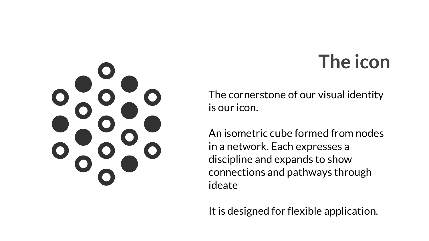
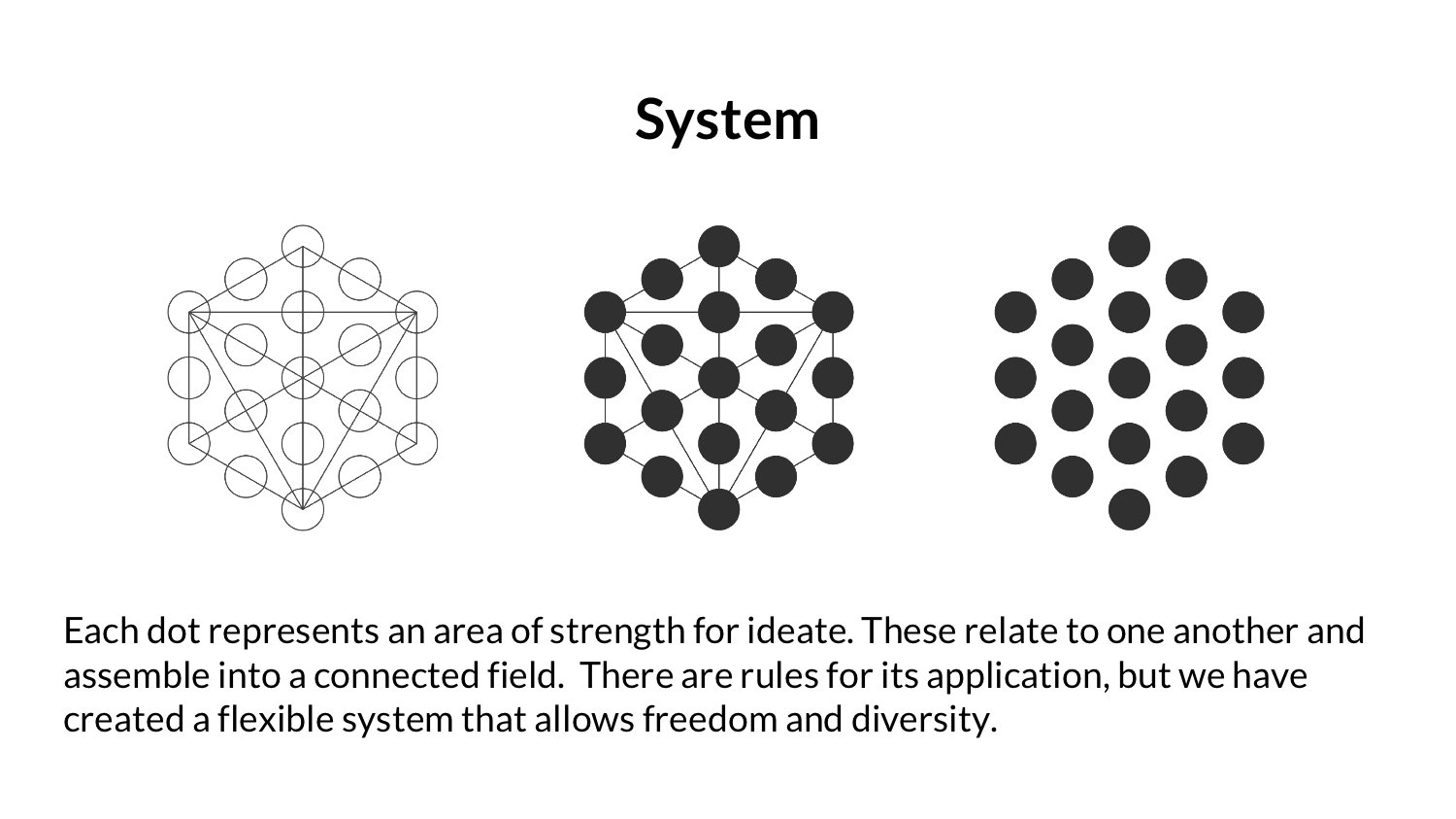
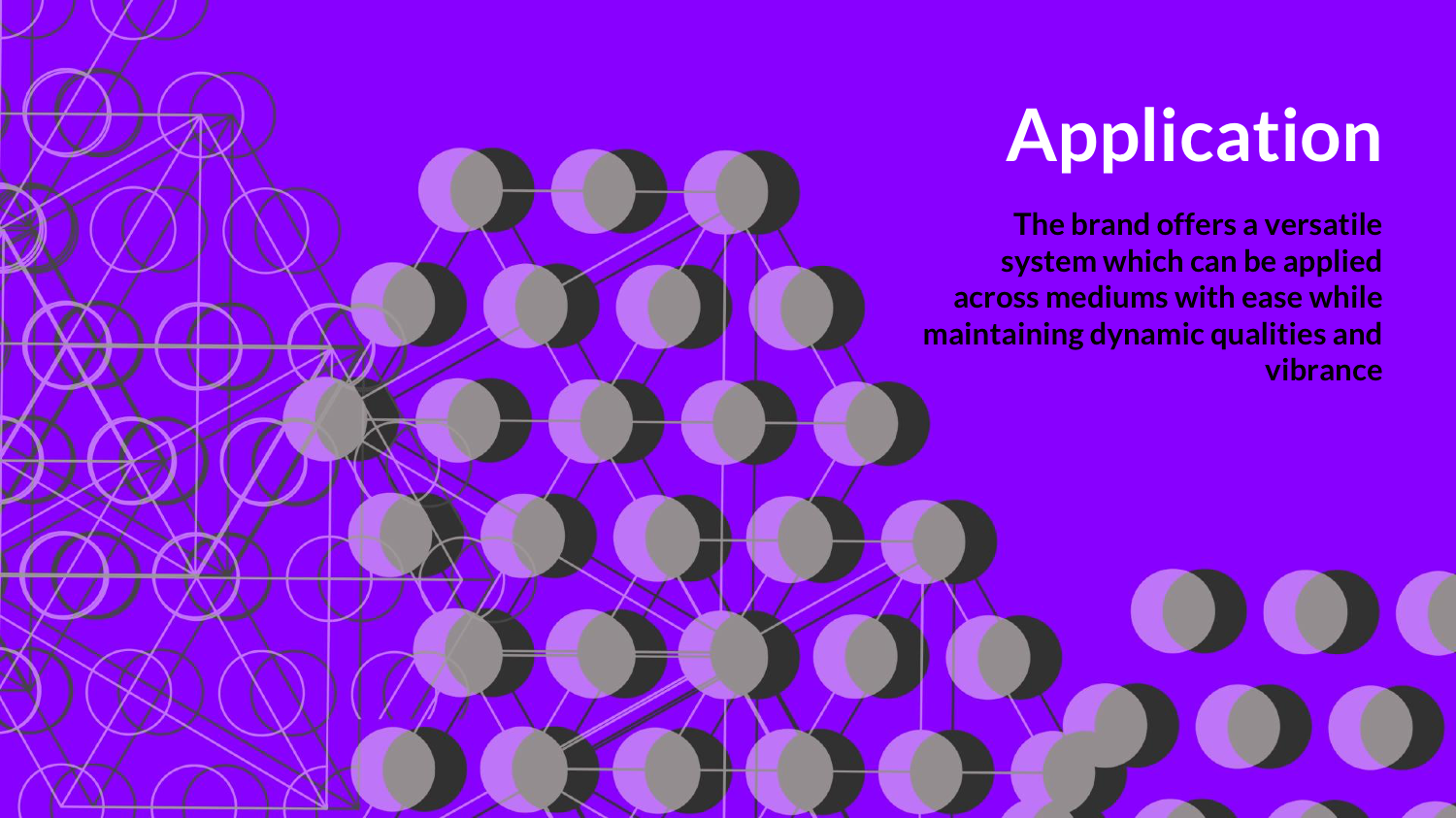
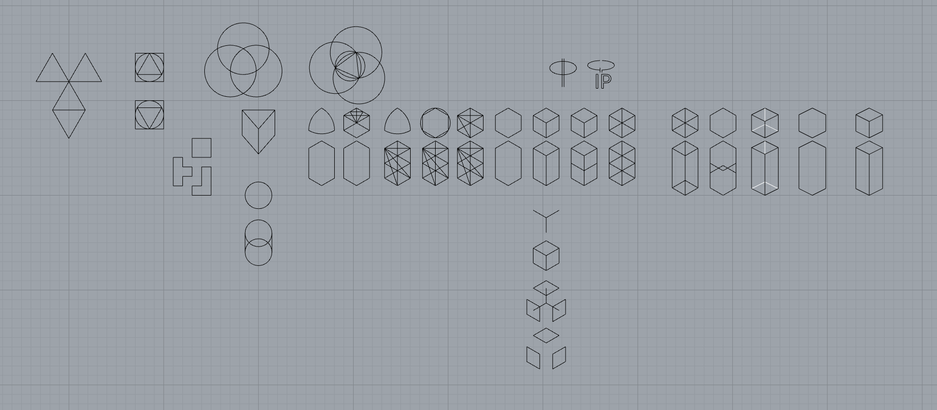
Given some of this feedback and thinking bigger towards a brand system over a strict wordmark design, I explored and landed on a circle based hexagon grid as seen in these iterations.


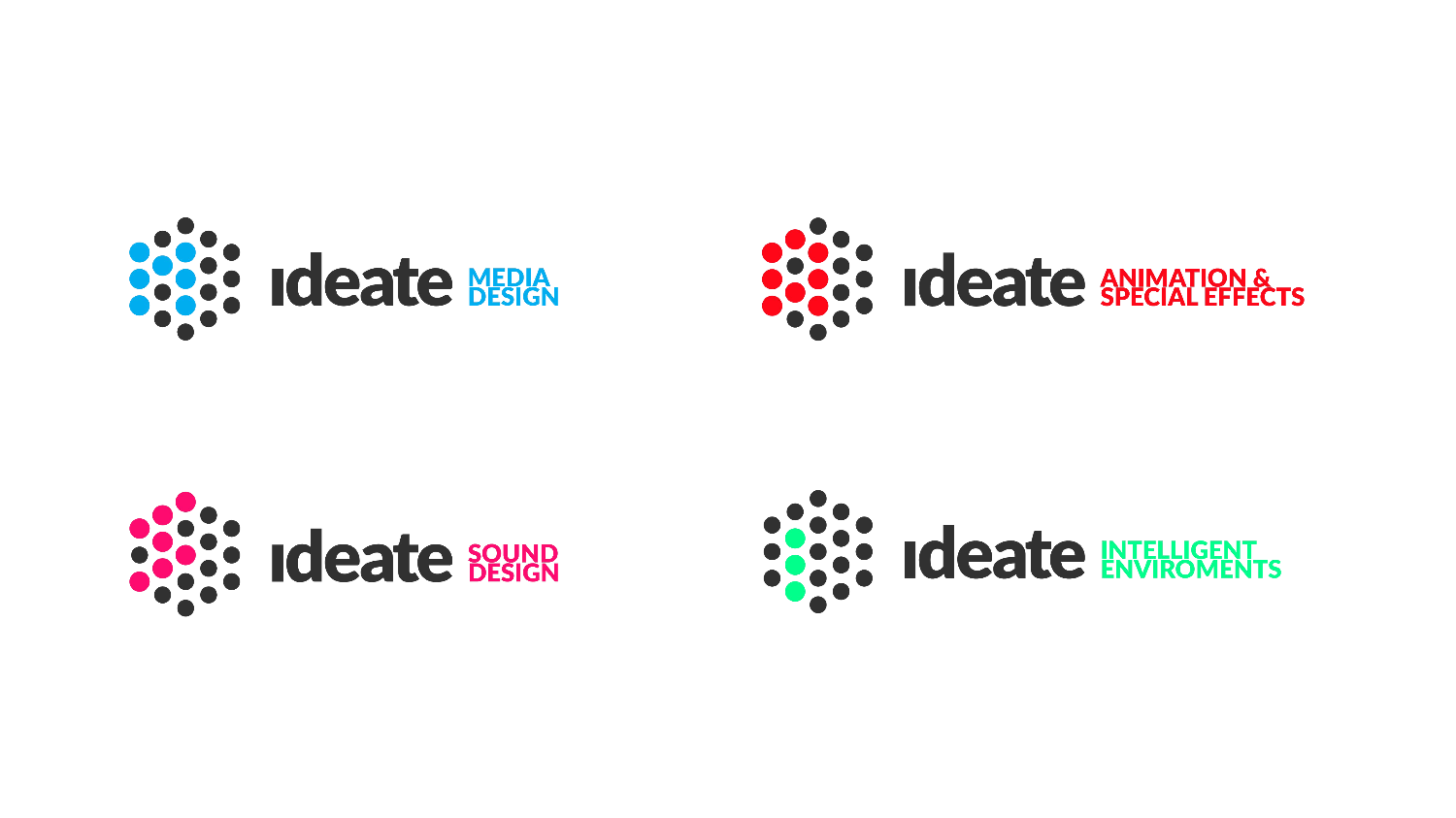
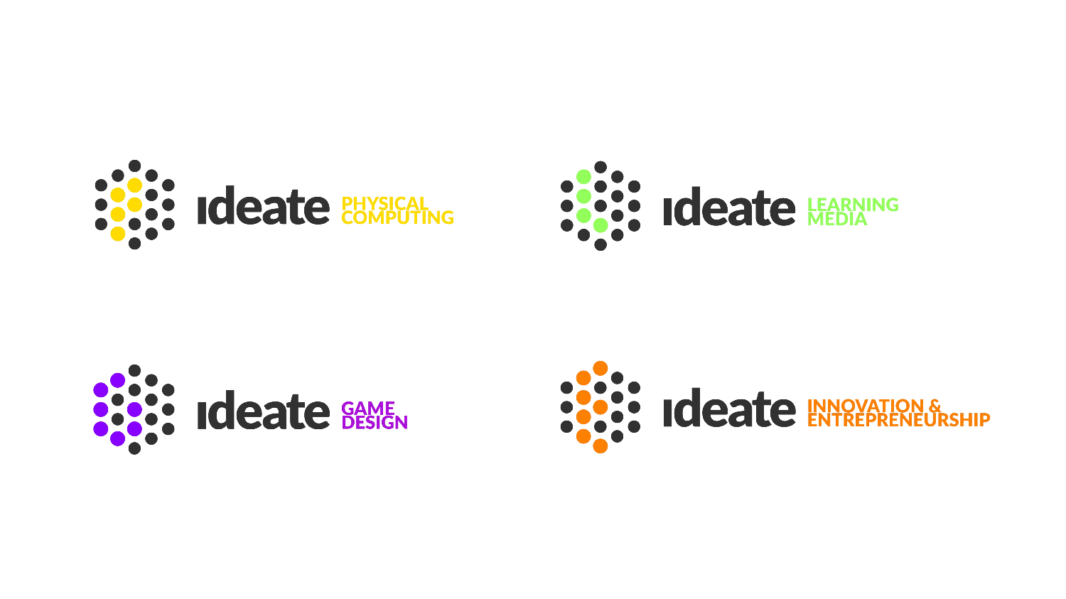
Playing with colors here! 👍
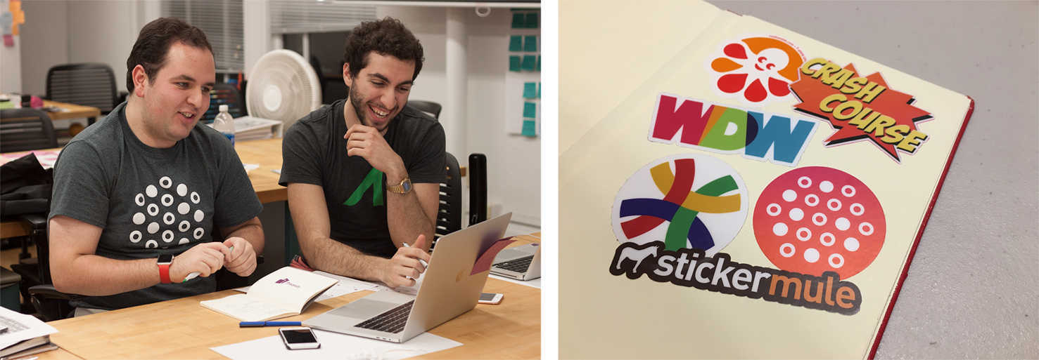
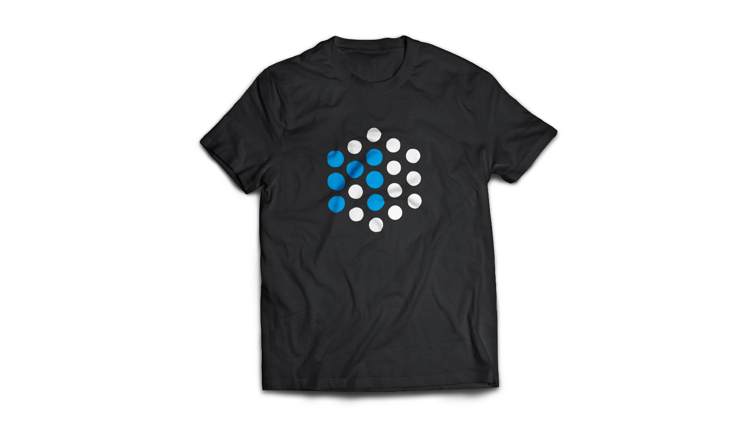
We made some t-shirts and stickers to celebrate! 🎉
