October 2021
Noodlehead Web Refresh
A web presence that stands up to the cuisine’s excellence.
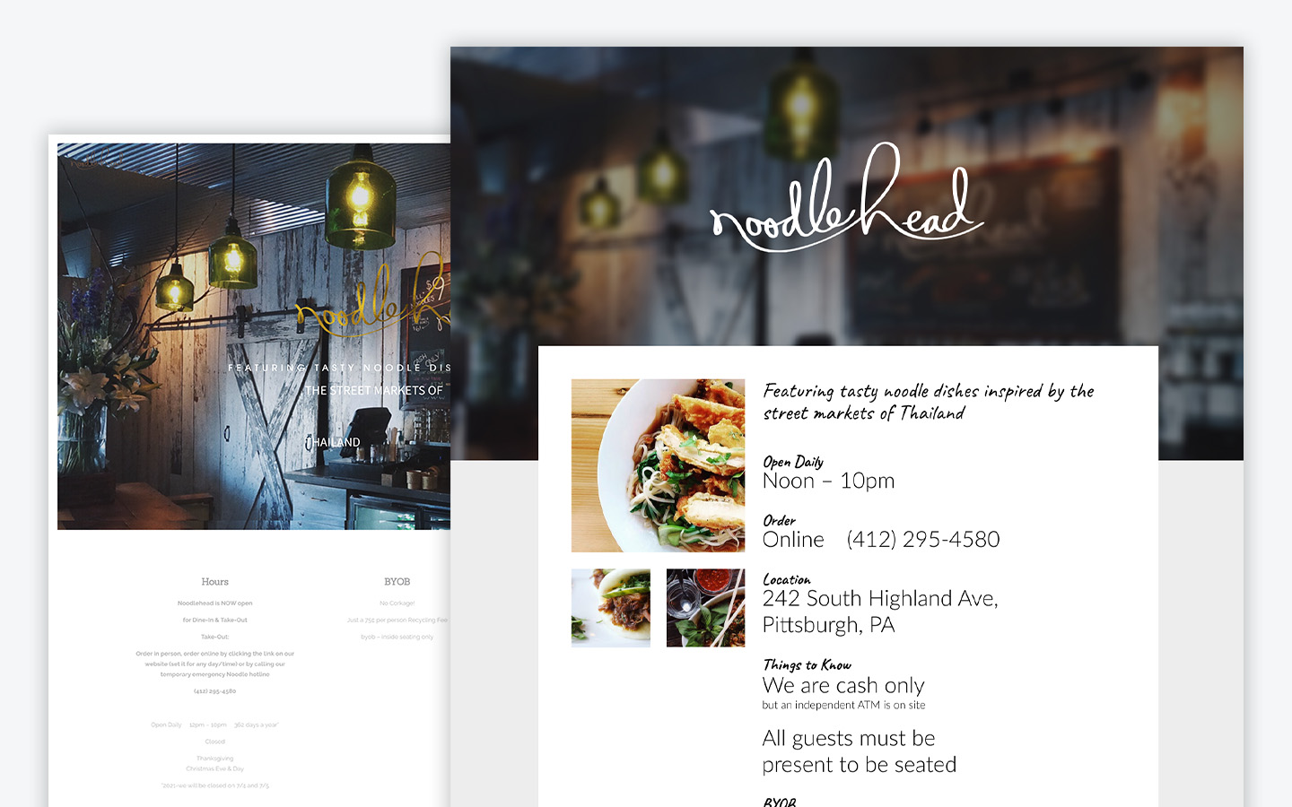
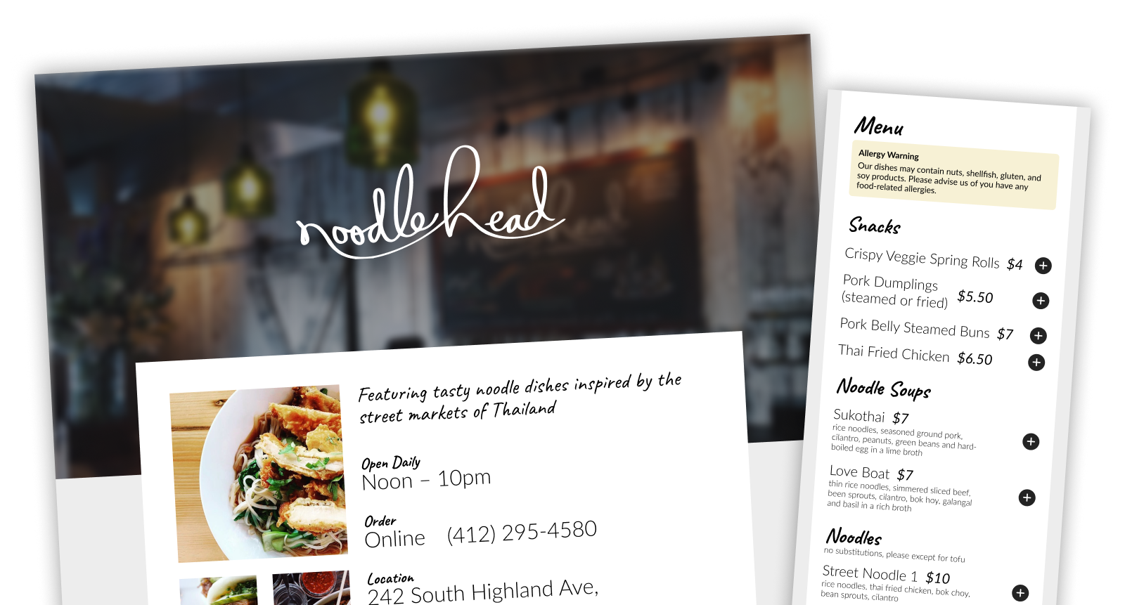
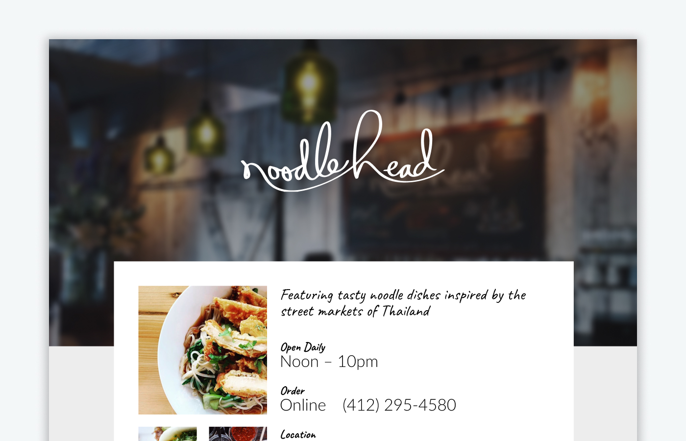
As part of my time teaching Web & Mobile Design at Duquesne University I had students audit several existing sites including the Noodlehead site. From their audits they were to redesign the site resolving any of the usability issues they identified. I too did the assignment along with the students and shared it with the class once they had wrapped as a way to show how I would approach the problem. One of the main aspects I wanted investigate was creating an integrated ordering experience with the menu. Unlike most restaurants sites that have a separate experience for order from display the menu.
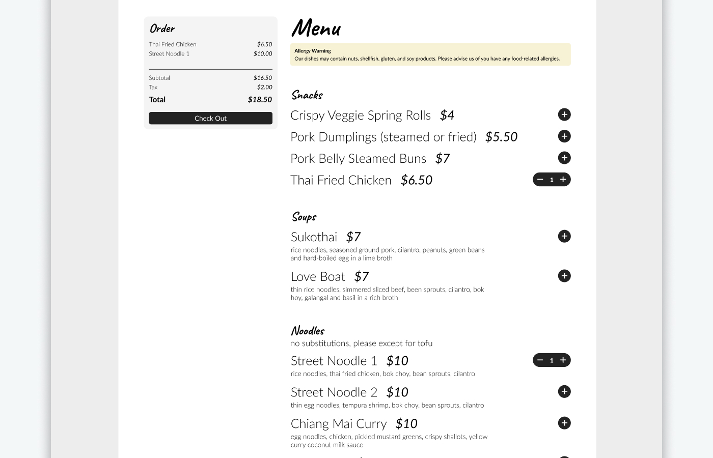
Our “client” saw the designs from the first part of this assignment and wanted to push the team to thing about what if there wasn’t a separate experience for ordering but it was cleanly integrated into to the home page menu. Thinking about creating an quick and easy way to place an order.
Your challenge is to create a nicely integrated ordering experience to the re-design. In addition to showcasing the brand and general usability of the product. Leverage previous class materials to help you on this journey!
If you are in Pittsburgh and get a chance to go to Noodlehead I recommend the Street Noodle 1 with a Lemongrass Honey Iced Tea that was always my go-to order!



Having fun with the spice level selector for online orders. Each level featuring a wonderful gif illustrating the spice level in increasing levels of heat and fun!

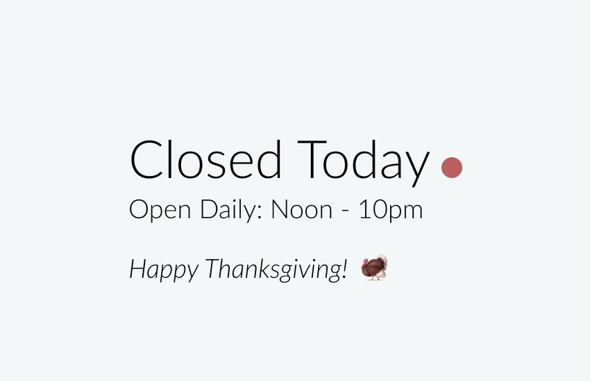
A clear indicator of whether the restaurant is open. Updated based on the day for a quick and easy way to know if they are open before you head over.
