The World of Radiology
March 2020

As part of my time at UPMC Enterprises, I worked on a project called Next Generation Imaging, NGI for short. NGI explored the world of radiology tools with our partner GE Healthcare. Specifically focusing on tools for viewing and analyzing medical imaging. This project consisted of both exploratory and tactical initiatives with the goal to not only capture quick wins for the products by also create a more mature UX culture to aid in future growth.
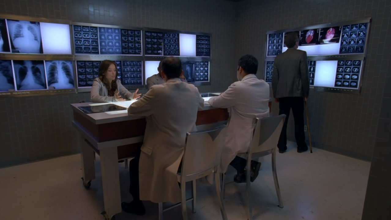
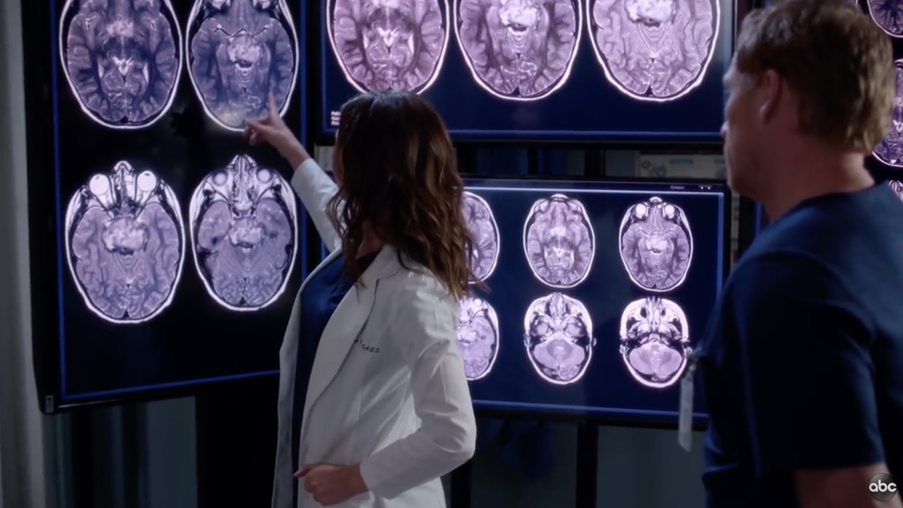
The first thing that might come to mind when thinking about radiology is something out of pop culture, maybe a scene from House M.D. or Grey’s Anatomy, with a wall of x-rays. While you may still find clinicians reviewing x-rays on a lightbox most of the radiology imaging has moved digital to review more complex imaging such as viewing hundreds of images from a MRI scans, or within the context of the rest of the patient’s medical record.

A lot of my time in the world of radiology involved deeply understanding the medical domain of radiology and the workflows for each of the team members, including smaller task flows that make up their day to day activities. Once we had a good grasp of the workflows and process we could start to build on top of it with software improvements to aid in efficiency, clarity, ease and continuity for our users.
The basic radiology workflow involves 4 main steps, acquisition, image quality check, reading and treatment, as depicted in the diagram above. The tools I worked on aided in the later 3 steps, a worklist management tool and diagnostic viewer for use in image quality checks and for reading of the images by the radiologist, as well as a lighter weight viewer for use by some radiologists and other image centric clinical teams.

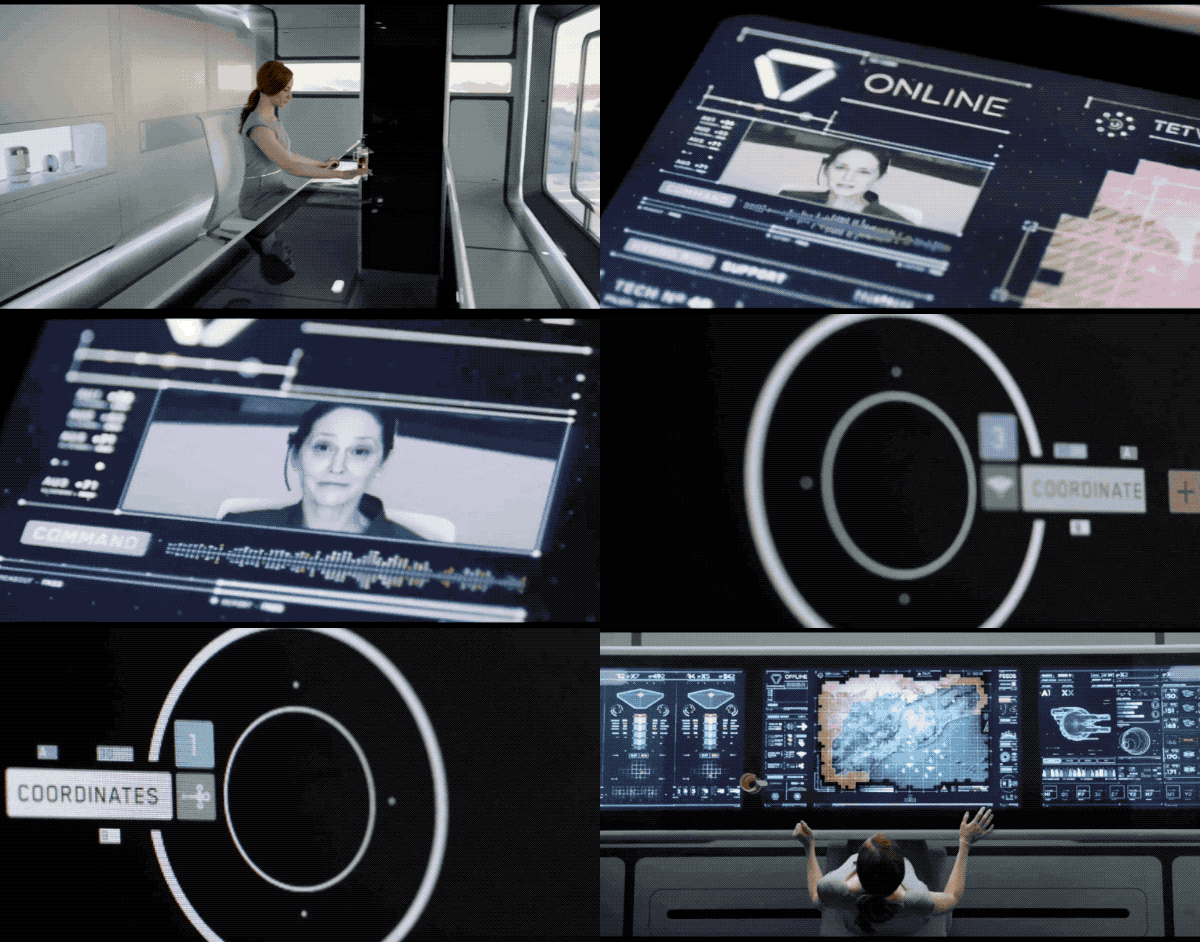
I have always been a fan of looking to other industries and even science fiction for inspiration, this project was no exception. One of the main tools you quicky learn a radiologist uses all the time is a Dictaphone for generating reports, but for most radiologists voice commands end there, which is sad to see based on how conformable and efficient it is for their workflows. You also quickly notice massive multi-monitor setups at all their workstation. As such I pulled an Adobe voice demo and a command center scene from Oblivion 2013 as inspiration to explore these 2 areas.


Building platform agnostic applications may not seem like a crazy idea, but unlike for many consumer applications it’s quite a bit harder for enterprise solutions if for no other reason than the level of integration between a suite of applications and a single institution’s infrastructure and what they are willing to support for their staff. With many applications build for 1 environment or workstation I wanted to make sure we covered the right range of setups across the main flow: acquisition, image quality check, reading and treatment workflow.
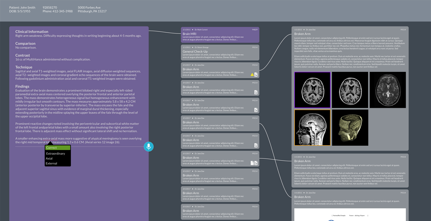
Looking at the crazy amount of applications our users have to jump between I wanted to take a look and imagine what if there was a simplify and rethink this problem from the ground up, which let me down the path of a “super app” akin to WeChat where you can basically handle everything you need from this one place for all steps in your workflow and of course no worrying if patient data was staying in context.
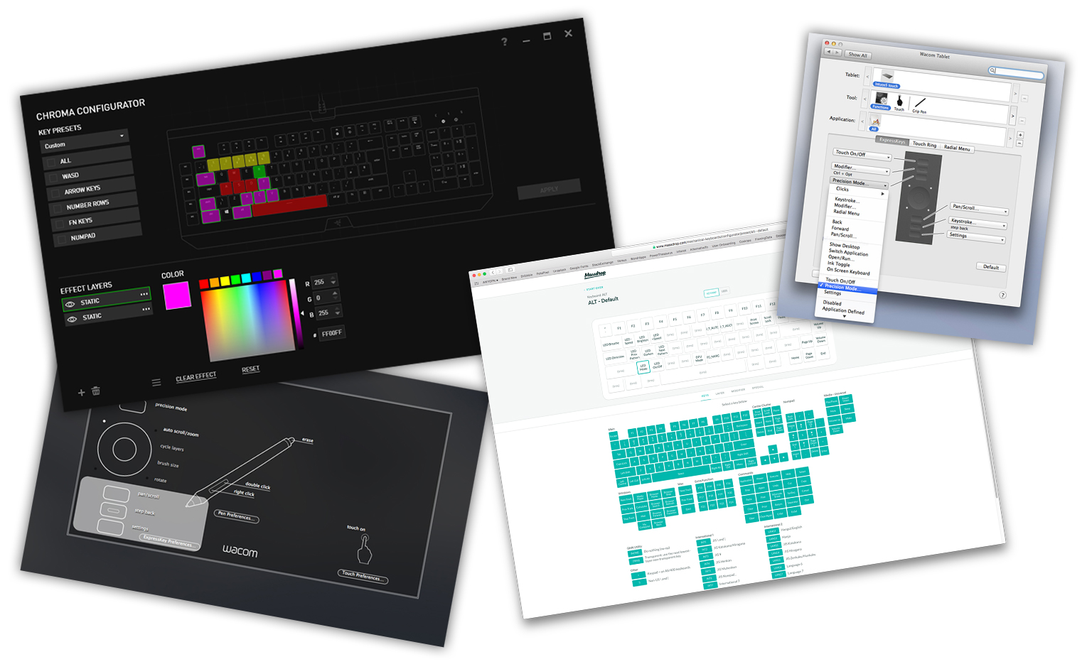
No need to reinvent the wheel, explore other industries! This was definitely one of my mottos throughout the project and encouraged my teams to do as well. Working in a regulated industry, such as healthcare, means that cutting edge work may not be first to market, but no worries leverage the work of other industries. One example leveraged the gaming and graphics industry for a custom shortcut configuration I was working on.


Love some quality voice interfaces! Created a couple simple commands to help our radiologists speed up their workflow for repetitive actions. Speak and done! “Label Vertabrae” or “Apply Lung Window”


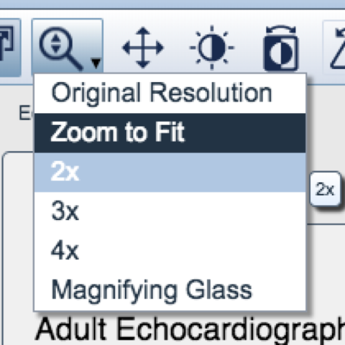
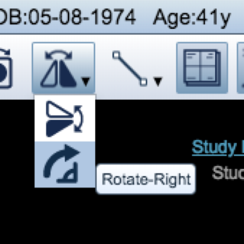
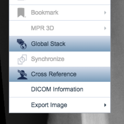
Also good to do a thorough audit of your application. Above are a bunch of colors many used to convey the same meaning in similar contexts and inconsistent icon styling and states. Under the hood some of the assets were rastered files and other vectors aiding in more complexity while pushing towards platform agnostic applications.
Not only are audits great in starting conversation around standards it also help other teams see what might be causing unnecessary cognitive load for the users and the engineering team as they try to sort out if the design is creating a new thing or following some existing component in the application.
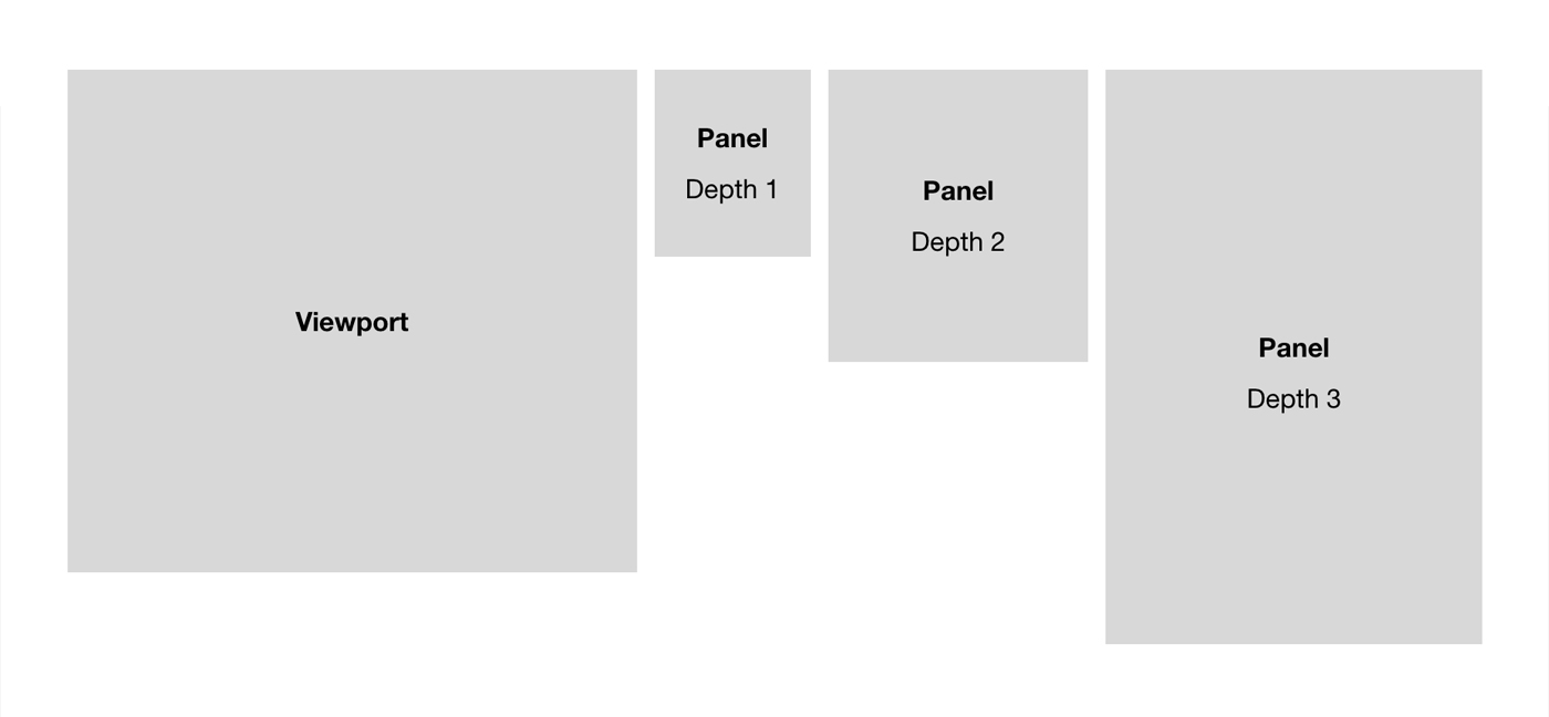
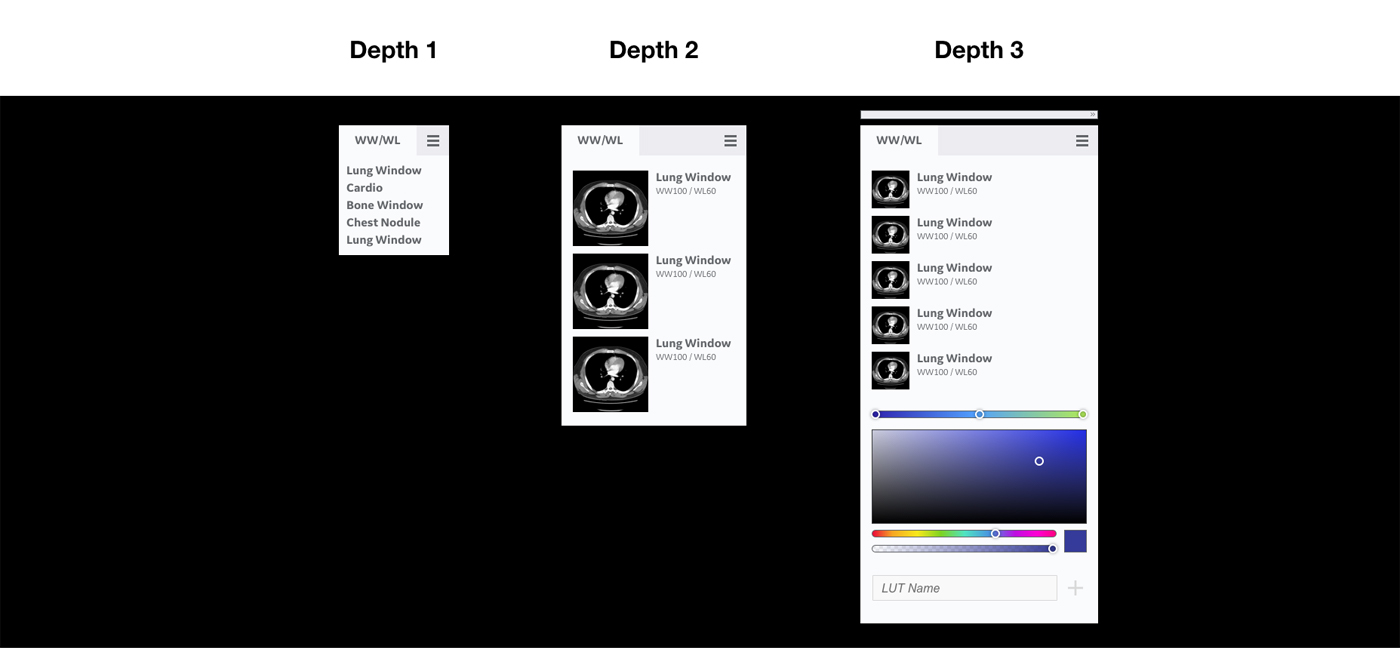
Love some scalable systems. Easy to plug and play, replace, iterate and have much lower costs to experimentation. Experimented with what Window Width / Window Leveling (WW/WL) could look like. Think of WW/WL as similar adjusting contrast though it is based on different needs when looking deeper.


A really interesting consultation workflow between 2 radiologists. First the radiologist had to call several hospital reading rooms to find their peer, wait for them to wrap up their tasks, call back and then have a whole dialog to find the correct reference article in a medical journal over the phone. If the tools had some kind of communication feature these individuals could have sent reference material back and forth more easily and allow for it be captured for future use as well, and possibly for others having a similar need doubly the case at a teaching institution.
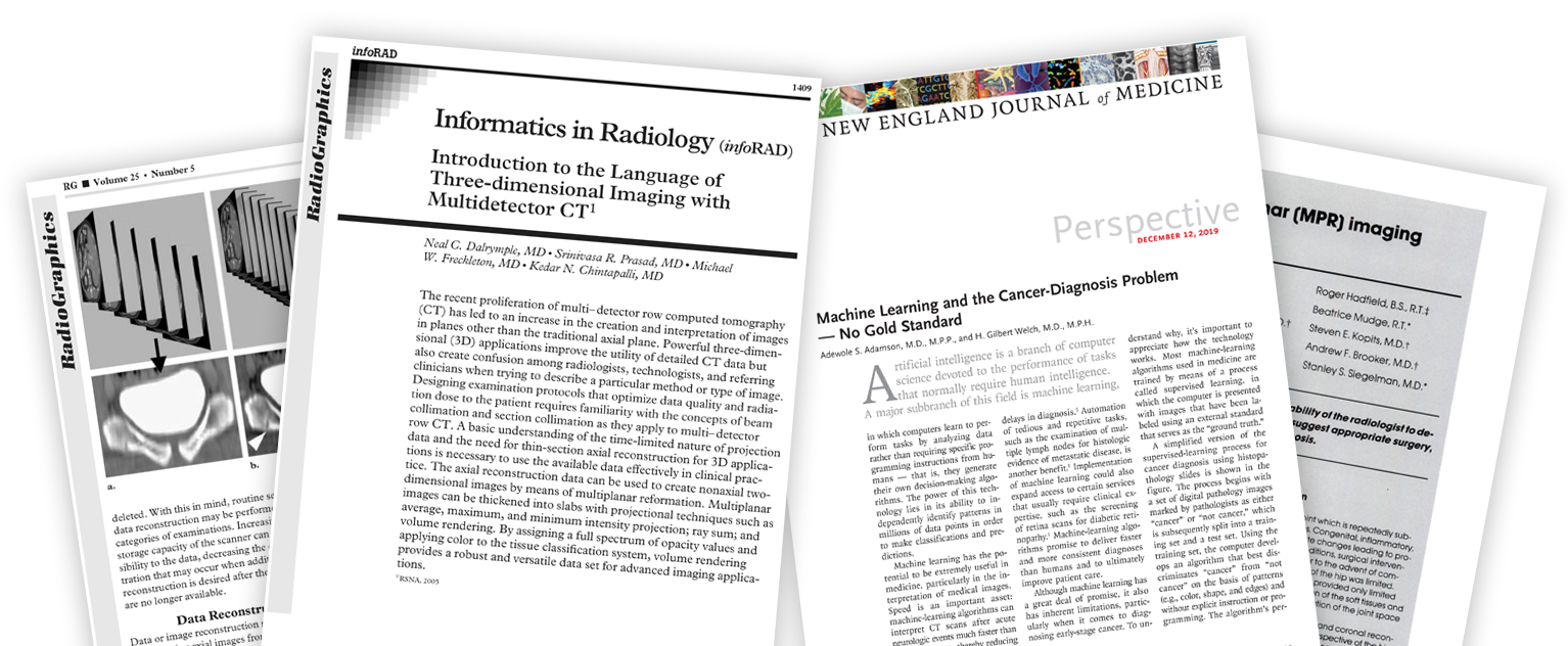
Not coming from a medical background going deep into medical journal was key! 🔑 It helped us better understand the clinical context and allowed us to have better conversation with our clinical teams, understanding their needs.

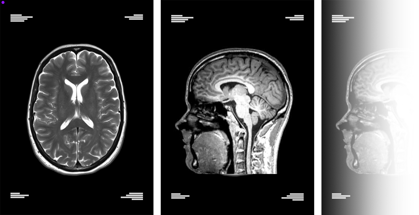
This is some juicy stuff, get ready! Let’s talk a bit about 3D imaging, it was awesome to flex some of my 3D knowledge on this work. You might be wondering, this looks just like a static image nothing 3D here, well MRI scans have dozens if not hundreds of images in a single stack allowing your radiologist to scan through your body to get a better understanding, zooming, panning, scrolling and rotating around the model. Leading to this diagram that speaks to the way we had to layer data that way as the radiologists manipulated the images annotations, controls and meta data acted as it should.


You made it to the last section of this page! Congrats! 🎉 Ok so that was a lot of content, what’s the take away or the lessons learned from all this wonderful work?
- Regulated industries might be slower, but you can squish in lots of good research and exploration work with slower release schedules!
- Continually advocating and pushing for strategic design efforts is critical not only for your users bandwidth but your internal teams as well.
- Make sure you understand the medical side of the situation to ensure the most fruitful conversation with your clinical partners
- And lastly don’t forget about all the other people outside of your organization that may have already solved a similar problem that you can leverage.