
June 2022
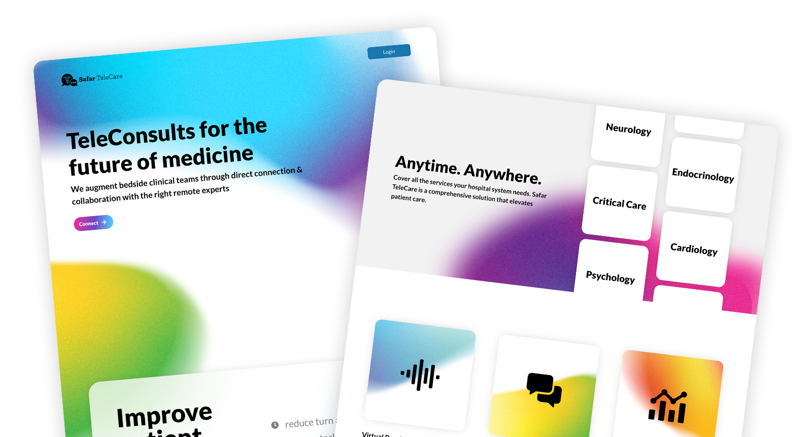
Safar TeleCare Splash Page
Every product needs to make a splash!
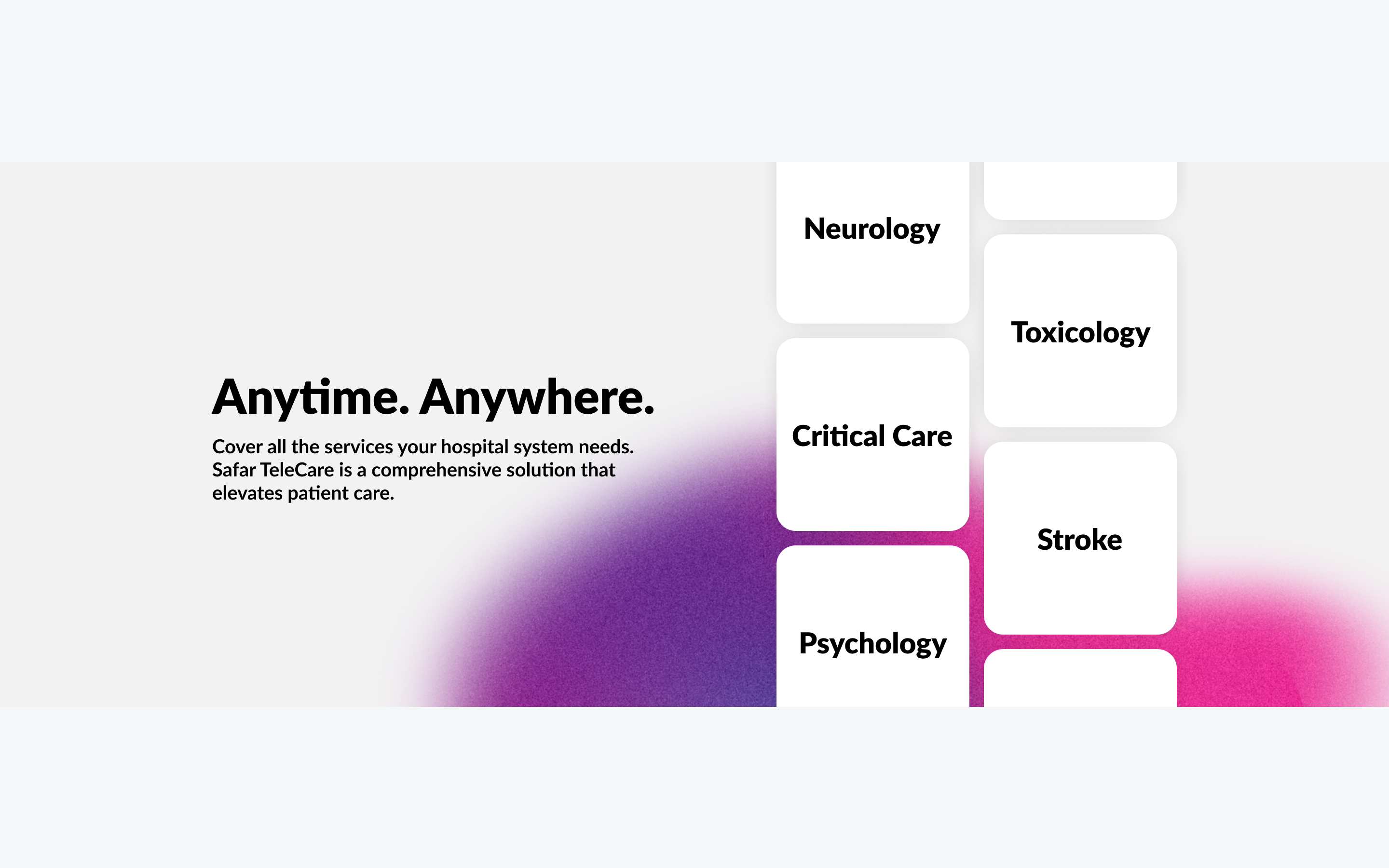
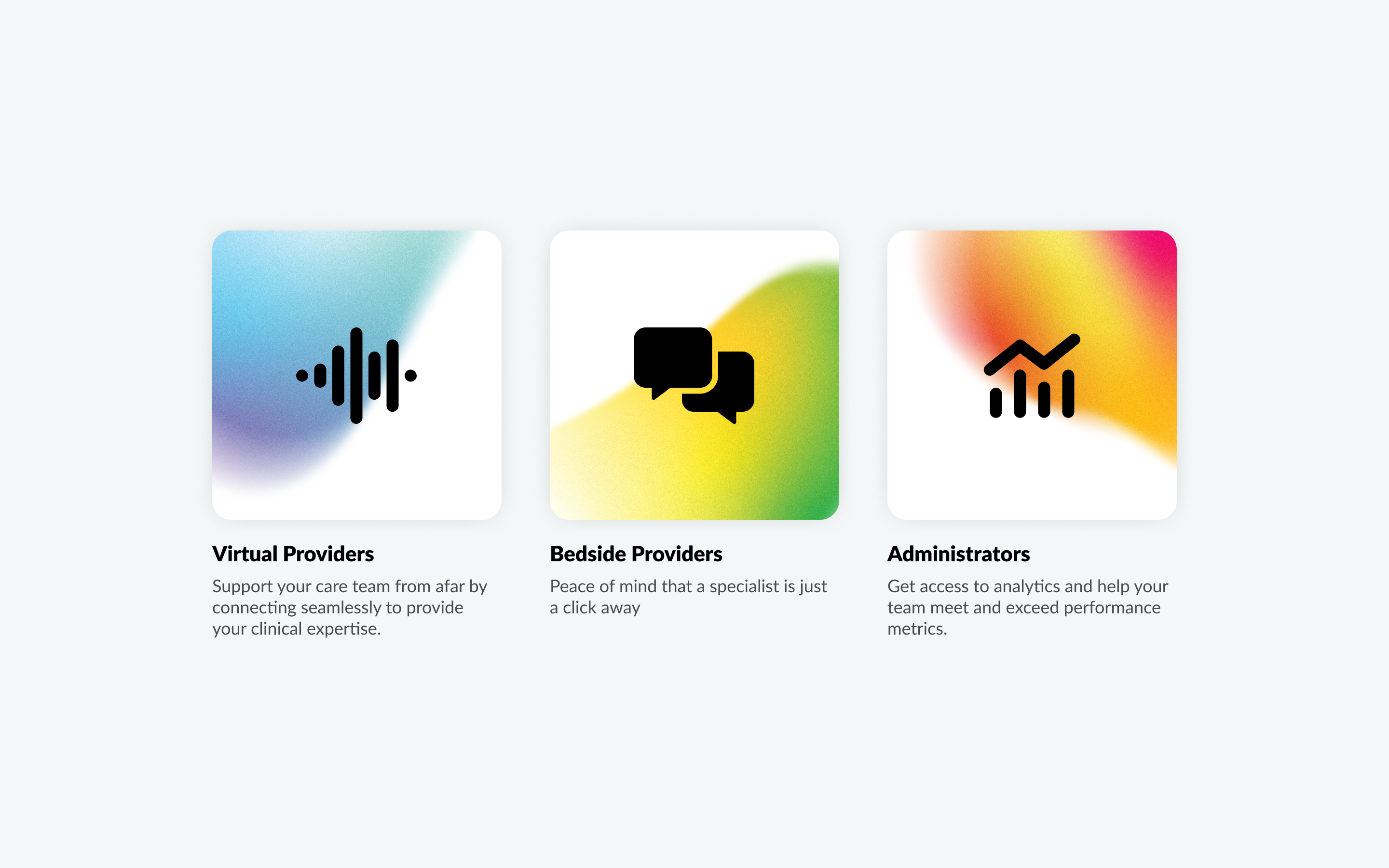
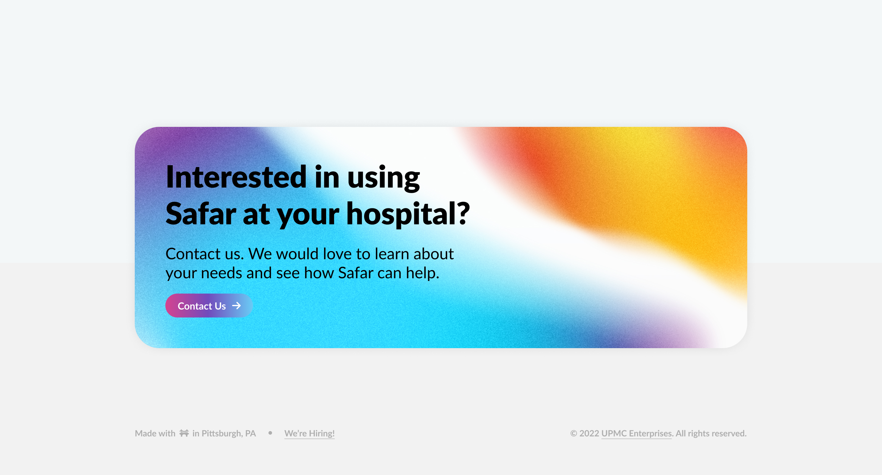
With the new splash page for Safar TeleCare we wanted to extend the brand and showcase the main value and benefits of Safar for clinical staff and their support teams. Shaping the future of healthcare tools from traditionally complex enterprise applications to simple and straight forward apps that are designed with consumer sensibilities in mind.
Hover effects can be a lot of fun! Here are 2 micro-interactions we decided to bring to life.
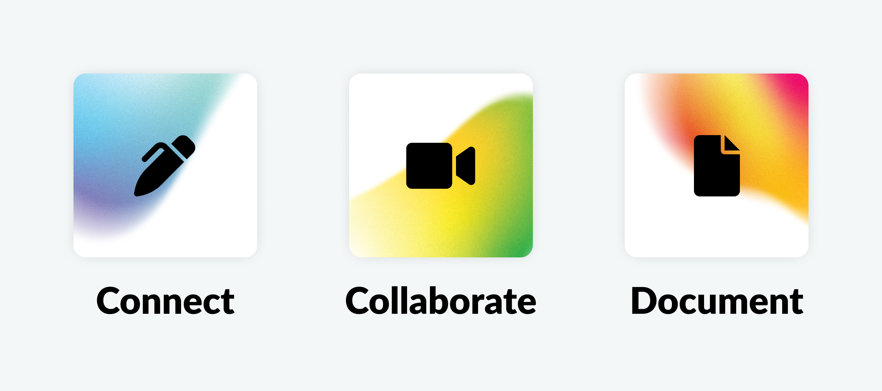
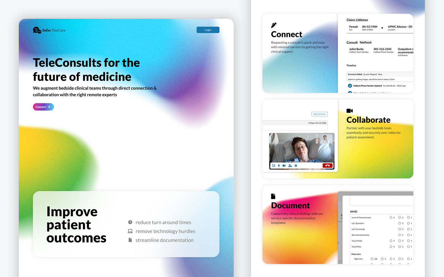
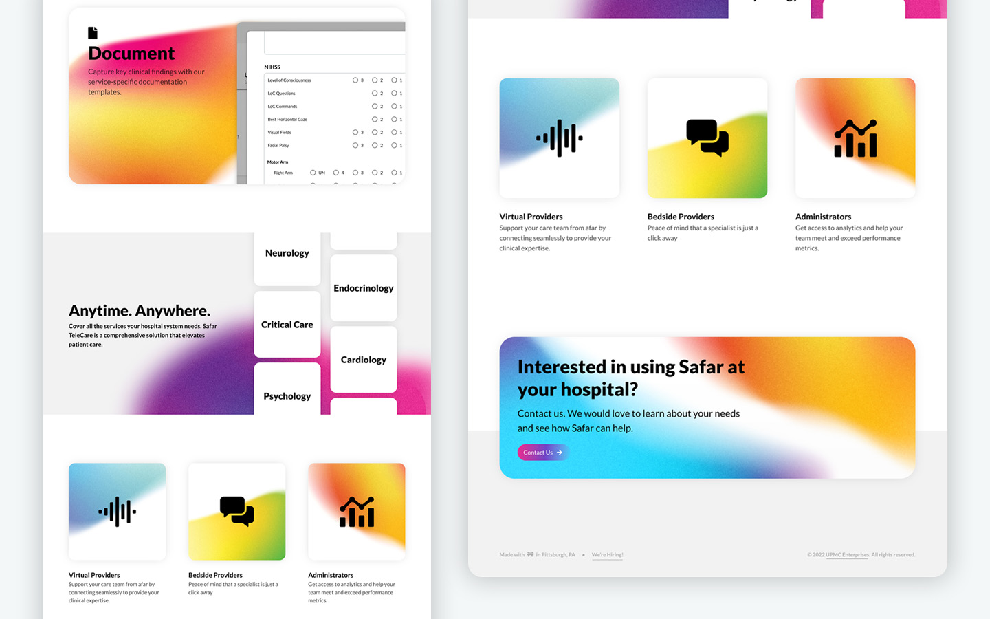
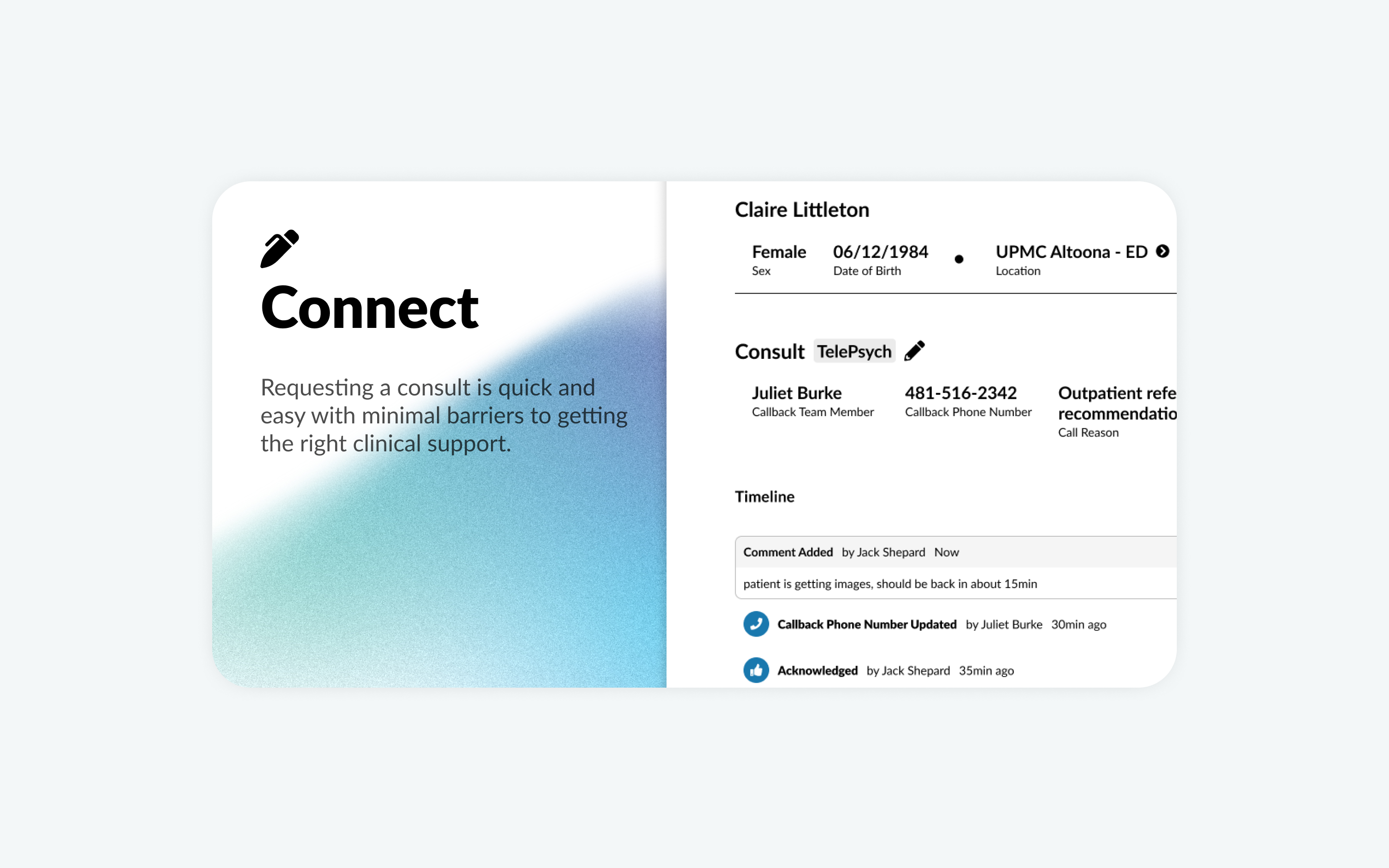
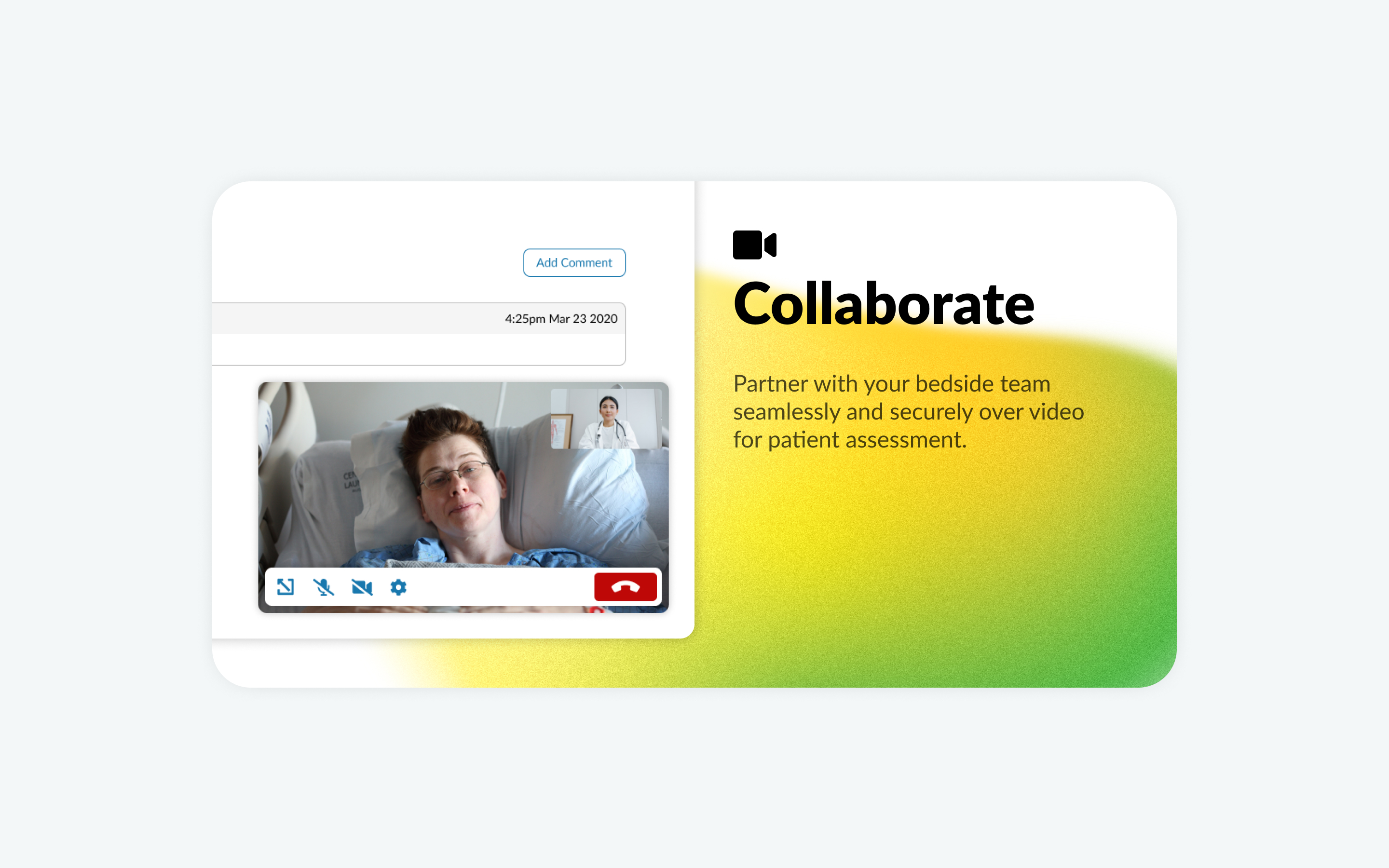
The 3 steps of the consultation workflow in Safar TeleCare. Connect. Collaborate. Document.
Behind the Scenes
Take a close look at some of the values on this mockup. Notice anything familiar? The keen eye may recognize a couple of the names and numbers from the tv series Lost. Gotta love a little easter egg here and there!

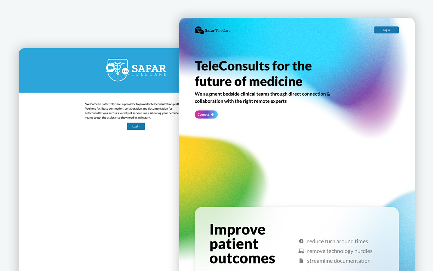
From a simple login page to a branded and product-focused splash page, sharing the value and brand of Safar TeleCare.
If you are curious how I brought these beautiful gradients to life check out this video! This tutorial explores design techniques to create soft gradients that are inspired by the characters of Pixar’s Soul. Enjoy!