Consumer Reports
August 2015
Consumer Reports has a long history dating back to 1936 as an organization dedicated to unbiased product testing, investigative journalism, consumer-oriented research, public education and consumer advocacy. As part of their testing process they run numerous tests on all products to make sure they hold up over time, are safe to use and many other aspects of a product we all expect as consumers.
The cars team runs around 110 tests that capture around 400 unique data points for each one of the cars. These data points and tests are then analyzed and bubbled up to a more digestible score which gets presented by way of a product score and category scores.
I was tasked with exploring what if we exposed more of that rich data to the users, beyond the 1 overal score. for those who want to go deep but also not forgetting about the folks that come to Consumer Reports to get a ‘yay’ or ‘nay’ answer on their buying purchase as well. Here are my explorations.
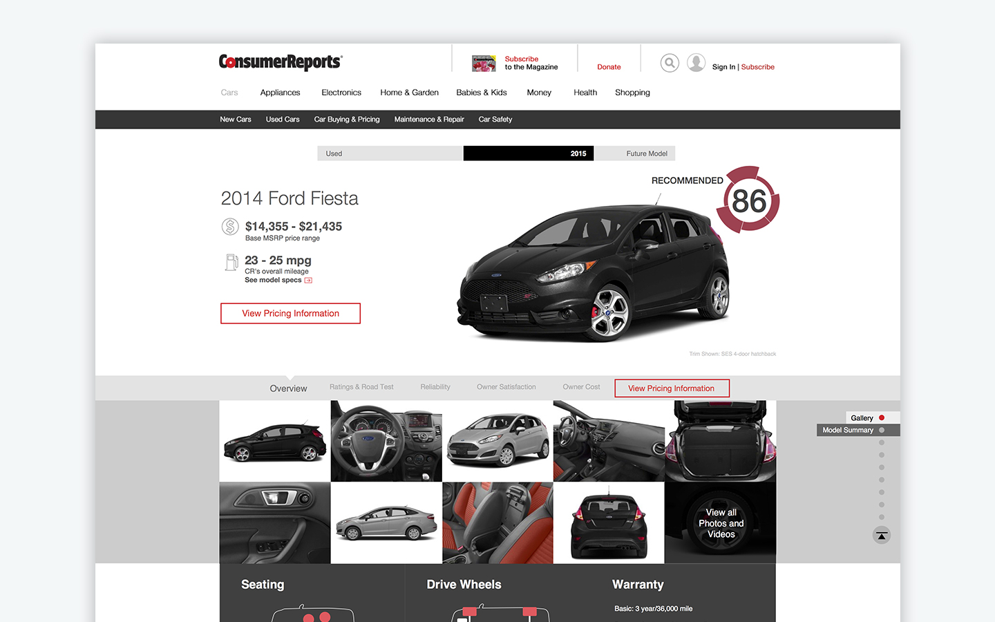
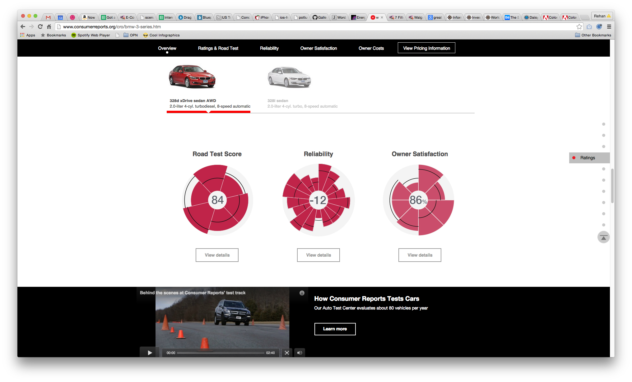
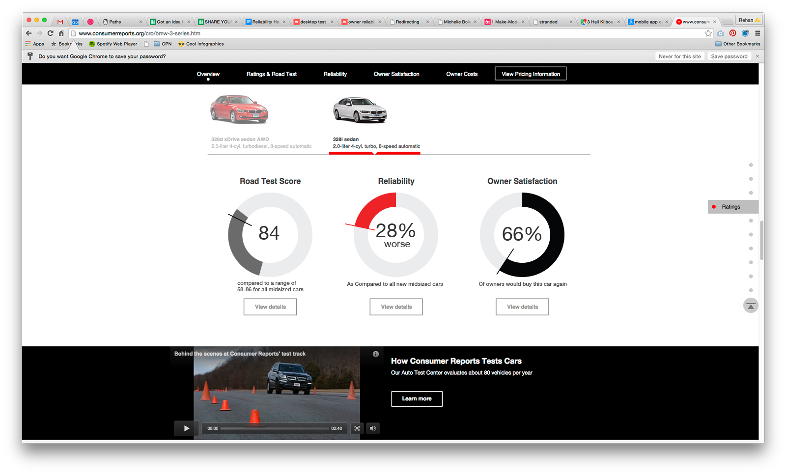
Let’s walk through the above 3 images. When the user first arrives onto the model page, 2014 Ford Fiesta in this case, they will see the road test score graphic, top right. This is the entry point for the new scoring system and is used as an icon to understand that there are components that make up the score.
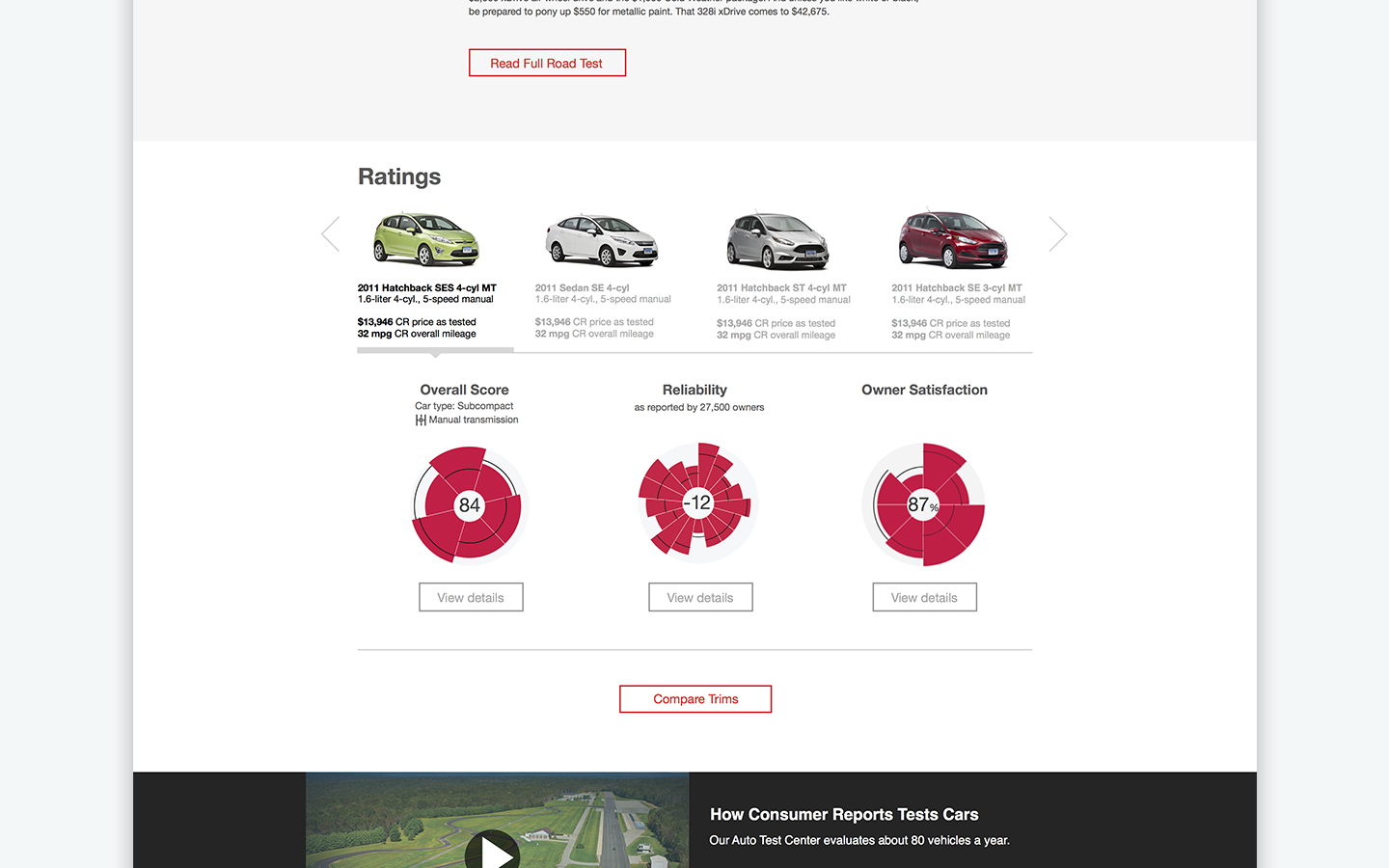
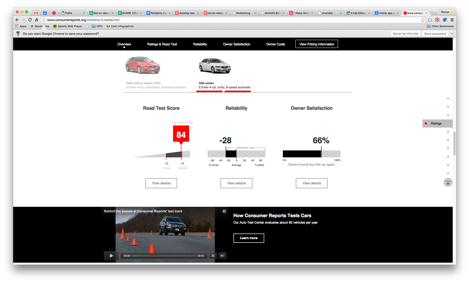
As the users scrolls down the page they will notice a similar circular scoring graphic for 3 of our scores, again showing that the score can be broken down into more pieces. This view also has a bit more information by showing the average score for cars in that category and a grey threshold circle showing what a perfect score would look like.
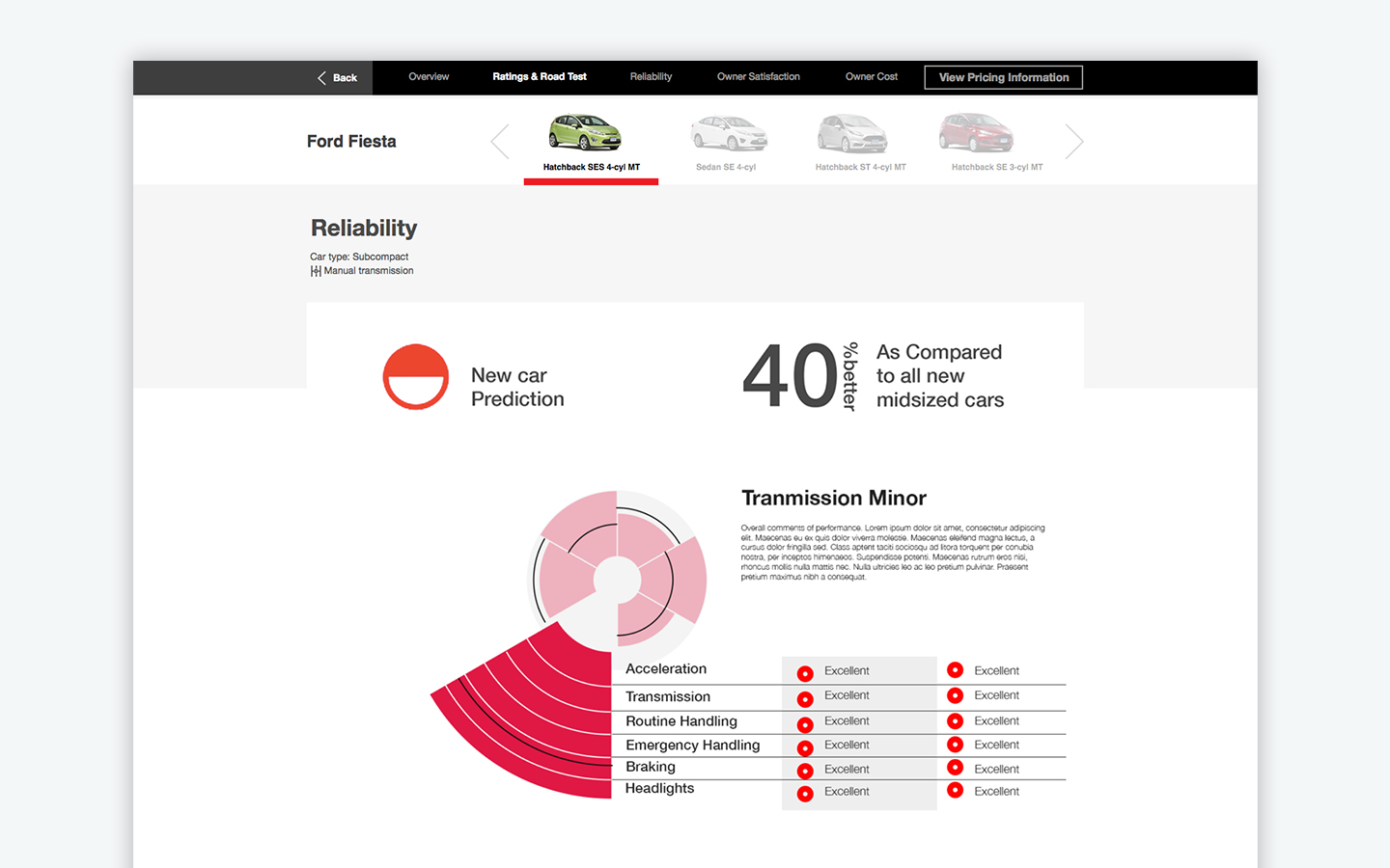
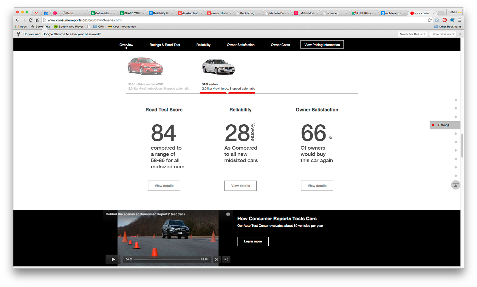
Once a user clicks in to view details of any of these, again they will be greeted by a similar graphic broken down even further, while still retaining some of the common elements of the overall score as to not loose context of the overall vehicle.
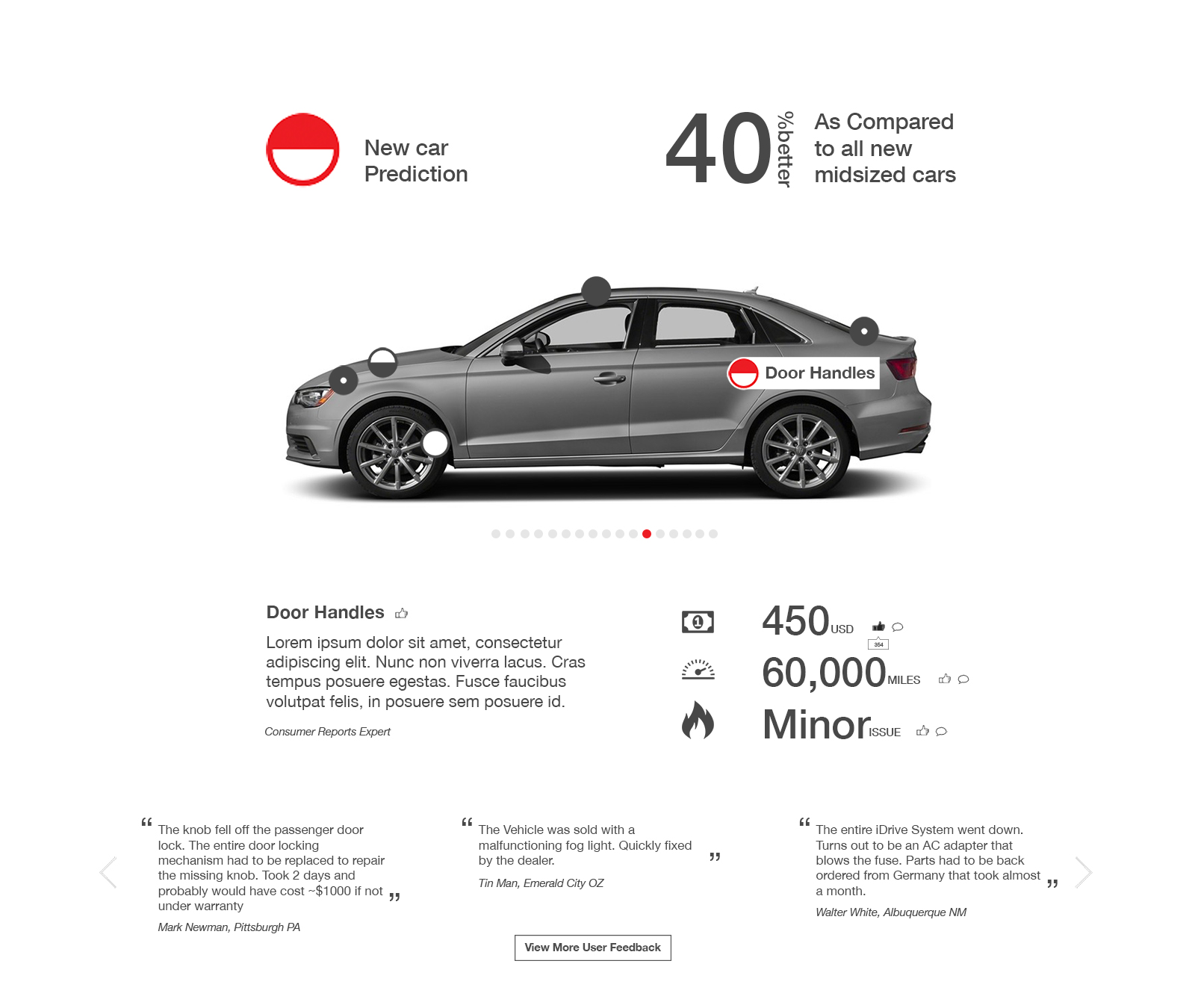
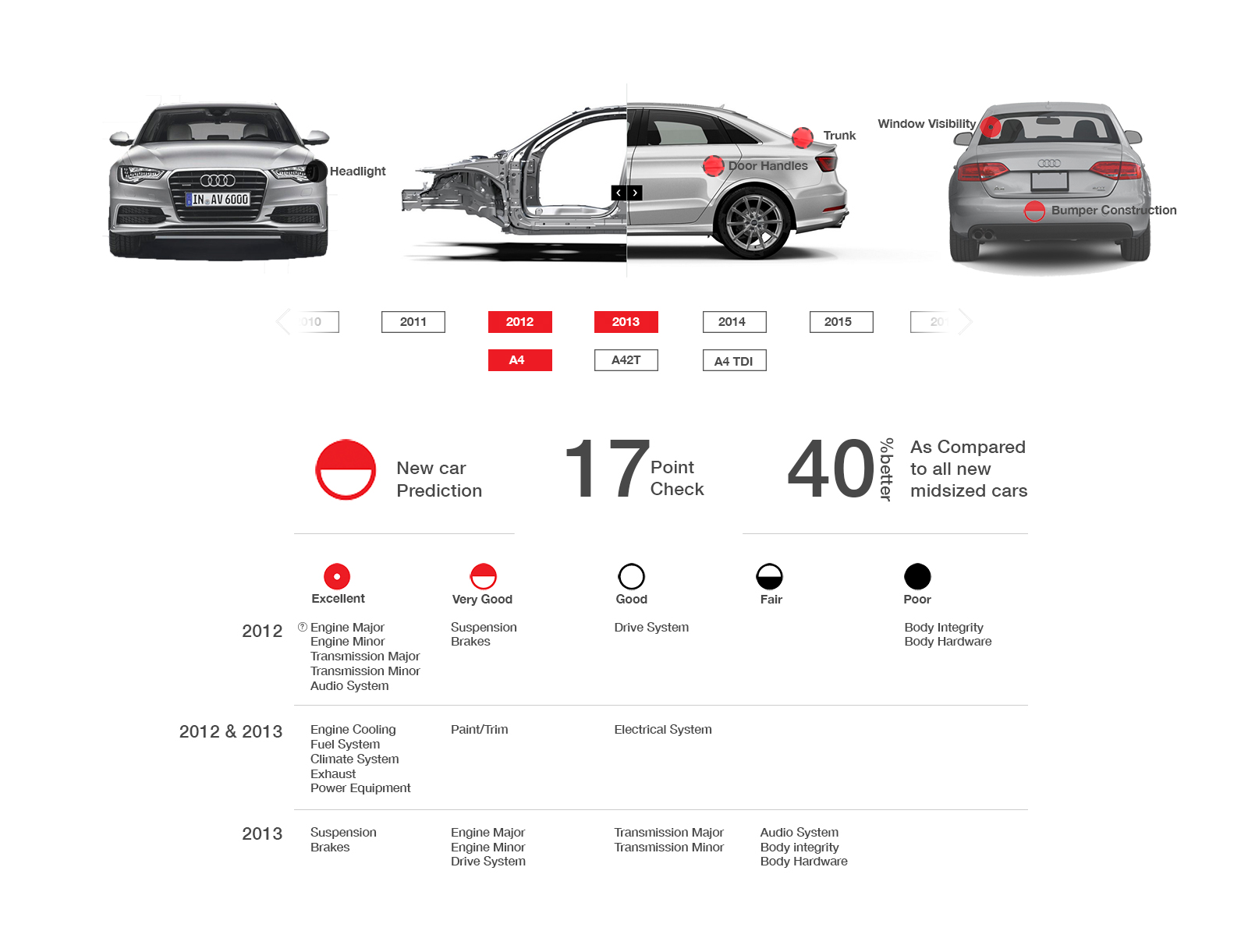
Explored pinning ratings onto the vehicle as a more visual way to digest the data. Also allowing for the consumer to explore areas that they care more about.
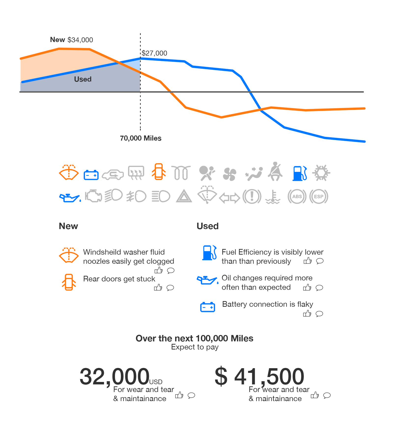
Explored using the dash icons as a way to track reliability over time and from a new vs used car purchase.
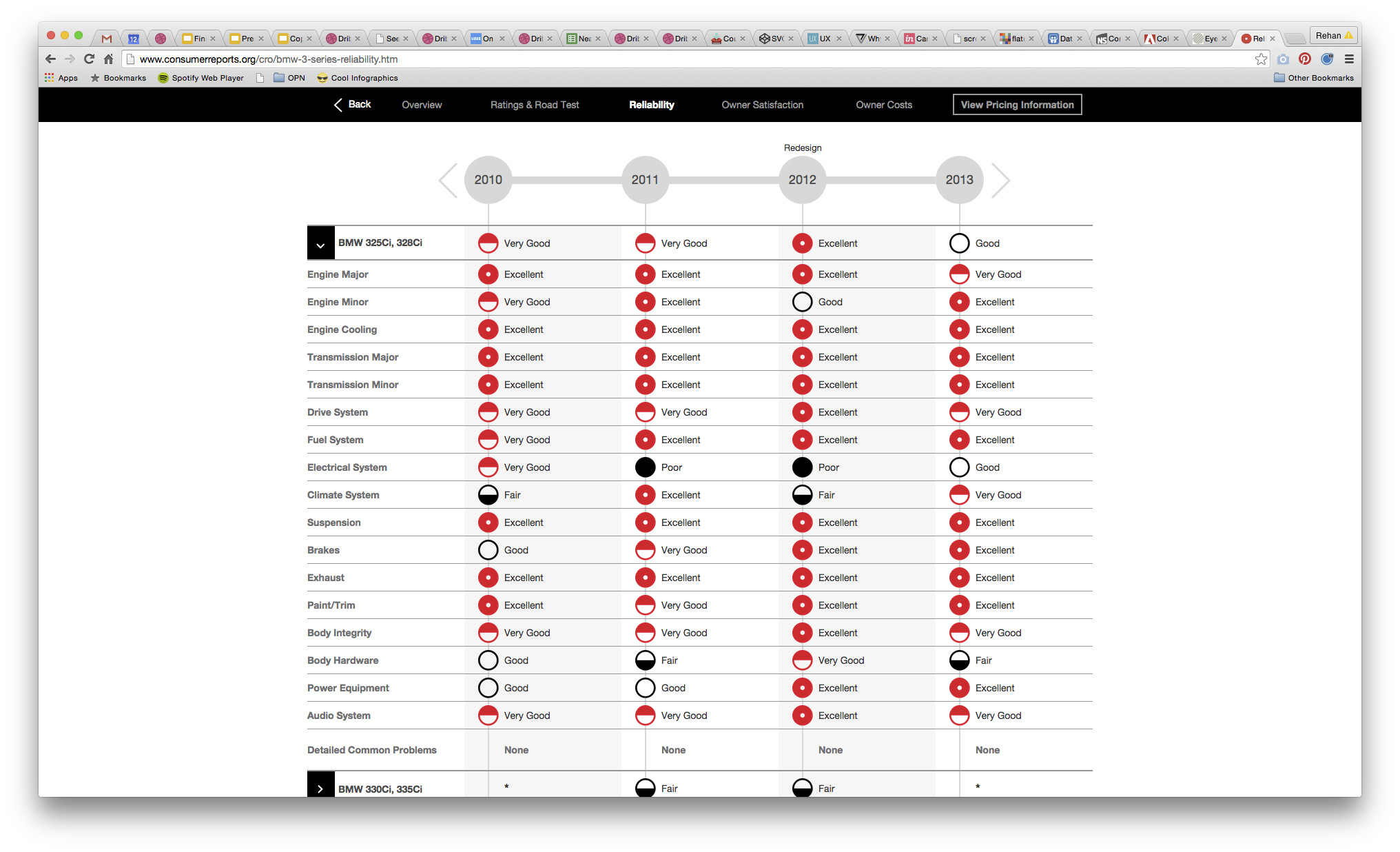
One of the current visualizations. Something that was, often times, hard to digest. Almost came across as a wallpaper pattern which you could easily get lost in.
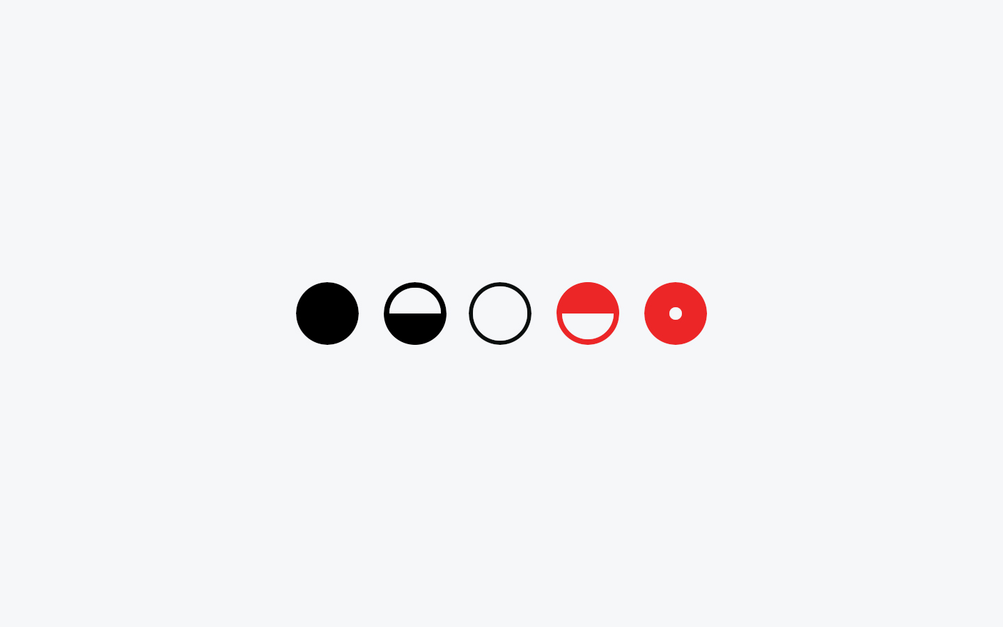
A major part of the Consumer Reports brand is their iconic rating system. A mortified versions of Harvey balls Opens a new window (seen above). The red circle indicated the highest rating, the half red and white circle being the second highest rating, the white circle being neutral, the half black circle being the second-lowest rating, and the entirely black circle representing the lowest rating possible.
While exploring how to bubble up more of the testing data to the consumers, changing the Harvey balls rating system was explored. Also check out my Consumer Reports Rebrand project for related materials.


Explored a spiral timeline visual as a way to help bubble what where in the lifetime of their vehicle they were likely to run into issues and what those issues were. Pulling in data from both the testing data and the yearly reliability survey that the cars teams puts together.
