Consumer Reports Rebrand
August 2015
Consumer Reports has a long history dating back to 1936 as an organization dedicated to unbiased product testing, investigative journalism, consumer-oriented research, public education and consumer advocacy.
As part of my summer working with Consumer Reports. I explored a rebrand that better fit the refreshed direction of the company with the goal to stay relevant with the younger generations in a world of YouTube and blog reviews.
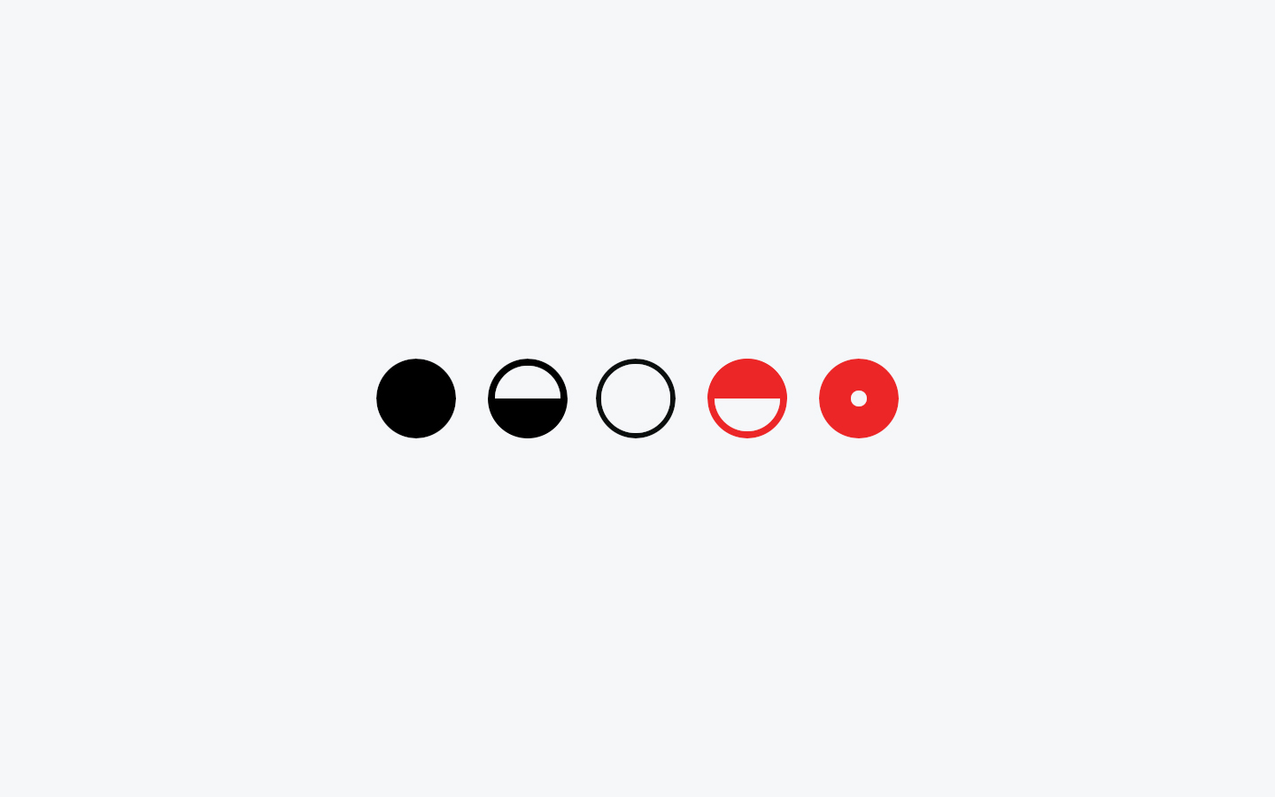
In addition to the logo a major part of the Consumer Reports brand is their iconic rating system. A mortified versions of Harvey balls Opens a new window . The red circle indicated the highest rating, the half red and white circle being the second highest rating, the white circle being neutral, the half black circle being the second-lowest rating, and the entirely black circle representing the lowest rating possible.
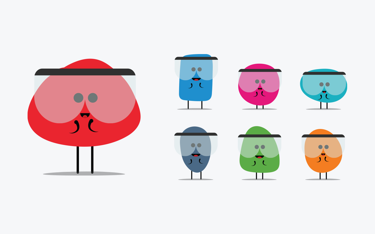
Bringing together a color language for each of the content focus areas, with a mascot to help guide you through the experience.
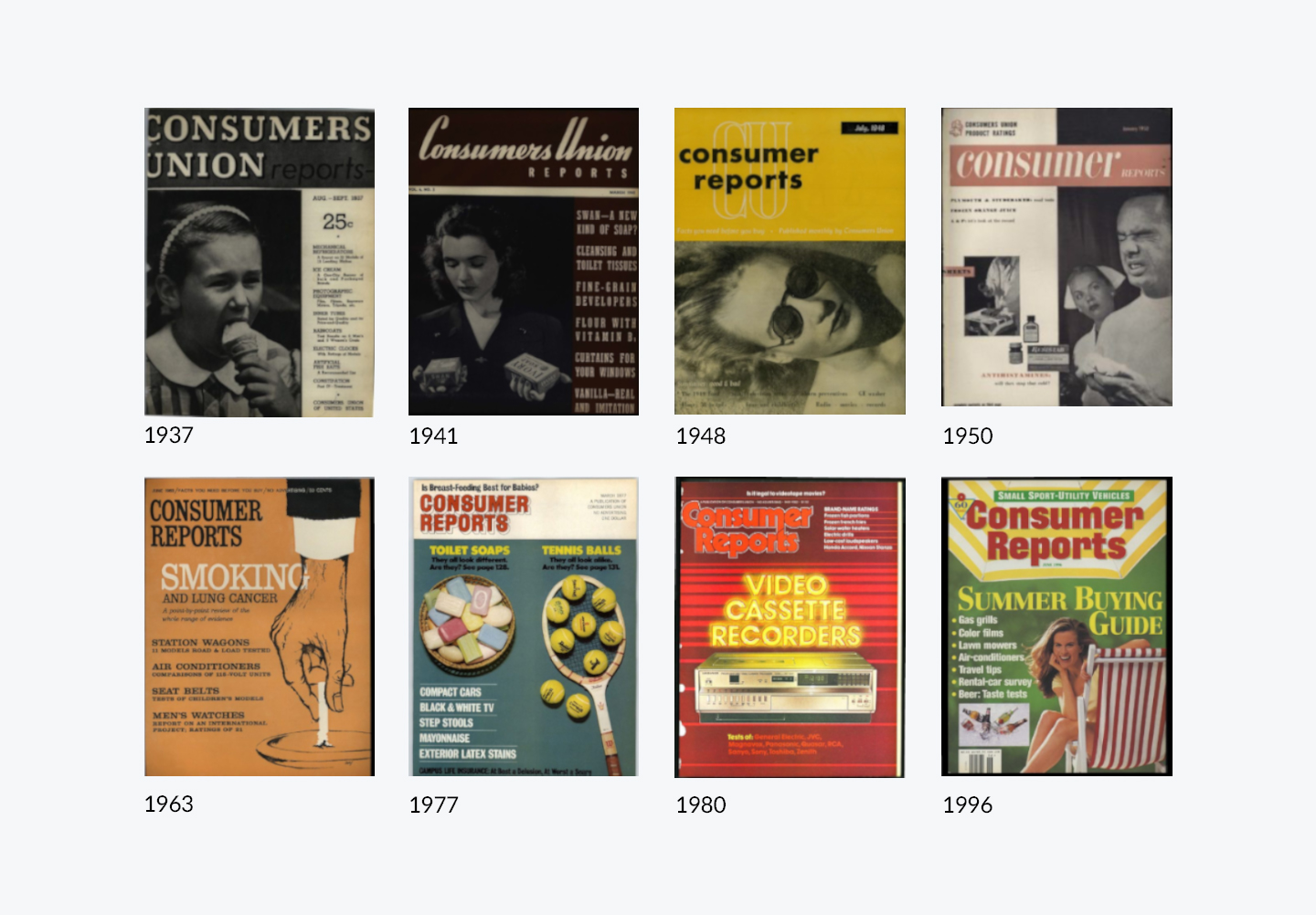
Exploring the history of their magazine
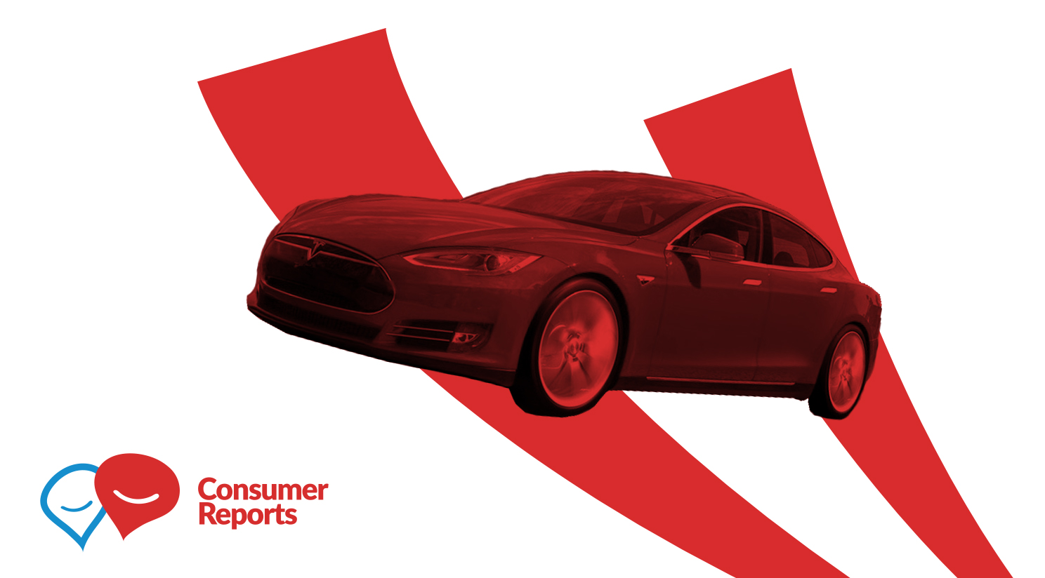
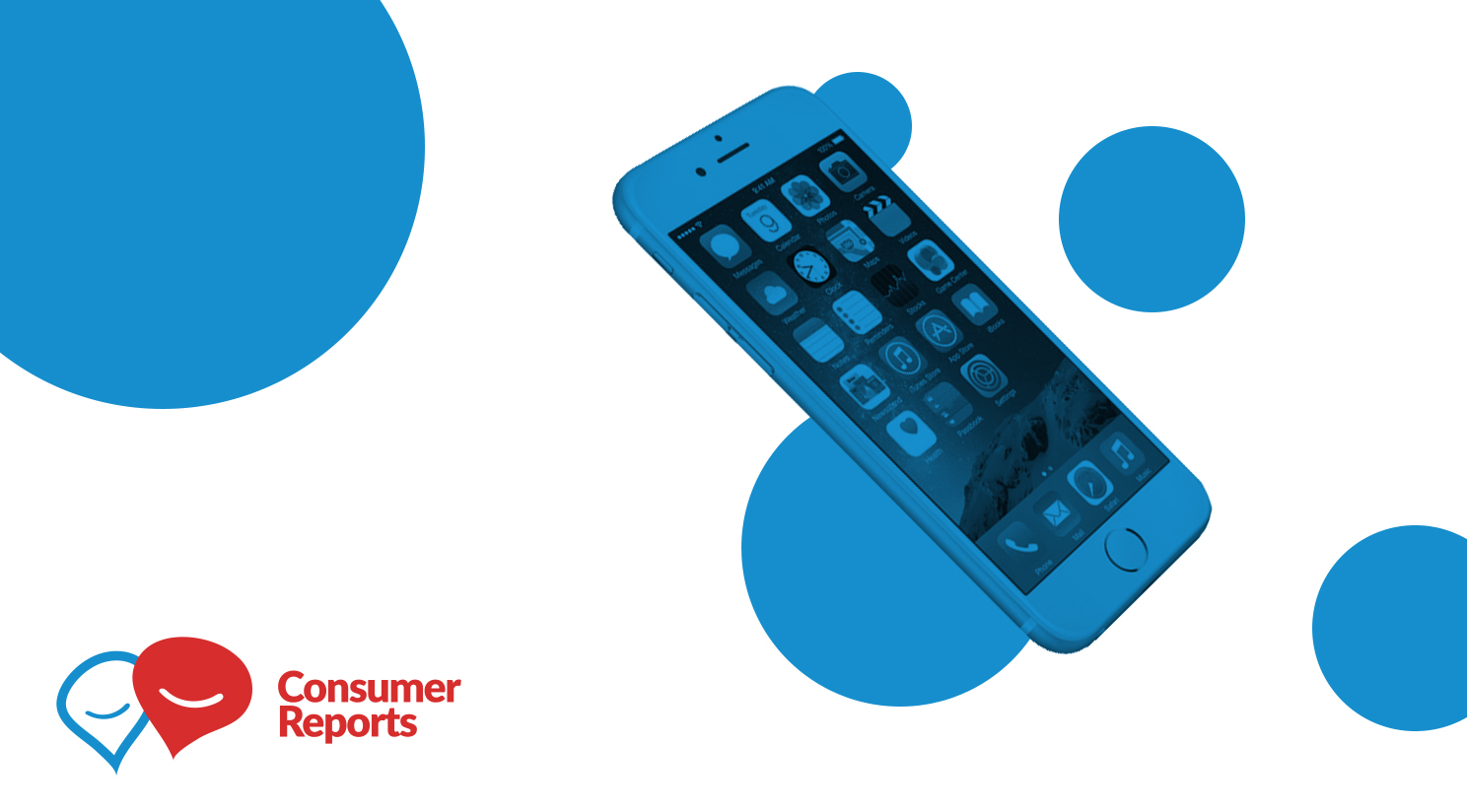
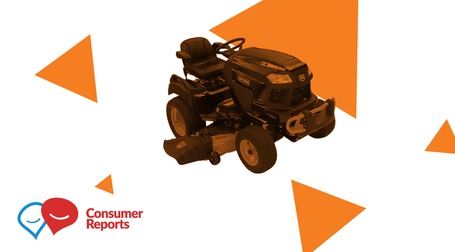
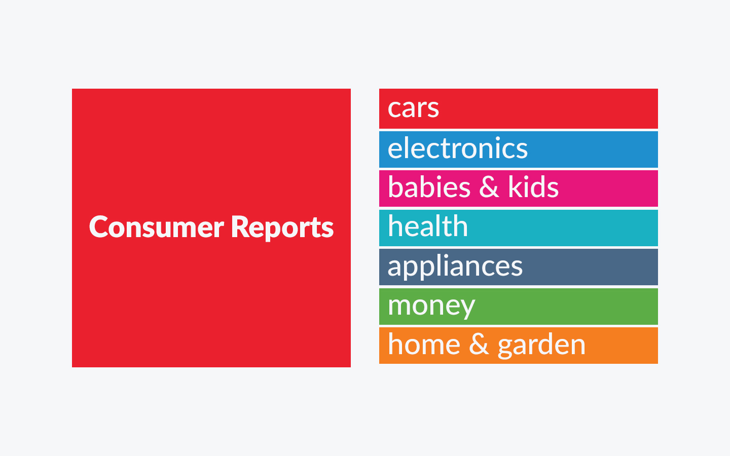
Exploring a shape language to pair with the color language for each of the content focus areas: cars, electronics, babies & kids, health, appliances, money and home & garden.
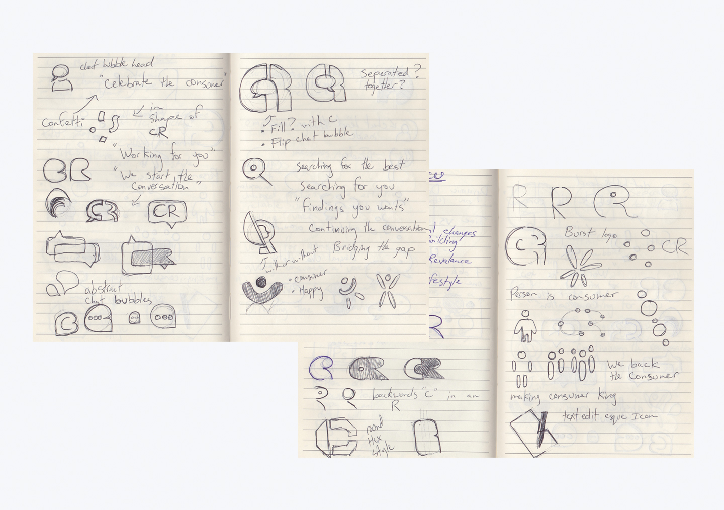

Shape exploration, going deep on the idea of a speech bubble as Consumer Reports is activating conversation around consumer issues.

Typeface and lockup exploration
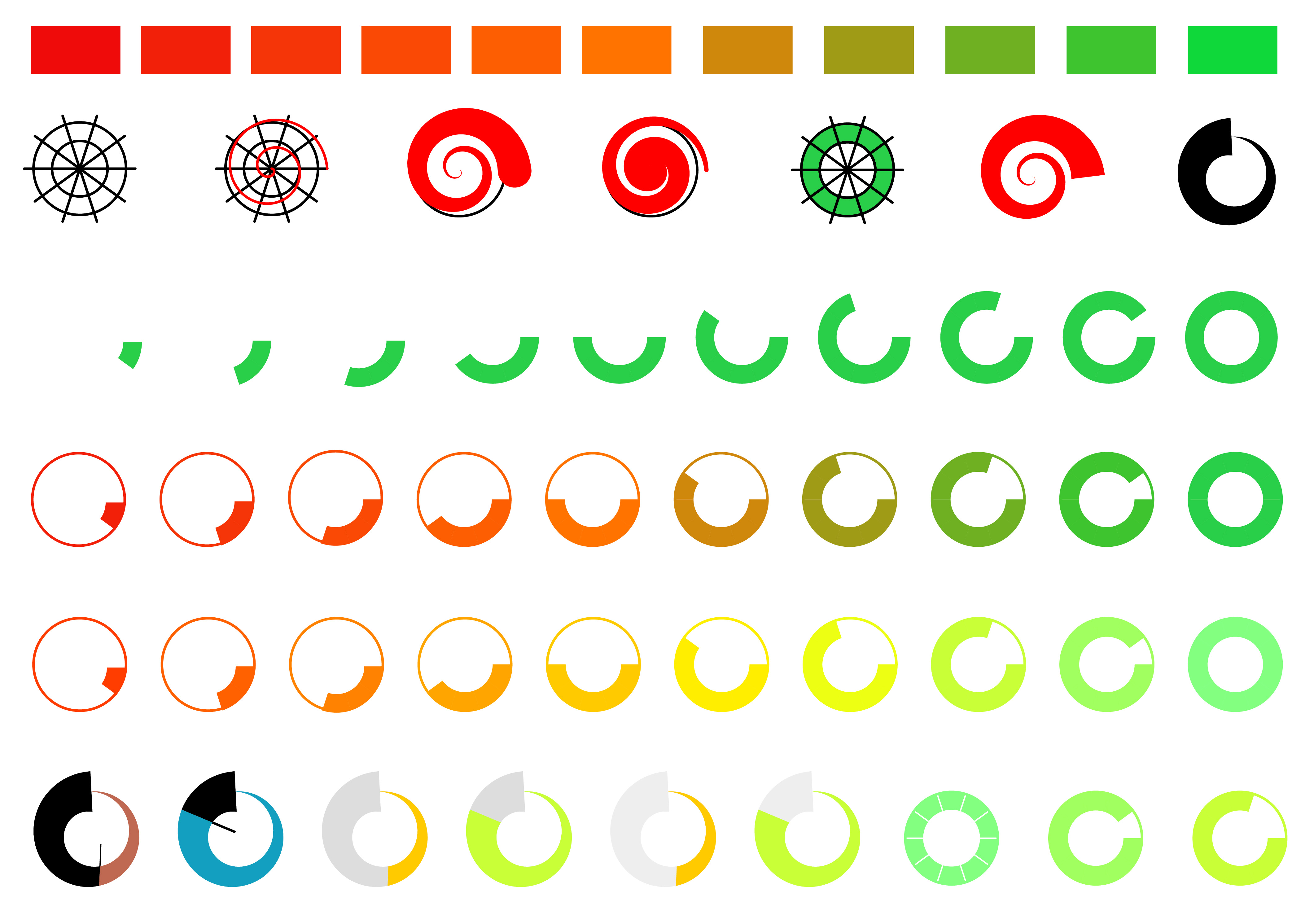
As previously mentioned the Consumer Reports rating system is a major part of their brand, which also required exploration. My exploration led to more questions than answers. Should it remain a 5 point system? Does it convert to a percentage scale? Is there another scale that works better for the audience? How granular of a scale needs to be represented? How granular is the data collected during the testing process? As such I left the rating system question unanswered for the larger team to explore.
Above you see a couple different scales I explored, with shape and color independent of the testing context. If you are curious of what a deeper exploration of their rating looks like, check out my data visualization work I did with the cars team.