Shine Registry Rebrand
January 2021
Shine Registry is a platform that gives founders a platform to ask for support as they are starting their businesses. One of the goals of this rebrand was to help formalize a growing start-up’s visual identity with its existing community while also introducing a more scalable and cohesive brand system as it continues to expands.

Explored the existing world of Shine Registry to get a sense for the brand and its visual identity.
Once you are done exploring this rebrand of Shine Registry checkout the full redesign project as well, see where the home page is now.


Audited the existing color and shape languages. Starting with the colors, I wanted to expand the palette for a greater diversity of use cases both on and off the web and wanted to ground the primary color a bit allowing each business to out shine the platform’s brand. Resulting in a wider range of colors and a more earthen palette.
Similarly with the shape language, it was important to give greater contrasts between different elements on the platform. It was also important to add a more natural feel to the site, better reflecting the entrepreneurs and their businesses that are on Shine Registry.

Bringing together the color and shape languages to create this really sharp, natural and inviting tone.

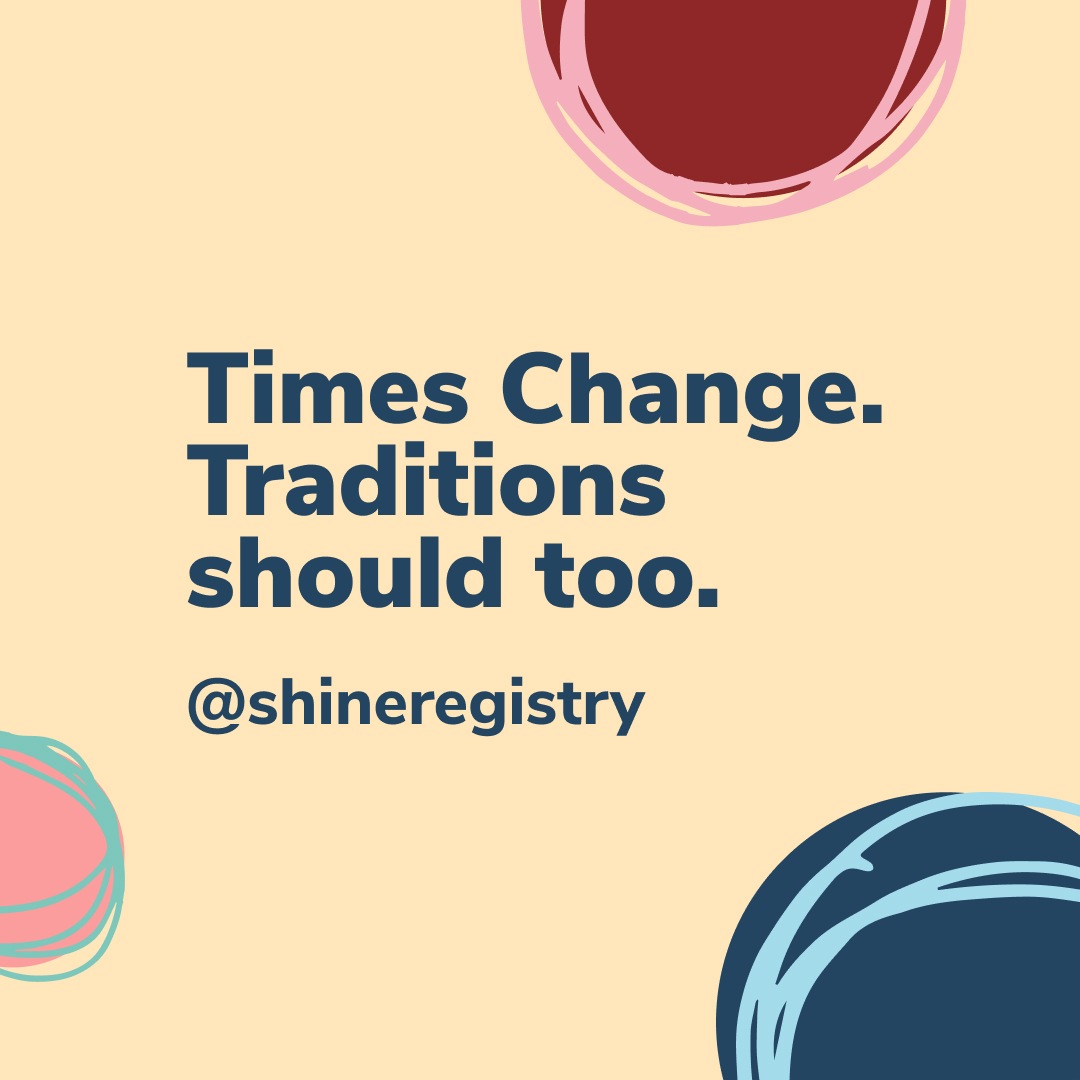
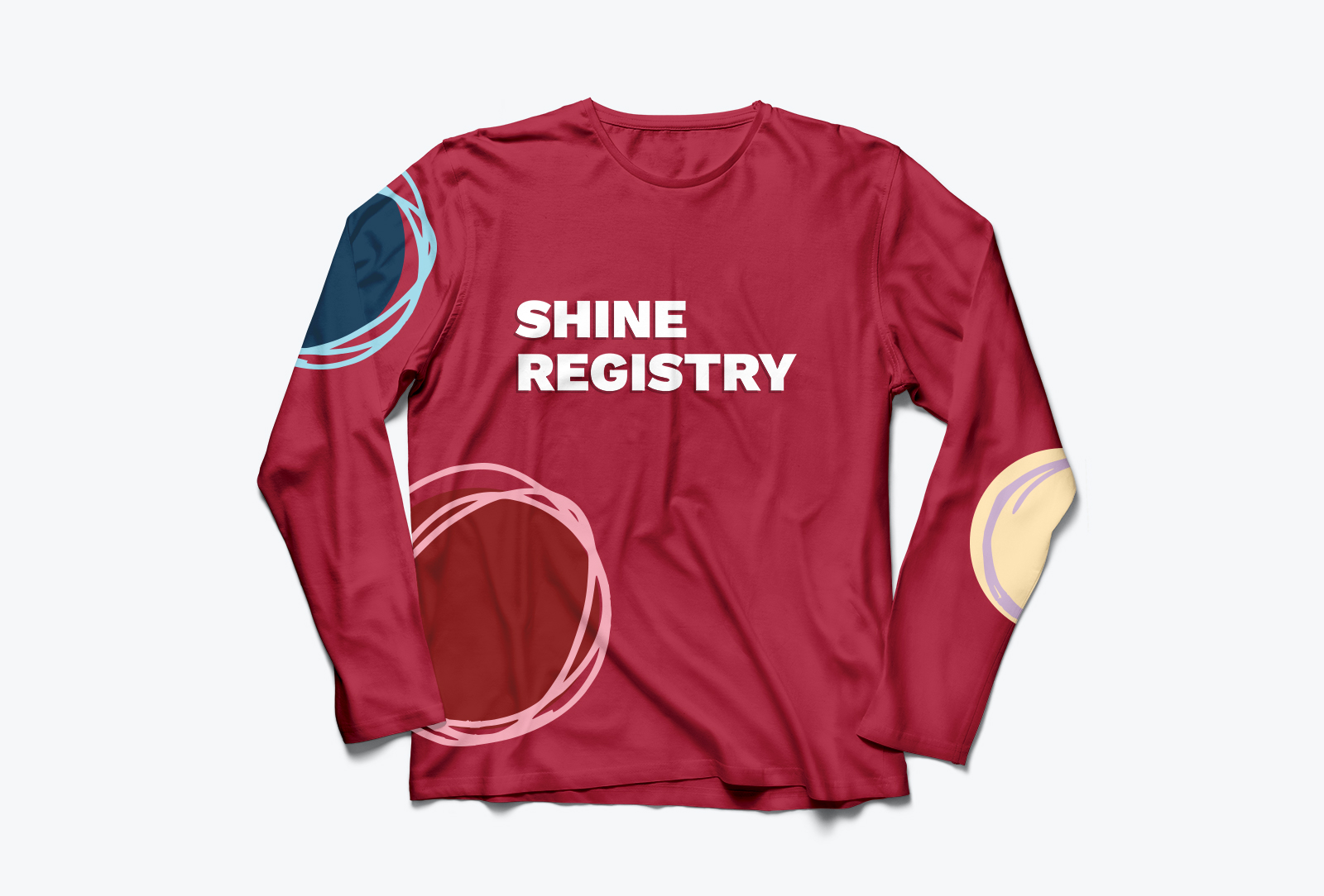

The brand in action on social media and some concept merch!
See how the new brand language was used across the platform as part of the redesign.